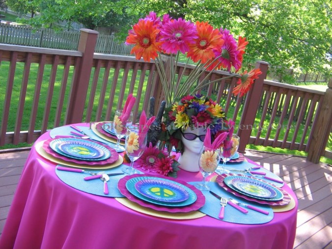
My husband is giving me “that look.” You know the one: the look that says, “Here we go again! Just shoot me now!” But I swear on a stack of pancakes I am NOT getting back into the wedding business!!! I am simply lending the benefit of my expertise to two three a few couples who have recently asked me for a little jump-start in their planning. And it’s not like I’m planning the entire wedding like I used to. Just the reception decor part. I mean, what’s the harm in that? 🙂
I had a lunch meeting a couple of weeks ago with a lovely couple and Mother-of-the-bride who are planning a May 2013 wedding. We spent nearly an entire day together, grinding our way through the details of their reception decor. I wanted to continue working right through the noon hour, so I set up a casual & fun lunch table that was pretty much in line with their chosen colors…and professions!
(Click on any image to enhance/enlarge it.)

 Thanks to the sweltering heat (stick a fork in me…am I done yet??!?!!), we were relegated to the basement level of our home for the marathon meeting. We worked on the soft seating/big screen TV side of the room for most of the day, but lunch was set up in a little out-of-the-way corner on a marble top table.

 Both the groom and the Mother-of-the-bride are elementary school teachers, so I thought it would be fun to use these lunch trays to make them feel right at home. (And to remind them that they’ll be right back in there with those screamin’ little demons in less than a month! :-)) I got an “A” for effort on that one!
I have been holding onto these really cool lunch boxes from Kirkland’s for another upcoming project, but the couple’s colors are turquoise, orange and white. How could I resist? Another “A” for effort!
I set it up so that we could just take the food from our lunch box and put it on our plate when ready to eat.
 The chocolate and white luncheon-sized melamine plates (Target 2010) have just a touch of muted orange and turquoise in the simple design. I couldn’t believe how the plate colors nearly spot on matched those of the fun retro design lunch box!!! (The lunch box design reminds me of “Rowan & Martin’s Laugh-In“. If you’re old enough to remember that show, take a little break and go fix yourself – and me! – a Metamucil cocktail with a Geritol chaser! ;-)) Fun white flatware from TJ Maxx lightens the look and stands out nicely against the deep color of the lunch tray. A bottle of refreshing Sioux City orange cream soda looks great with the setting and tastes great goin’ down…like a creamsicle!!!
 Lunch was a quick and easy one: a piquant Southern fried chicken sandwich, a parchment paper cone filled with crispy thin Lay’s potato chips, and little Ziploc baggies of celery and carrot sticks. Just like in grade school…but without the stinky kid with the perpetually runny nose wanting to sit next to you! 🙂 I put a little ice pack in the bottom of each lunch box to keep the contents cold until time to eat.

 The little wine table beneath the small screen TV was perfect for setting up munchies and dessert. (Yes….sadly, we have two televisions in the basement. My husband has grand delusions of this being a TGIFriday’s!)
 We finally called it a day around 4:20. Sheesh….7 grueling hours of decision making!!! But guess what? The decor side of the wedding is now all but set in stone, and we won’t have to meet again until early April to finalize everything. Hallelujah! I love it when things work out like that!!! I hope you’ll check back next May to see the fruits of our labor!
Oh…I forgot the other thing: I got a glowing report card of straight A’s on my tablescape!!! 🙂 It would work really well for any kind of meeting including a teachers’ back to school planning session. This lunch and learn tablescape would also be something fun and different for a teen study group!
I’m linking up on Wednesday night with Cuisine Kathleen for “Let’s Dish!“ and on Thursday morning with Susan for “Tablescape Thursday“ over at Between Naps on the Porch. You can also find me at BeBetsy.com. I hope you’ll join us!