This is one of the most exciting posts I have ever created!!! I hope YOU are excited, too, because you have a chance to win a Mikasa “Daylight” gift set!!!!!!!!! It is just TOO pretty….I fell in love with it the moment I saw it!

First, the business end of the giveaway. Rules for your chance to enter and win are:
- Leave a comment and become a follower of this blog, Tablescapes at Table Twenty-One. Both current and new followers will be eligible. Scroll to the bottom of this post, or click here to become a follower.
- Post photos of your best spring tablescape on the Mikasa Facebook page. Be sure to mention on their Facebook page that you are a part of this fabulous giveaway!!!
That’s it! That’s all! It’s just that easy!!! The contest for this beautiful Mikasa “Daylight” gift set starts right now and runs through March 30, 2011, 11:59 p.m. I will select and announce the very lucky winner here on Friday, April 1, 2011. (Wouldn’t it be nice to get a GOOD April Fool’s Day surprise for once?!!) The winning table will then be featured here on Tablescapes at Table Twenty-One the following week with a link to your blog! So put your creative thinking cap on, pull out all the stops, design & photograph your best spring tablescape, and enter to win! I can’t wait to see all the fabulous entries!!!
Now…pictures of not one, but TWO very different set ups I created using this incredibly versatile pattern.
DESIGN #1
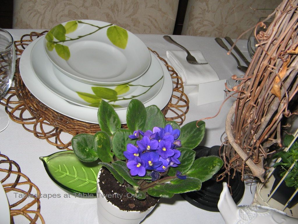
 The first design pairs the apple green found in the dishes with lucious purple, and it is suitable for breakfast, brunch or a spring luncheon.


 On a crisp white table linen, I started with a Pier 1 “Natural Flower” placemat and a plain white porcelain charger. While my chargers look great with this ensemble, Mikasa has a fabulous charger in the”Daylight” pattern that would look even better! Atop the charger is the “Daylight” dinner plate.
 The final layered piece is the “Daylight” soup bowl. Off-centering the bowl allows you to show off the design on both pieces. Simple glassware and flatware lets the dishes be the star. (Mikasa has crystal glasses in this pattern, though, that would really make your table special!!! Their “French Countryside” or Wallace “Butterfly” flatware – both available through Mikasa.com – would be a hit here, too!)
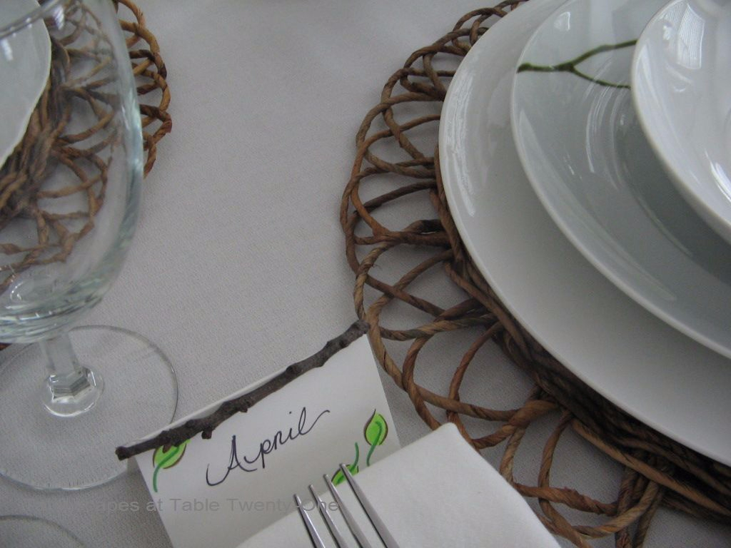 My husband insisted that the table needed place cards, so I fashioned these using plain white tent cards to which I added a leaf design and piece of natural twig to complement the dishware. OK, Ramon…you were right again! Whatever, man! 🙂
 It’s officially spring according to the calendar, but it’s still a bit chilly out. To bring nature in, the centerpiece contains lots of outdoorsy elements including a weathered metal birdcage filled with spring flowers from the nursery. When the weather warms a bit, I’ll plant the flowers in containers on the porch (if I can keep them alive that long!). A Hobby Lobby grapevine wreath on a Pier 1 iron stand adds further texture, color and dimension to the display.
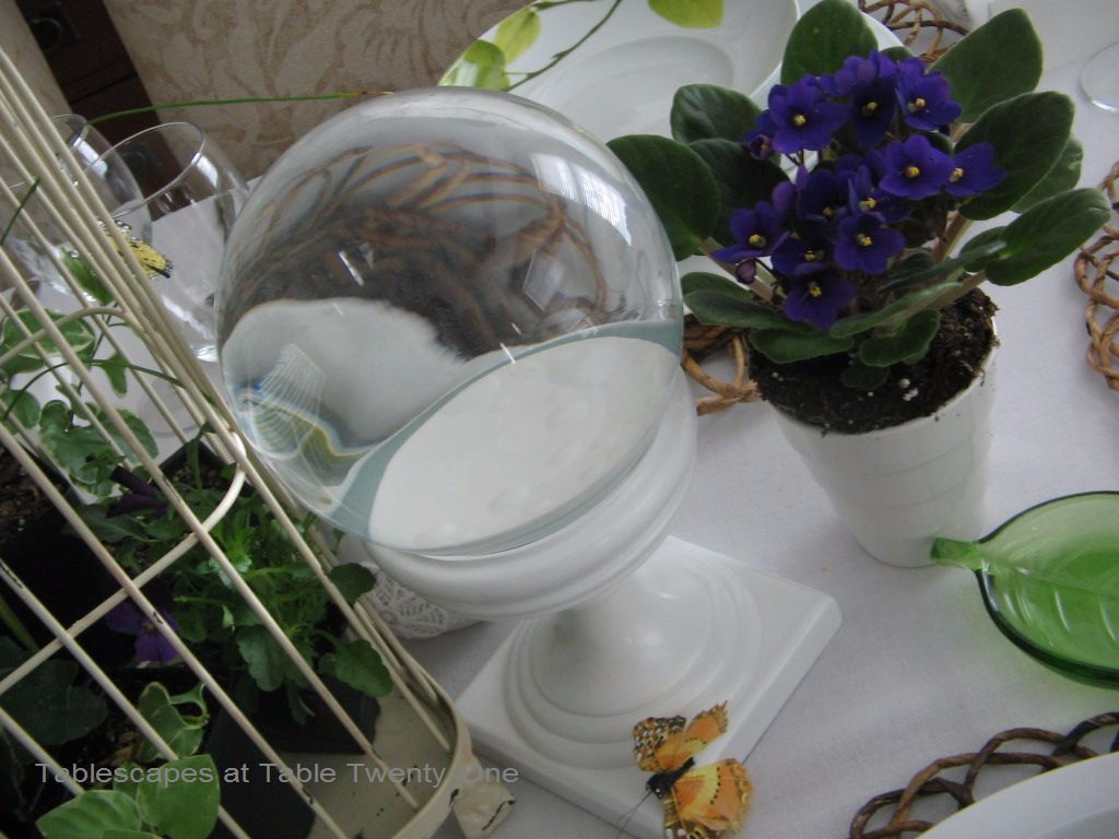 I bought this cool clear gazing ball at Z Gallerie last year.
 A pair of these pretty white birds were a recent purchase from Michael’s.
 African violets in white ceramic pots anchor the ends of the entire centerpiece.
 Bells of Ireland from St. Patrick’s Day are still thriving, and they go very well with this color motif. Pots of chartreuse pothos would also be an excellent choice.


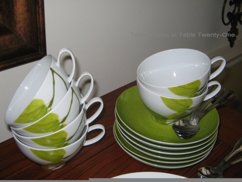

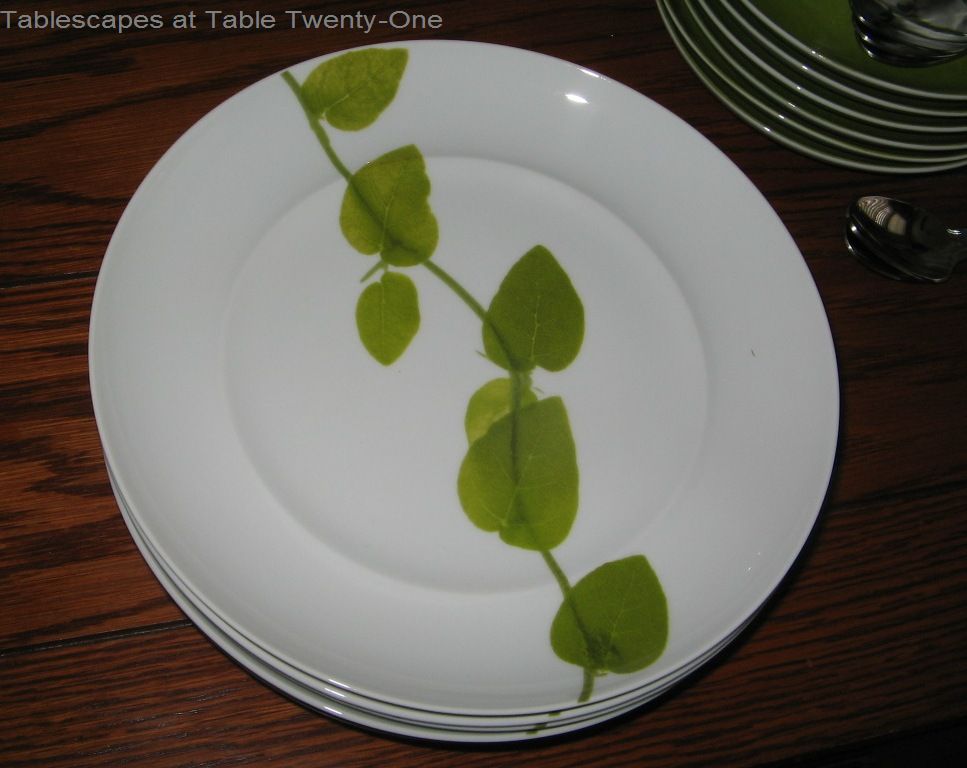
 The salad/dessert plates and cup & saucer sets are magnificent! The saucer color just blows me away!
There are many, many additional tabletop and serving pieces in the “Daylight” collection. You can bet your bottom dollar I will have several on my birthday and Christmas wish lists!
DESIGN #2
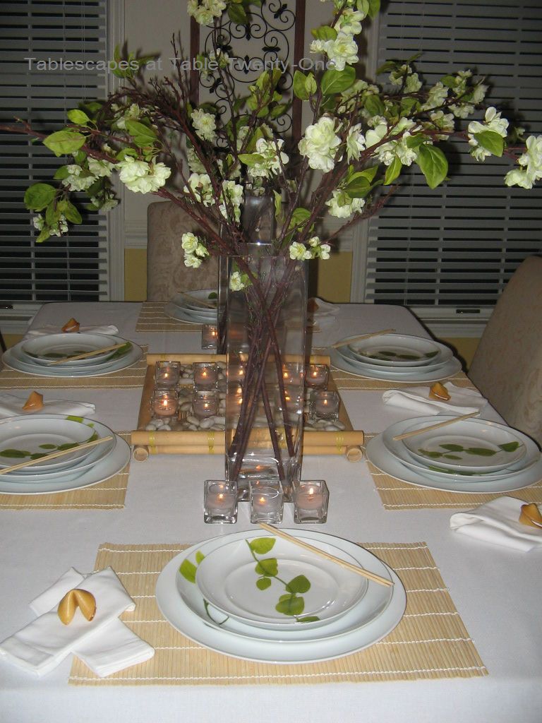
The second look I put together is geared toward the dinner hour to show, in the Mikasa website’s own words, how the “Daylight” pattern is “perfect for casual and formal entertaining alike.” The Asian influence created here was suggested by my stepdaughter in a moment of creative clarity while working on her chemistry homework. Thank you for the suggestion, Robyn!

 This is a much simpler, pared down look that really gives the dishes the starring role.


 In many Asian cultures, drinks are not often served with meals. Therefore, I decided to forego stemware for this setting. Starting again with a white table linen, I topped that with a bamboo placemat. Notice how the placemats are turned vertically to hang off the table for the side guests and horizontally for the end guests. This was just a measure for added visual interest on my part. The same white porcelain charger from the first setting was used although, again, the apple green of the “Daylight” charger would look even better. Here I imagined a meal served teppanyaki style (a la Benihana) with a salad, soup (served from the buffet in back), and then the grilled entreé.
 Chopsticks are traditionally and correctly placed to the right of the dishes on a chopstick rest, but I liked them here on the edge of the plate instead. For those who have not yet mastered chopsticks, Mikasa’s “Rockford” stainless flatware is the perfect substitute!
 I used plain white cotton napkins, folded to resemble a Japanese obi (sash). A fortune cookie rests atop each napkin. According to Wikipedia, “fortune cookies have been summarized as being ‘introduced by the Japanese, popularized by the Chinese, but ultimately they are consumed by Americans.'”
 I wanted the centerpiece to convey a feeling of tranquility and simplicity. A bamboo tray lined with smooth river rock and neat rows of square votive cups is my version of that. Tall square vases filled with blooming cherry blossom branches flank the lighted piece with a few additional votives placed on each end.


 The tranquil Asian theme is carried over to the buffet. A matching bamboo tray holds cups and saucers ready for tea after dinner. A neat stack of soup bowls with Pier 1 miso spoons awaits a healthy portion of egg drop or sweet and sour soup. (If you want to go more authentic, Mikasa has a beautiful 10 oz. rice bowl in the “Daylight” pattern!!! There is also a fabulous 20 oz. rice bowl for serving!) The teapot shown here is from Pier 1, but…you guessed it!…Mikasa has a stunning tea pot in this gorgeous leafy pattern! (On my wish list, Ramon!)
So….that was a lot of pictures!!! I hope you were able to get a little inspiration from these diverse settings. I will feature other table settings using the “Daylight” pattern in future posts when I can finally get outside in the fresh air!
Remember…to enter: just leave a comment and subscribe to follow this site below, then hustle on over to Mikasa’s Facebook page to “Like” Mikasa and post your most enlightened spring tablescape! I will announce the winner on this blog (no fooling!) on April 1! Happy tablescaping, and good luck!
Last, but not least, I’m linking to Susan’s Tablescape Thursday again this week!
Join us, won’t you?


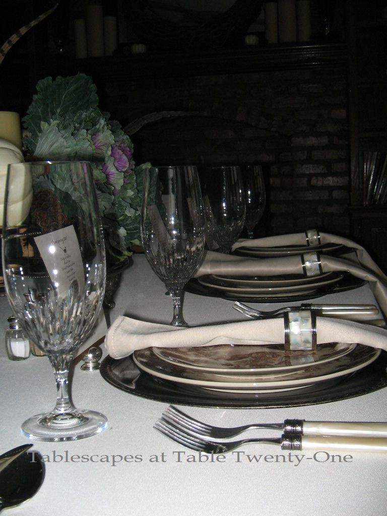
 While black and creamy white may not be a traditional Thanksgiving decor combination, I decided to buck the system and go for it!
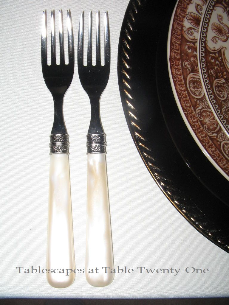
 Inspiration for this black and white tablescape came from my Royal Stafford “Herdsman” dinner plates. The rim is peppered with stems of wheat among the bounty of fruits and flowers. The braided rope rim of the charger imitates the design on the inner circle of the plate.
 The black napkins are folded twice lengthwise then doubled over inside the silver napkin ring. I fanned out the bottom for a fuller look of this simple napkin fold.
 Keeping with the very traditional look of the table – color scheme notwithstanding – I chose Mikasa’s “Jamestown Platinum” stemware. The name “Jamestown” just evokes thoughts of colonial Virginia! (Fun fact: Jamestown celebrated their first Thanksgiving 401 years ago in 1610.)
 Of course, Hampton Silversmith “Patriot” flatware seemed absolutely right for this traditional Thanksgiving tablescape! (Hampton…yet another Virginia city!)
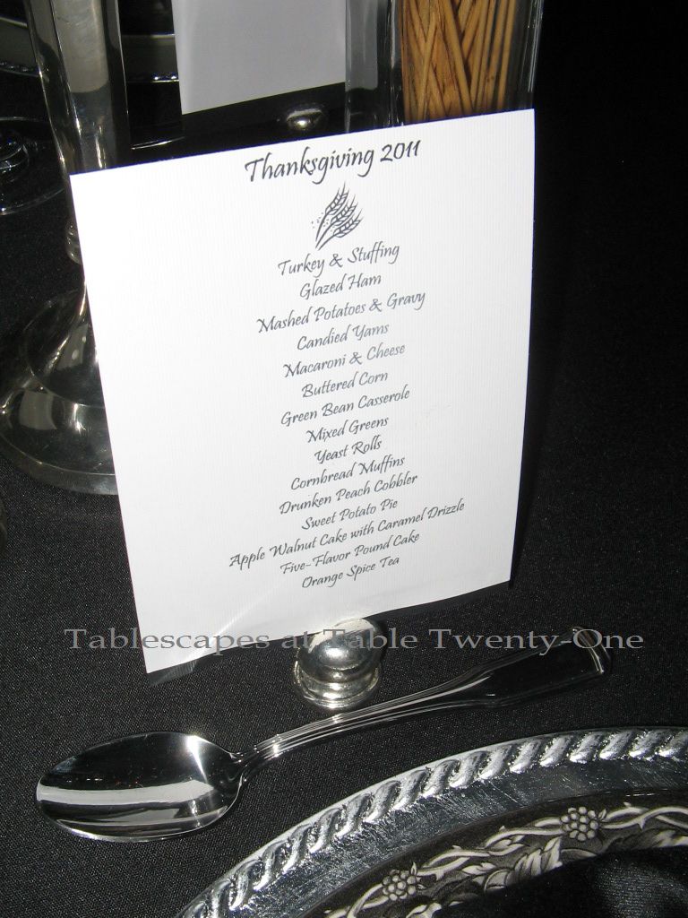 An image of wheat on the menu furthers the theme. (Find recipes for the Drunken Peach Cobbler, Sweet Potato Pie, and Apple-Walnut Cake here or by clicking on “Recipes” tab above.)
 The centerpiece was kept simple with a few silver candlesticks and blackbeard wheat in square vases. The very center of the table was reserved for a silver bread basket filled with cornbread muffins and my sister’s fabulous yeast rolls.
 The buffet piece is a blackbeard wheatsheaf adorned with a simple black bow. No one was more surprised than I that it turned out as nice as it did…and didn’t fall over! 🙂


 The smaller components of the extended centerpiece correspond with the main piece. Iron candlesticks with fat pillar candles are flanked by small rose-filled globes stuffed with reindeer moss to keep a consistent look.