Fairy Tale Wedding Shower – Princess & the Frog

Full disclosure: My granddaughter has zero interest in anything “girly” in nature, so I am left to cater to other people’s fantasies. Oh, well…c’est la vie.

I recently found three pink painted metal dress forms on the clearance shelf at Michael’s marked down 80% from $17.99 to a much more palatable $3.59 each. I had no idea what I was going to do with them, but before I could say “plies and pirouettes”, I found myself making miniature tutus. Me! The grandmother of a child who, after seeing pictures of herself decked out in a feathered number for dance class that made her look like Big Bird, spent a considerable amount of time bulking up and went dressed as The Hulk for Halloween!!!


After several grueling days of cutting and tying tulle and hot gluing my fingers together more than once, I had miraculously created 3 very girly tutus. After adding a healthy dose of rosettes and bling, I decided this could easily pass for a ballet tablescape, brides, bridesmaids, or princess tablescape. Fabulous! So if you’re looking to throw a “Princess & the Frog” or “Frog Prince” or “Black Swan” kind of bridal shower or birthday party, this over-the-top tablescape might be right up your alley! (Seriously, though, if you’re going to throw your best friend a “Black Swan” bridal shower, maybe you should reevaluate your relationship! :-))
(Click on any image to enlarge/enhance.)

I promise the candles aren’t crooked. They just oddly photographed that way!

The tulle used for the tutus is ivory, so I used an ivory full-length linen and napkins. TIP: for real weddings and tablescapes: If the bride is wearing an ivory gown, best to go with ivory linens in the reception space so as to not make the bride’s attire appear dingy. Years of professional wedding plan taught me that little gem!

I’m not a super fan of shiny runners at all, but they just seemed to work here. The blinding pink runners and creamy ivory linens are all from LinenTablecloth.com.


I used 13″ round mirrors purchased a couple of years ago at Hobby Lobby as chargers and “10 Strawberry Street” ivory stoneware from TJ Maxx. Ivory dishes are a nice little addition to your collection as they come in handy when using ivory linens.

You can buy cute lily pads like this from places like Michael’s or Hobby Lobby. Since “diamonds” are a major part of this overall theme (after all, they are a girl’s best friend whether she’s a bride, a princess or a ballerina!), I sprinkled on a handful. I guess they could also pass for water droplets if you want to go that route! The tiny ceramic frogs are from 2011 stock at Hobby Lobby. A demure pink spray rose brings color and yet another layer of texture to the setting.

The flatware is none other than my beloved “Royal Danish” sterling. The napkins are bundled up with a pretty “diamond” napkin ring. I bought these wholesale, but I have seen similar ones at places like Tuesday Morning and Z Gallerie. (Aaahhhh…Z Gallerie! The happiest place on earth!)

The diamond cut in the Cristal d’Arques “Longchamps” stemware is a perfect fit!

The centerpiece is a compilation of pink princesses, silver Revere candlesticks with ivory candles (you need to carry the ivory all the way through!), scads of “diamonds”, and pretty pink roses.

Someday I may do a tutorial of my own on how to create a no-sew tutu, but in the meantime you can click HERE for Julie Figueroa’s very easy step-by-step instruction. It’s basically just tying strips of tulle onto a length of ribbon. Too easy…even for clueless, craft-challenged me! I hot glued silk rosettes to the waistline and sporadically across the skirt itself. Little rhinestones were a pain (literally AND figuratively!) to put on, but the results were worth the half tube of silvadene cream. 🙂 To lend a little height and put these princesses on a pedestal (again, both literally AND figuratively!), I added 6″ silver cake plateaus/stands. (So sorry….I bought the cake stands wholesale several years ago and have no idea where to direct you to buy some this size.) A generous smattering of more “diamonds” runs the length of the centerpiece.

Medium-sized pink roses are nestled into a sea of more of the acrylic “diamonds” that fill a Cristal d’Arques “Longchamps” mini vase.

The final component of the centerpiece is a parade of 11″ silver Revere candlesticks. I used my trusty (ivory) 15″ Paradise metal case candles to avoid any messy drips and reduce the threat of fire that always exists…especially when using something so flammable as tulle! Metal case candles found at stores like Hobby Lobby are usually white, but you can ask your florist to get other colors and sizes for you.

The exalted Frog Prince eyes the bevy of beautiful princesses from his perch on the buffet behind the table. A 12″ silver cake stand in the same pattern as those used to elevate the princesses gives him a little height. A larger lily pad is topped with a lacy ivory ring bearer’s pillow from the Beverly Clark collection. A trail of much heftier diamonds runs the length of the buffet along with clusters of soft pink roses. Notice that the silver candlesticks on the buffet are quite similar in shape (by design) to those used on the dining table to lend continuity. Ivory pillar candles are used to double back ambient light in the mirror.

Maybe someday my granddaughter will decide she wants to be a fairy princess instead of a weird, angry, steroid-enhanced green dude. A grandmother can only hope!

See more pretty pink posts on this site:
Days of Wine & Roses
Peonies & Pearls
Chocolate Traditional
Princess Pink Birthday Dinner
Pink Plaid & Posies
Showered in Pink
Springtime in Paris Mother’s Day Buffet
Mother’s Day Luncheon
Tea Roses
Coming Up Roses
Au Revoir
Blushing Bridal Shower
Peony Power!
Pleasant Under Glass

Come on over and join the party at Cuisine Kathleen’s “Let’s Dish!” anytime after 7:00 p.m. CDT on Wednesday! I’m also joining for the first time “Tutorials, Tips & Tidbits” over at Yvonne’s “Stone Gable” blog. Then be sure to join Susan and a whole bunch of my cool blogger buddies for “Tablescape Thursday” anytime after 9:00 a.m. CDT on Thursday. You’ll be glad you did!

Working Lunch

My husband is giving me “that look.” You know the one: the look that says, “Here we go again! Just shoot me now!” But I swear on a stack of pancakes I am NOT getting back into the wedding business!!! I am simply lending the benefit of my expertise to two three a few couples who have recently asked me for a little jump-start in their planning. And it’s not like I’m planning the entire wedding like I used to. Just the reception decor part. I mean, what’s the harm in that? 🙂

I had a lunch meeting a couple of weeks ago with a lovely couple and Mother-of-the-bride who are planning a May 2013 wedding. We spent nearly an entire day together, grinding our way through the details of their reception decor. I wanted to continue working right through the noon hour, so I set up a casual & fun lunch table that was pretty much in line with their chosen colors…and professions!
(Click on any image to enhance/enlarge it.)

Thanks to the sweltering heat (stick a fork in me…am I done yet??!?!!), we were relegated to the basement level of our home for the marathon meeting. We worked on the soft seating/big screen TV side of the room for most of the day, but lunch was set up in a little out-of-the-way corner on a marble top table.

Both the groom and the Mother-of-the-bride are elementary school teachers, so I thought it would be fun to use these lunch trays to make them feel right at home. (And to remind them that they’ll be right back in there with those screamin’ little demons in less than a month! :-)) I got an “A” for effort on that one!

I have been holding onto these really cool lunch boxes from Kirkland’s for another upcoming project, but the couple’s colors are turquoise, orange and white. How could I resist? Another “A” for effort!

I set it up so that we could just take the food from our lunch box and put it on our plate when ready to eat.

The chocolate and white luncheon-sized melamine plates (Target 2010) have just a touch of muted orange and turquoise in the simple design. I couldn’t believe how the plate colors nearly spot on matched those of the fun retro design lunch box!!! (The lunch box design reminds me of “Rowan & Martin’s Laugh-In“. If you’re old enough to remember that show, take a little break and go fix yourself – and me! – a Metamucil cocktail with a Geritol chaser! ;-)) Fun white flatware from TJ Maxx lightens the look and stands out nicely against the deep color of the lunch tray. A bottle of refreshing Sioux City orange cream soda looks great with the setting and tastes great goin’ down…like a creamsicle!!!

Lunch was a quick and easy one: a piquant Southern fried chicken sandwich, a parchment paper cone filled with crispy thin Lay’s potato chips, and little Ziploc baggies of celery and carrot sticks. Just like in grade school…but without the stinky kid with the perpetually runny nose wanting to sit next to you! 🙂 I put a little ice pack in the bottom of each lunch box to keep the contents cold until time to eat.


The little wine table beneath the small screen TV was perfect for setting up munchies and dessert. (Yes….sadly, we have two televisions in the basement. My husband has grand delusions of this being a TGIFriday’s!)

We finally called it a day around 4:20. Sheesh….7 grueling hours of decision making!!! But guess what? The decor side of the wedding is now all but set in stone, and we won’t have to meet again until early April to finalize everything. Hallelujah! I love it when things work out like that!!! I hope you’ll check back next May to see the fruits of our labor!

Oh…I forgot the other thing: I got a glowing report card of straight A’s on my tablescape!!! 🙂 It would work really well for any kind of meeting including a teachers’ back to school planning session. This lunch and learn tablescape would also be something fun and different for a teen study group!

I’m linking up on Wednesday night with Cuisine Kathleen for Let’s Dish! and on Thursday morning with Susan for Tablescape Thursday over at Between Naps on the Porch. You can also find me at BeBetsy.com. I hope you’ll join us!

Diwali My Way

The extent to which I am familiar with Indian culture is that which I’ve seen in movies like “Bend It Like Beckham”. Last year, though, I found a blog called Rainbow – The Colours of India hosted by my blogger buddy Sanghamitra Bhattacherjee (Mukherjee). Sanghamitra is an avid traveler and photographer who captures some of the most beautiful images I’ve ever seen. She has become my personal version of National Geographic. 🙂 I’m in awe of people who can just pack a suitcase and hit the road (or skies, or water) without reservation or hesitation. I’m the consummate homebody, so I live vicariously through those brave, happy-go-lucky souls.

Sanghamitra’s photos of the bright colors of India, along with her posts last Fall on Diwali (popularly known as the “festival of lights“), inspired me to try my hand at a table that celebrates the festival which generally begins in October/November. This Diwali-inspired tablescape is by no means “traditional” or “authentic”, but it is my attempt to capture the colors, smells, tastes and feel of a country I admire but will never see in person. I think it fits right in with Cuisine Kathleen’s “Destination Challenge” this week!
(Click on any image to enhance/enlarge it.)

An abundance of rich, bright colors starts with the hot pink overlay.


Each place setting begins with a gold-leafed glass charger. The amber glass dinner plates are from Pier 1, and the 222 Fifth “Ornamental Scroll” salad plates were a Home Goods find a couple of years ago.

Sheer gold napkins from Pier 1 are cinched with tiny child-size bangles purchased at a local market called Namaste India. It’s a fun place to shop with lots of different foods, clothing, jewelry and other items unique to the Indian culture.

Shiny gold flatware works well against the brilliant colors.

A combination of opulent glassware includes gold-embellished tumblers that I bought at TJ Maxx in several different base colors (purple, red, turquoise) including the green pictured here. The purple gold-rimmed wine glasses were a Pier 1 find many years ago, and the leggy amber flute is from World Market. I love every opportunity to mix and match glassware!

The centerpiece that extends the length of the table is a mix of various components. Hot pink rose balls sit center stage atop a gold vase. Flanking the vases are graceful red gem-studded gold Buddhas that I found at Jo-Ann Fabric & Craft store a couple of years ago. Multi-colored glass votive holders dot the rich swath of red & gold silk fabric placed diagonally and allowed to puddle onto the floor for dramatic effect.

The buffet behind the table boasts colors that complement in the flowers, candles and other details.

Spices commonly used in Indian cooking are as beautiful as they are tasty. Coriander, cumin, curry, fennel, ginger, mustard seed, paprika and turmeric are just a few of the wonderfully fragrant spices that add zesty flavor.

Cinnamon, star anise, and fragrant bay leaf are other popular spices used in Indian cooking that produce a special flavor. Finish off the evening with a fabulous libation made with blue curacao liqueur.

I carried the hot pink color to the buffet via a small arrangement of peonies and a more imposing bouquet of calla lilies in a brass vase from India.

Other Asian-inspired posts on this site:
Mandarin Bling
Copper Zen
Peaceful Peonies
Year of the Rabbit
Zen Garden
Mikasa Daylight Giveaway

I enjoyed my week off and got a lot done, but I’m glad to be back with all of you in Blogland! Please join me at Cuisine Kathleen’s for “Let’s Dish!” and at Susan’s place for Tablescape Thursday again this week!

Time Out!

I am taking a brief, but much-needed, blogging break. My house looks like a remnant camp of Occupy America, I’ve not been to the salon in weeks so my eyebrows look like Abe Vigoda and Andy Rooney had a baby, my husband now refers to me as “What’s-Her-Name Who Used to Take Care of Me“….it’s all just a big ol’ hot mess around here!!! And just keeping it real, folks, I need some plain old R&R! 🙂

I am so grateful for each and every visit, and I hope you’ll hang in there with me. I’ll be back next week (or possibly the next…depends on if my stylist has to send out for more wax to tackle these caterpillar eyebrows!) stronger than ever. Meanwhile, especially if you’re a first-time visitor, please take a look around and see if there’s anything you like!

Have a glorious week (or two!), and I’ll see you on the flip side! 🙂

Summer Orange Tablescape

If you’re lucky enough to live in an area where the mid-summer heat and humidity doesn’t rob you of all your energy and drench you from head to toe, this saucy orange tablescape might work well for your next casual dinner party. As for me, I’m campin’ out in the big produce cooler at Costco! 😉
(Click on any image to enhance/enlarge it!)

If your outdoor tables are unsightly like ours (average Joe folding tables), just add a full-length linen to cover up the scene of the crime. It masks the ugly and adds a touch of class a la Carolyne Roehm! LinenTablecloth.com is a good place to start your search for linens that fully cover all sizes in white, ivory or black. (Their customer service re: returns/exchanges is not the best from my experience, so choose carefully!)

I skipped chargers this go round. Instead, each place is set with just an orange dinner plate with a meandering white floral design and a salad plate with a reversed color palette. These melamine plates from Target’s 2010 summer collection are just one of so many great patterns available these days at very affordable prices.

The sheer simplicity of Hampton Silversmiths’ “Patriot” flatware works well with so many settings!

Simple clear glass stemware from Old Time Pottery is both inexpensive and functional, and the austere design won’t clash with even the busiest dinnerware pattern.

There are so many great reasons to opt for a long Tuscan-style table for your entertaining needs. Many tend to think that round tables allow for conversation with more guests, but that’s not necessarily the case. If you measure the distance between 6 guests seated at a 72″ round table and compare it to that of 6 guests seated at an 72″ oblong, you’ll see what I mean! The decorating possibilities are extended, too, both literally and figuratively because you can create wonderfully lush centerpieces in the spirit of fabled King Arthur’s era!!!

I used a number of elements to fill out the center of this table. The central component that lends height and allows for candlelight at an elevated level is a pair of white metal hurricane lanterns from Z Gallerie. Flanking 2 sides of each lantern are pots of grass that add both color and texture to the tablescape. Note that the votive holders used are the same shape of the cylinder in the hurricane. Similarly shaped decorative pieces create a subtle sense of order and uniformity.

Whenever possible, I like to place multiple small floral arrangements across the table. Grouping some and leaving some as singles adds visual interest and forms a kind of “link” between elements down the entire length. Here clusters of inexpensive white alstroemeria are displayed in fun pear-shaped orange ceramic vases from Old Time Pottery.

When we dine in the yard, I like to create an outdoor lounge area for guests to chill out before and after the meal. Here I arranged our wrought iron set much as you would in a living room with silk pillows and a “sofa table” (actually just an ugly old 4′ folding table from the garage!) behind the settee. (Cushions are MIA due to a sudden hailstorm of bird poo that had to be vigorously scrubbed off! :-()

The sofa table is covered with a full-length white linen to better show off the orange accessories on top including an actual lamp brought out from our dining room. (Just run the cord to the nearest outdoor outlet! No outlet? Consider creating a cordless lamp using a shade on a glass vase with a battery-operated candle or uplight as seen HERE.) Use a “bug light” rather than a white bulb. It will not only ward off pesky insects, but the amber shade is very flattering and adds to the ambience! Cocktails – in this case, fuzzy navels made with peach schnapps, a splash of triple sec, and fresh-squeezed orange juice – are served from the table.

I’ll be really glad when I can fold up my tent and vacate the Costco produce cooler. Meanwhile, I hope you’re finding a way to stay cool and enjoy your outdoor entertaining!

Other summery tablescapes on this site using orange to jazz it up:
Orange You Glad You Came to Dinner?
Mandarin Bling
Oranges & Blossoms
Raining Orchids
Hot Tropical

I’m pleased to once again join Cuisine Kathleen for Let’s Dish! starting Wednesday anytime after 6:00 CDT and Susan for “Tablescape Thursday” starting anytime after 9:00 a.m. on Thursday.

Flamingos in Paradise

If the thermometer on my car is right, it is currently 96 degrees outside. I’d say summer is h-e-r-e!!!

While living in the great Midwest doesn’t afford much of a true beach experience, we can always dream! This poppin’ pink tropical tablescape for 10 is great for a gathering of friends celebrating any casual summer occasion. I know my good friend/cake stylist, Patrick “the-Flamingo-Lover” Snuffer, would never leave!
(Click on any image to enhance/enlarge it.)

I used two 6-ft. oblong tables pushed together horizontally to create an “almost square.” This shape provides more decorating space in the center with room left over if necessary for bread baskets, wine carafes, condiments and such.

A canvas of crisp white linen allows all the brilliant tropical colors to shine. Hot pink Bormioli Rocca “Inca” glass chargers recently purchased for a song at Gordman’s anchor the place settings. I blogged about it (here), and the pricing on these chargers was so hot that my friend Cherry Kay from Entertaining Women could barely finish her dinner before scooting out the door to snatch some up. I imagined us in that “Run, Forrest! Run!!!!” scene with me cheering her on! 🙂

The melamine dinner plate is a fun and inexpensive 2012 purchase from Old Time Pottery costing just $2.49 apiece. The napkins are actually bandanas purchased at Hobby Lobby. At just $.99 each, you don’t freak out so much about teriyaki sauce stains!

I used faux bamboo flatware from JC Penny Outlet to keep the tropical theme going.

This gorgeous and substantially-weighted turquoise blue stemware from Pier 1 is a perfect match to the cool blues in the dinner plate.

Clear glass cylinders are the workhorse of my centerpiece inventory. You can find them at places like Old Time Pottery, Michael’s, Hobby Lobby and Home Goods. Here a mix of high, medium and low cylinders displays some of the hundreds of seashells gathered or received as gifts over the years. Chalky white starfish from Z Gallerie sit atop the cylinders to add a little more height and form.

The cylinders are flanked by jaunty pink flamingos from Hobby Lobby wading in a sea of still more shells that run the length of the table. I used to confuse flamingos and storks…and then baby made three, and it became crystal clear which was which! 🙂

Snippets of hot pink and cream-colored plumeria are tucked here and there among the shells along with clear cylindrical votives. Even more color and texture is introduced by way of deep green hostas and tropical-looking ferns pillaged from our yard.

These brightly colored paper parasols from Hobby Lobby get a real workout at our house! I like to casually plunk them down around the perimeter of the deck to add color and a little bit of a “Wow!” factor. They’re cheaper and less back-breaking than bringing in a bunch of potted palms. Here they’re kind of like umbrellas in the sand at the beach!

A small oblong drink and hors d’oeuvres table is set up at one end of the deck, flanked by still more of the pretty paper parasols. Another, resting atop another glass cylinder, shades the food & drink from the unforgiving glare of the early evening sun. Tiny parasols garnish each glass.

These oh-so-fun-and-fabulous ceramic flamingo appetizer/salad/dessert plates are making their debut here serving up delicious crab cakes, but look for them again soon taking center stage in another tropical-themed post. My dear blog friend, Mona, sent them to me last summer when I was feeling very blue. Their arrival on my doorstep gave me a surge of energy to the nth power!!! Thank you, sweet Mona!!!♥♥♥

And this, dear friends, is what goes into the creation of a fun, colorful, casual beach/tropical-themed tablescape!

Other posts with a tropical theme on this site:
“Hot Tropical”
“Tropicana”
“Oranges & Blossoms”
“Old Navy Seafood Cruise”

Other posts using paper parasols on this site:
“Daisy Crazy”
 “Oopsy Daisy!”

I will join Cuisine Kathleen for her 14th “Let’s Dish!” this week. Be sure to tune in anytime after 6:00 p.m. CDT on Wednesday. This week is her “At the Beach” tablescape challenge, so it will be lots of fun! C’mon and go surfin’ safari with us! Looking for great centerpiece ideas? Join me at the Style Sisters’ blog for “Centerpiece Wednesday“. I’ll also join Susan at Between Naps on the Porch for “Tablescape Thursday“, available anytime after 9:00 a.m. CDT on Thursday. Come on over! And check me out on BeBetsy.com!

Hot Tropical Tablescape

It reached a hot, humid 93 degrees yesterday in the Kansas City area. 93!!!! June JUST started!!! It feels like we’re in the tropics, but there are no banana trees, beach huts, or hot, shirtless cabana boys bringing me frosty cold fruit drinks with little umbrellas. Where’s the justice???!?!?!?

Since it’s feeling like the Seychelles outside, might as well enjoy a summertime meal with a casual, colorful tropical tablescape full of hot color! (But again, I have to ask….where are the hot cabana boys??!?!?!!)
(Click on any image to enhance/enlarge it.) 

One of the most striking colors around for a tropical tablescape is sexy, sultry, steamy hot pink! A lap-length plain linen is finished off with a rush of color and pattern with this monstera leaf/bird of paradise/hot pink plumeria-laden fabric from Jo-Ann Fabric & Craft Stores.

Place settings here are kept simple with clean lines that don’t duke it out with the linen. Hot pink melamine dinner plates (also used here) rimmed with a bit of orange are complemented with faux bamboo flatware. No salad plate is present even though a coconut laced fruit salad is on the menu. When dining outside in summer, consider chilling your salad plates or bowls to keep the contents crisper and cooler longer. Also consider presenting the salad fork to each guest in a bowl of ice (shown here or here, Tip #3). It looks cool, makes a grand presentation, and the cool fork won’t wilt your salad greens! (For a tropical setting like this, consider presenting the salad fork in a half shell coconut filled with ice and decorated with a tropical bloom!)

A small orange glass vase from Hobby Lobby is filled with plumeria blooms and placed in the center of each plate. The fabric topper features images of plumeria, lilies, and bird of paradise, so any of those (or a combination!) works well.

 A black poly-cotton napkin from Bed Bath & Beyond is tucked into simple clear glass stemware. (There actually is a bird of paradise napkin fold that  – if you have the patience & skill to create it – would look great if you wanted to place the napkin on the plate.)

The centerpiece used here is one of my favorite parts of the tablescape with its dramatic size, bold color, and asymmetrical design. I have used this oversized ginger jar from Home Goods for a couple of different Oriental tablescapes in the past. It is equally at home here decked with highly textural painted orange bamboo. I decided to place a few of the bamboo sticks in a perpendicular fashion to balance the width with the height of the centerpiece and lend fun modern flair.

A trio of black iron candlesticks outfitted with sleek black tapers is placed on each side of the centerpiece to further extend the length of the centerpiece on the 6-ft. table. Using black tapers rather than pink or orange keeps a sleek, continuous line going.

It’s always a good idea to dress serving tables to complement – although they needn’t necessarily match – the dining table. Here I used a full-length hot pink linen on a round table to serve icy cold “adult beverages” with tropical flair. Notice the plumeria cascading from the fruit bowl to draw from the tiny bouquets at each guest setting.

That’s it for this week! Go slip into a sassy little sarong (or a thong if you can still rock that! ;-)), get something fruity fresh going in the blender, and stay cool! (If you find those cabana boys, though, you have my permission to go from cool & collected to all hot & bothered!!! Can I get an amen? ;-))

Visit more summertime tablescapes on this site by clicking on the “Summer tab and on these individual posts:
Lemonade From Bill
Under a Paper Moon
Tropicana
Oopsy Daisy
Purple & Pastel
Give Peace A Chance Retro Tablescape
“Old Navy Seafood Cruise”

I’m joining Cuisine Kathleen this week for “Let’s Dish!” (anytime after 6:00 p.m. Central Time on Wednesday) and Susan at Between Naps on the Porch for “Tablescape Thursday” (anytime after 9:00 a.m. on Thursday).

Chargers Priced Right!!!

I want to share this with anyone looking for nice glass chargers at a bargain basement price this late Spring/early Summer!!! I found these Bormioli Rocco Inca chargers at Gordman’s in the Greater Kansas City area this past weekend. I looked at their location map, and the stores seem to be concentrated in the upper & lower Midwest. There are stores going as far South as Tennessee, Kentucky, and Mississippi. They also run to the west as far as Colorado, Utah, and Idaho. If there’s a Gordman’s in your area, get your hips over there as fast as you can move to scoop these up! Here’s why:

Apparently some unknown entity sells them for $12 (I’ve seen them online for as little as $9.99 at Bed, Bath & Beyond, $11 on Amazon.com, and at Bloomingdale’s for $11.99), but Gordman’s regular price is $7.99. Still too much as far as I’m concerned.

Some had been marked down to just $4 which is more within my budget.

Still others had been marked all the way down to $2. Even more palatable. But wait!!!

They are ALL marked an additional 33% off the lowest marked price!!! That means those marked $2 are now just $1.34 each! Those marked $4 are just $2.68, which is still one heck of a bargain for a Bormioli Rocco glass charger!

I only bought four, but they come in six vibrant colors: purple ($2), hot pink ($4), turquoise ($4), orange ($2), red ($4), and yellow-green ($2). (Sorry…the yellow-green ones DON’T work well with the green Dollar Tree goblets we all know and love. I took one with me to look for a possible color match, and no go! 😦 )

So what are you doing still looking at this post??!??!?!!! Hustle your little legs on down to the nearest Gordman’s now!!!!!!!
(For those of you in the Greater Kansas City area, there are 4 locations on the Missouri side and 1 on the Kansas side at 95th & Quivira which seemed to have the best selection.)

I’m linking up this week with Cuisine Kathleen’s “Let’s Dish!” I’m pretty sure this qualifies as it is one heck of a bargain on something from the dish family!!! 🙂

Give Peace a Chance – Retro Tablescape

With the recent passing of the Bee Gees’ Robin Gibb and iconic disco queen Donna Summer, I find myself in a retro sort of mood. I have been listening to a lot of music from the 60s and 70s the past few weeks. I have a whole “British Invasion” playlist on my iPod that includes a lot of Beatles music. John Lennon’s “Give Peace a Chance” somehow played twice in a row, and I took it as a sign (a peace sign?) that I should pay homage to the era. So tuck a flower in your hair, put on your mood ring, slip into your bell bottoms, and get ready for a hip and very colorful retro tablescape!!!
(Click on any image to enhance/enlarge it.)

The day was a breezy one, so it was a challenge to keep everything on the table! The hot pink table linen kept going all Marilyn Monroe-on-the-subway-grate-in-the-“Seven Year Itch” on me!!! 😉

IMG_6218WM

I drew on all the bright, mind-bending colors of the 1960s including hot pink, yellow, and a range of blues. Each psychedelic place setting starts with a yellow woven placemat, slightly overlapped with an aqua one, both from Bed Bath & Beyond. Hot pink ruffled chargers from Crate & Barrel are then topped with an aqua blue plastic dinner plate and a funky fun tie-dye “peace” salad plate from Hobby Lobby.(Have your corneas burned out yet? :-))

Bright hot pink flatware from TJ Maxx is positioned to resemble a peace sign. The color really resonates against the aqua blue of the placemat! Right on!!!

IMG_6214WM

IMG_6224WMYou might think I’m totally zonked and trippin’ to imagine this, but I actually thought that this so-called “bunny ears napkin fold” looked a lot like a peace sign! Work with me, people! Look at the hot pink napkins folded and secured with a Bed Bath & Beyond daisy napkin ring (to soothe your inner flower child!) and tucked into the simple clear glass stemware. Tell me that doesn’t look like the fun resin peace sign here from Home Decorators Collection!!!

IMG_6222WMThere’s a lot of 1960s flower power going on here! This groovy chick was so much fun to create using a simple Styrofoam head and inexpensive faux Gerbera daisies from Hobby Lobby. I just clipped the daisies from the cluster, leaving a 2-inch stem that I simply stuck into the head to create a full 1960s “afro.” She, of course, is decked out with her soulful shades. (Make the floral hair a bit longer on the sides and in the back, and you’ve created a Beatle-esque “mop top“!)

IMG_6239WMI created the look of the mega-sized hoop earrings of the era using floral wire spray painted gold and formed into a circle around a coffee can.

More flower power with this vase of oversized faux Gerbera daisies!

Sources: hpvf.com (Goldie Hawn); hippiefan.com (Janis Joplin); wikipedia.com (Beatles); zazzle.com (Sock It To Me button); wikipedia.com (Supremes); rollingstone.com (Jimi Hendrix); urbanmodernista.com (lava lamps); technorati.com (John Lennon)

Can you dig it? Did I blow your mind?
This setting would be great to celebrate the birthday party of someone born in the 60s or turning 60!

Jet on over with me to Susan’s crib anytime after 9:00 Central Time this Thursday to let it all hang out with some other really far out chicks & dudes for Tablescape Thursday.  It’ll be a gas, man!

Have a nice day! 🙂
(Post update: Tablescape Thursday has been cancelled for this week due to technical difficulties in the hostess’s change over from Blogger to Word Press. Please join us all next week for Tablescape Thursday!)

Peachy Keen Breakfast Tablescape

A great big hello and welcome to all my new followers, and a huge welcome back to those of you who have been following for awhile! I always appreciate your visit!

I had tulips leftover from the Mother’s Day tablescape for my Mom last week, so I thought I’d bring you a look at those arranged in a completely different way in a casual breakfast/brunch setting.
(Click any image to enhance/enlarge it.)

I found this beautiful peach-colored full-length table linen at LinenTablecloth.com. I felt its soft color to be fresh and invigorating, yet soothing enough for a breakfast ensemble. I have also used it to dress a wedding cake table, flaring it at the bottom for a totally different look. (Click HERE to see that look.)

Tablescapes at Table Twenty-One - Peachy Keen Breakfast

Peachy Keen Breakfast

I was bowled over by this 222 Fifth “Indochine” floral dinnerware from TJ Maxx. It looks great for a Spring or Summer table thanks to the capricious design in shades of orange, peach, green and blue on a stark white background. The salad-size plate is fully covered, while the dinner-size plate restricts pattern to the rim. The colors on the table are toned down by the use of a plain white hemstitch napkin.

IMG_6071WM
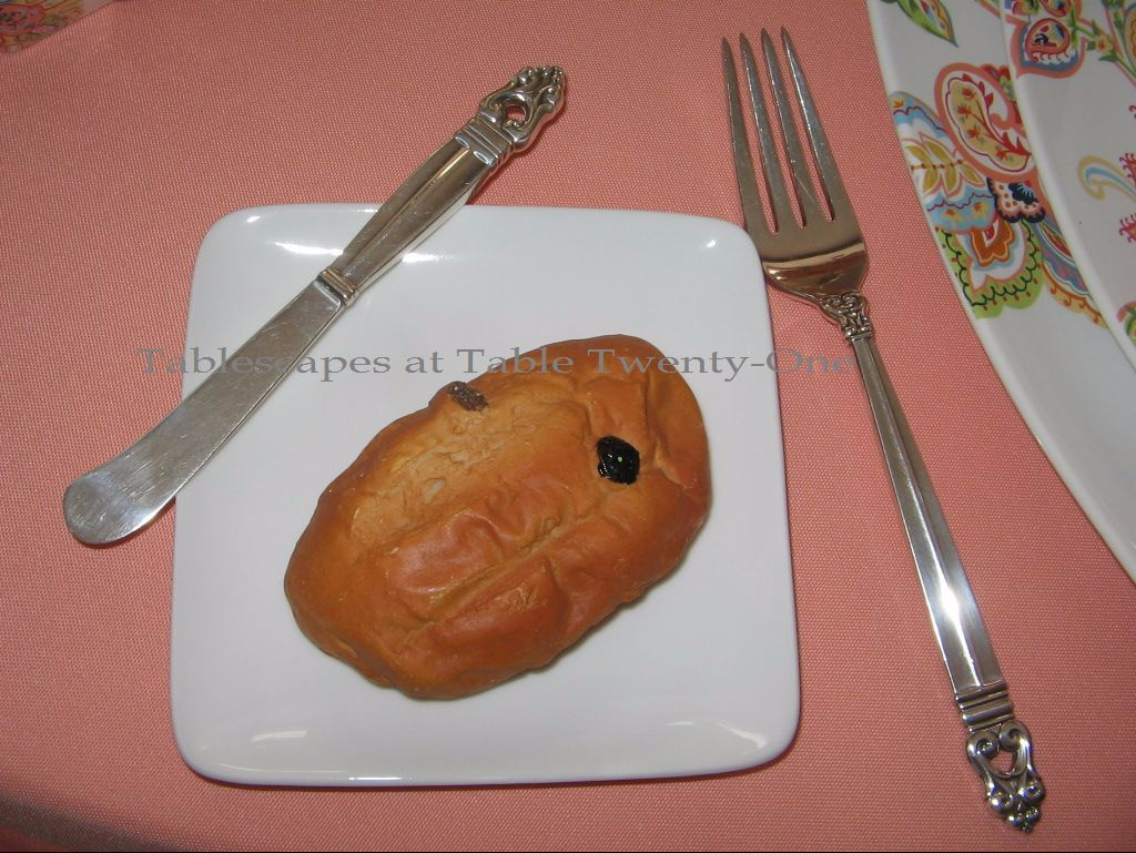
I like to use a bread plate whenever possible, even at breakfast. If you’re like me and don’t like bread made soggy by runaway sauces or gravy, opt for something like this plain white appetizer plate from Crate & Barrel. Notice that I used a square appetizer plate to complement the shape of the other dishes on the table.

I love the squared off look of these coffee mugs! So cool!!! Plain clear glass stemware for a healthy serving of juice or water is added to the setting. If you have squared glasses (I’ve seen them around but haven’t bought any yet), go for it!!! That would be even cooler!

I used my “Royal Danish” sterling silver because the shape of the tip end mimics the scrolled pattern of the dishes.

A plain white pot from Home Goods serves up steaming hot coffee or tea in style.

Plump white bird salt & pepper shakers from Pier 1 work well with the other white elements on the table.

When in need and flat broke, improvise!!! I didn’t have a jelly server for the orange marmalade that looked good, so I fashioned one out of a white ramekin from Pier 1.

This is what I was trying to get those crazy tulips to do last week for my Mother’s Day table!!!! They look just like the ones on the salad plate! I just love when tulips open wide and flail themselves outward with total abandon, but nothing I did would coax them into it last week!!! Oh, well…better late than never!

IMG_6151WMBreakfast – at my house anyway 🙂 – is not complete without a Bellini bar!

Other posts on this site using shades of orange or peach:
Mandarin Bling
Oranges & Blossoms” (1st post on page)

Orange You Glad You Came to Dinner” (scroll to 6th post on page)
Raining Orchids
Tulips in the iHop Hour
Flirty Peach Skirt

I’m linking up with Cuisine Kathleen again on Wednesday this week for “Let’s Dish!” starting at 6:00 p.m. Central Time. Stop on by and see what’s going on!