I love getting together at home with friends! If time and money would allow me to do it twice a week, I would. There’s just something about the relaxed atmosphere before, during and after that generates warm, happy feelings.

 My friend Andre Harper, owner of Harper’s Catering which specializes in Cajun cuisine, slaved over a hot stove to create a massive sized pot of some of the best gumbo I’ve ever tasted. Puttering around in the kitchen in a dual effort to make garlic-cheese drop biscuits, sipping cocktails, and doing a little pre-dinner munching on the wonderful seafood dip Andre made is a great way to spend a Friday evening. (The biscuits were a huge hit with all the guests and a tasty and unexpected departure from traditionally-served French bread.)
 When we finally sat down to the dinner table, spirits were high and appetites were mighty as we all dug in.
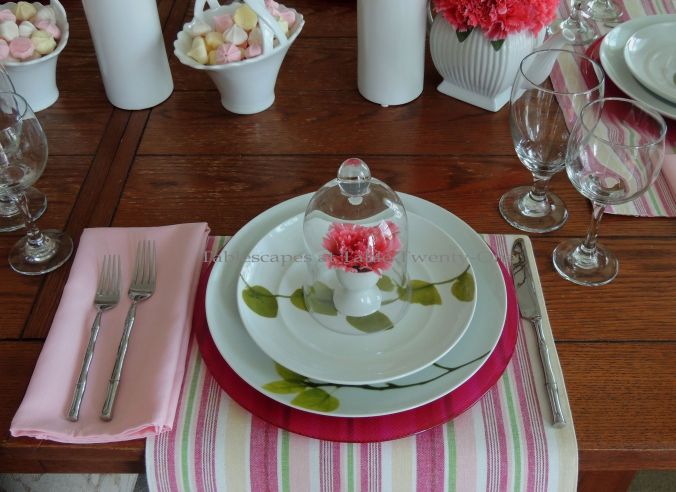
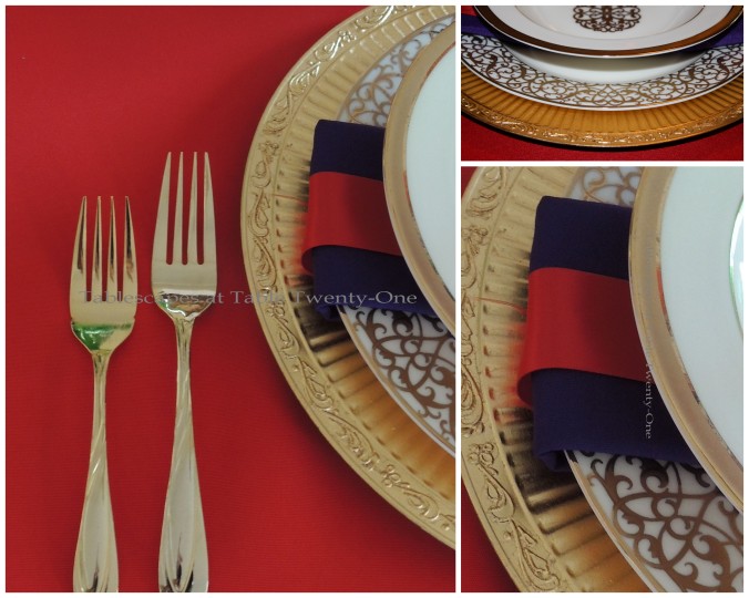
Even for casual get-togethers like this one, I still like to let friends know I care enough about them to set a pretty table. A thoughtful mix of relaxed and formal elements draws the eye to the tablescape’s place settings. Here I start with a “Natural Flower” water hyacinth round placemat from Pier 1. The rough hewn texture of these placemats is just as important as the style in creating the desired look. Next comes American Atelier’s creamy off-white “Empress” chargers and soup bowls topped with chocolate brown oak leaf-shaped salad bowls from Pier 1. Classic Cristal D’Arques Longchamps glassware and Hampton Silversmiths “Patriot” flatware add a bit of glam, and a sunny yellow napkin from Bed, Bath & Beyond add a much needed punch of unexpected color.

The buffet behind the dining table is enlivened with the shocking orange of a wooden platter from Z Gallerie. A small floral using similar flowers to those on the table softens the look. The end of the dining table is used for service with the gumbo in a sleek pale yellow tureen from Pottery Barn.

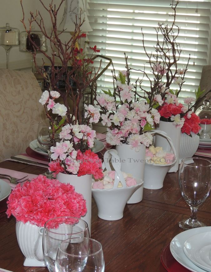
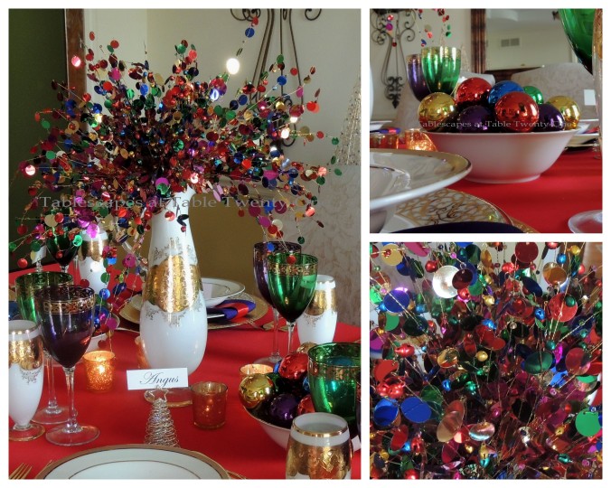
The centerpiece is a trail of dark iron candlesticks and brightly colored sunflowers, spider mums and carnations (pink, just to mix things up a bit!) from Costco in Longchamps mini vases. (TIP: Buy a single bunch of flowers and divide them up into small vases for a plentiful look on the cheap!) The total look: upscale with a casual kick.
Andre and I have collaborated on other events, most notably in the Spring of 2012. Visit Purple and Pastel, a dinner party in honor of his parents’ birthdays and 60th wedding anniversary!!!