I’m taking a break from the buffet tables I have shared the last couple of weeks to bring you something a little different. I have a goofy rule about not buying anything unless I can think of at least 5 ways to use it in under 30 seconds. Sometimes that’s a real challenge. Other times, however, the ideas just flow.
I recently conducted an exercise in my “Art of Tablescaping” class that engaged the students in looking at a centerpiece item and brainstorming about all the different ways it could be used. The genesis of these two tablescapes is that exercise, along with napkins & matching placemats I bought year-before-last at Burlington. The white flowers remind me of Fuji mums, and the gentle nature of the design makes me think of a quiet Japanese garden. I figured I could bring out a little or a lot of that Asian feel depending on the additional elements used, but that both looks would work well for a Spring tablescape.
 I remember sitting in the aisle with the napkin on my head (the inspiration seems to come quicker for me that way!) with possibilities shooting out from every which way. (And yes, I often sit there for long periods of time making purchase decisions that have more to do with “How much trouble will I be in for spending this money?” as opposed to “How many ways can I use it?” Don’t judge me! ;-))
What you’ll see here are side-by-side comparisons of how switching just a couple of elements can change the whole look and feel of a tablescape. See if you can spot the subtle differences. “Mum’s the Word” on the left would be great for any “business casual” get-together, and “Zen Garden” on the right would work well when serving something fun like sushi or takeout Chinese food.
(Click to enlarge any photo.)


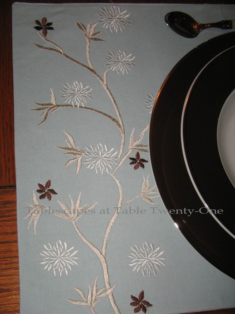
 Besides the robin’s egg blue placemats and napkins, both place settings utilize Z Gallerie’s “Delfina” china with its glossy white center, chocolate brown rim, and sophisticated silver edging.
 Making the napkin look a little different is as easy as changing the napkin ring. The napkin on the left has a silver-rimmed faux mother of pearl ring (I bought them at Old Time Pottery, but Z Gallerie has them, too), while the ring on the right is a natural rattan (Pier 1).
 The setting on the left uses clear glass everyday glassware from Old Time Pottery. The setting on the left replaces the all-American stemware with a simple white sake cup from World Market.
 The flatware on the left with faux mother of pearl handles is distinctively different from the stainless bamboo on the right which evokes a more deliberate Asian feel. (Both from Target.)

 The elements of the unusual centerpiece remain the same for both tablescapes. A stripped natural manzanita branch from TJ Maxx (yeah, that’s right, TJ Maxx…who’d have thought?!??!) mimics both the color and curves of the branch on the placemat. Soothing white Fuji mums in clear glass Hobby Lobby cylinders stand alongside silver Revere candlesticks with chocolate brown candles. (Note: Fuji mums will last for a couple of weeks if you cut the stem on the diagonal, change the water every couple of days, and maintain a comfortable room temperature.)

The overall look of the buffet is altered by the simple addition of extra elements that steer away from the more austere look of simple candles and florals as pictured on the left.

 The simple white World Market sake set and teapot (T.J. Maxx) definitely lend Asian influence.
 The melodic sounds from soothing Japanese chimes can be used to gently alert your guests that a feast awaits.
Subtle differences can make a world of difference!
Other posts on this site with an Asian feel:
“Mandarin Bling“
“Copper Zen“
“Year of the Rabbit“
“Peaceful Peonies“
“Mikasa Daylight” (Design #2)
I am joining Susan and many other talented tablescapers from out there in the world for Tablescape Thursday again this week. Also hooking up with The Style Sisters for Centerpiece Wednesday. Hope to see you there!


 I used an adjustable height bust form from my dressing room as the foundation for the centerpiece.


