Celebrate Mardi Gras!

INSPIRATION: Colorful miniature masks found on clearance after Christmas at Pier 1

INSPIRATION: Colorful miniature masks found on clearance after Christmas at Pier 1

If you’re looking for some last-minute Mardi Gras inspiration, you’ve landed at the right spot!
(Click on any photo, then click again to enlarge/enhance it.)

Tablescapes at Table Twenty-One, www.tabletwentyone.wordpress.com: Celebrate Mardi Gras! - Full dining room

Tablescapes at Table Twenty-One, www.tabletwentyone.wordpress.com: Celebrate Mardi Gras! - Place settings

Tablescapes at Table Twenty-One, www.tabletwentyone.wordpress.com: Celebrate Mardi Gras! - LinenTablecloth.com gold crinkle tablecloth detailing
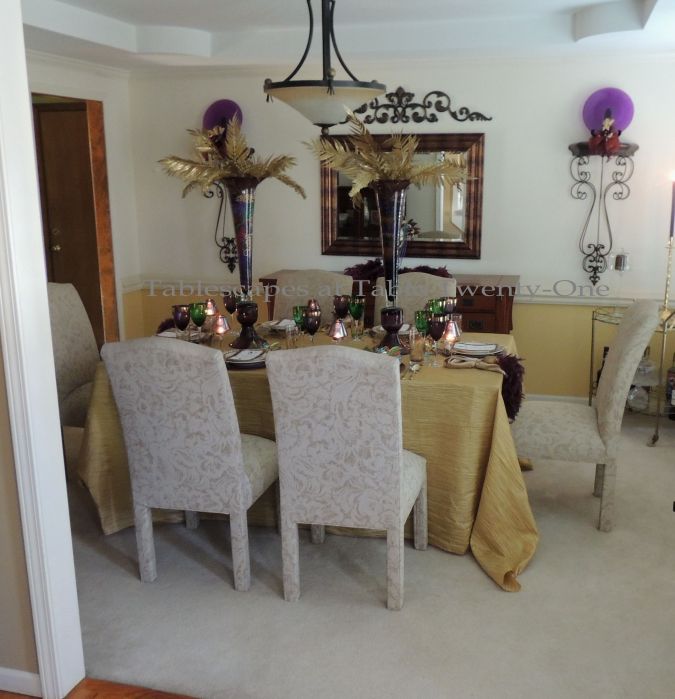
I’m all for fun where Mardi Gras is concerned, but we tend to go a little more upscale in the decor for certain friends & family…and you know who you are! 😉 This gold crinkle taffeta tablecloth from YourChairCovers.com serves as a beautiful foundation. The crinkles remind me of ruching on some bridal gowns. Very elegant AND no iron! Gotta love it! If you want to go for a posh Harlequin look, I suggest the eggplant (purple) pintuck from LinenTablecloth.com. You can’t go wrong either way!

Tablescapes at Table Twenty-One, www.tabletwentyone.wordpress.com: Celebrate Mardi Gras! - Place setting
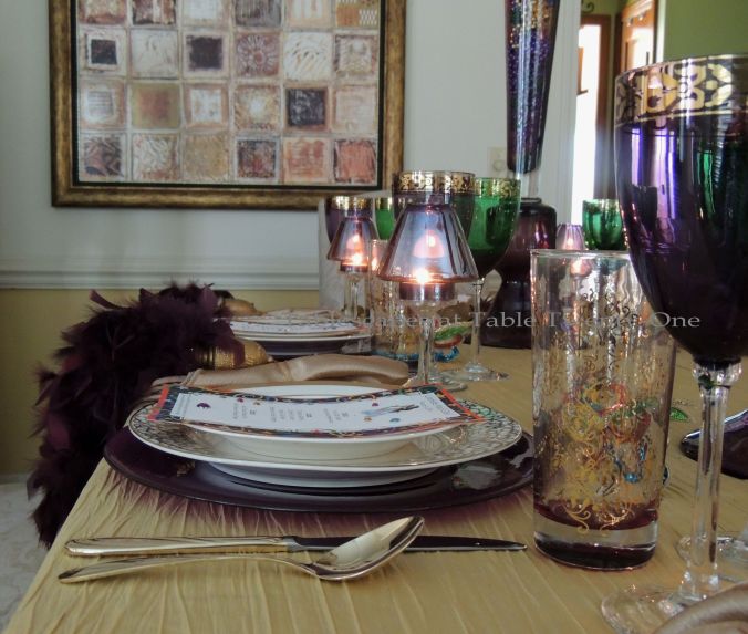
The royal purple Bormioli Rocco “Inca” glass charger anchors the place setting and is topped with an American Atelier “Florentine Scroll” dinner and salad plate. I chose this pattern because of the frenzied flourish of scroll work around the rim and in the center…for what is Mardi Gras if not frenzied and full of flourish? 🙂

Tablescapes at Table Twenty-One, www.tabletwentyone.wordpress.com: Celebrate Mardi Gras! - Menu
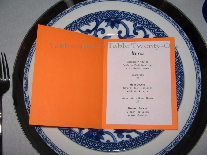
There will be food. LOTS of it!!! I always overdo. I can’t help myself. At least there are great leftovers which = time off from the kitchen for at least a day. I created these menus on my desktop. The fun multi-colored background layer are actually postcard invitations I’ve had for years just waiting for the right moment to make their debut. Notice how here, too, there is frenzied scrolling. I added various colored faux gemstones for a more 3-D look and…let’s be honest…because the blingier the better!!!

Tablescapes at Table Twenty-One, www.tabletwentyone.wordpress.com: Celebrate Mardi Gras! - Flatware, napkin collage
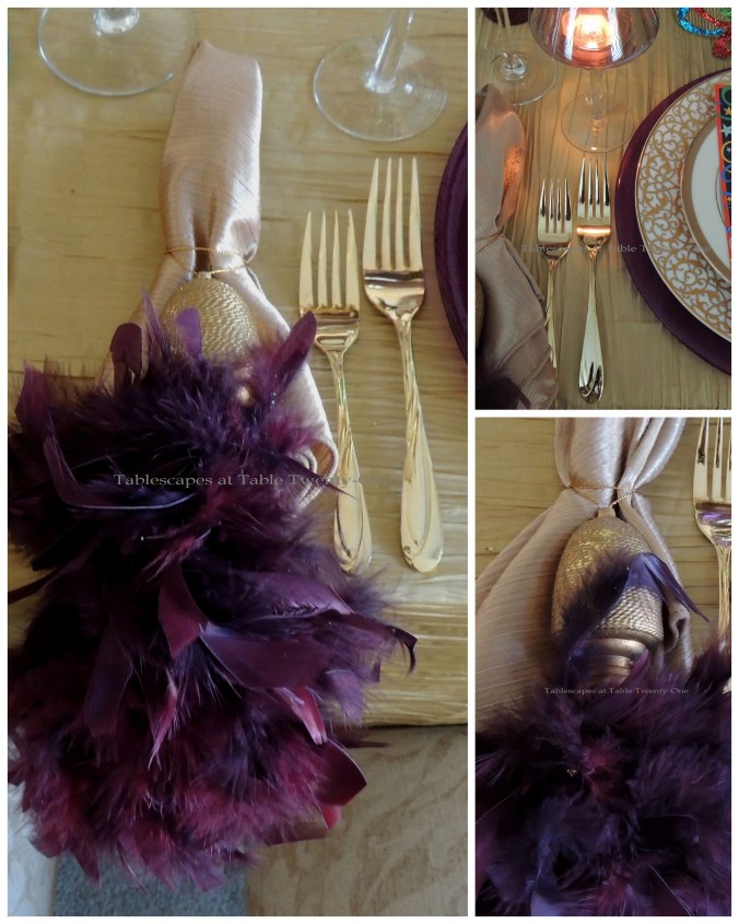
These things really excite me! I have literally had them for 20 years and NEVER used them. NEVER!!! I don’t know why. I have about 20 of them, purchased at a wholesale place in a “grab bag.” I suppose they’re actually feathered tassels of some sort, but I never let “intended use”get in my way. 😉 They’re quite full, very luxurious to the touch. They really add a lot of texture, color and sheer drama to the place setting!

Tablescapes at Table Twenty-One, www.tabletwentyone.wordpress.com: Celebrate Mardi Gras! - Pier 1 stemware/TJ Maxx glassware

Tablescapes at Table Twenty-One, www.tabletwentyone.wordpress.com: Celebrate Mardi Gras! - Glassware from TJ MaxxI use this Pier 1 gold-rimmed purple and green stemware just about every year for Mardi Gras. It’s perfect for the occasion and never gets old to me. It also comes in handy at Christmastime or when I want to go for an exotic look. I bought the intricately-designed glassware in several colors at TJ Maxx a couple of years ago (used HERE in a celebration of Diwali) after deciding the World Market price was just way too crazy for me. It has a wonderful vintage look, and notice…scroll work!

Tablescapes at Table Twenty-One, www.tabletwentyone.wordpress.com: Celebrate Mardi Gras! - Sequinned Mardi Gras maskThese miniature mask ornaments were the inspiration for this Mardi Gras table for 6. I found them while sifting through the 75% off area at Pier 1 this past January. While purple, green & gold are the traditional Mardi Gras colors, I’ve added a few more just to kick it up a notch!

Tablescapes at Table Twenty-One, www.tabletwentyone.wordpress.com: Celebrate Mardi Gras! - Purple glass cabaret lamps
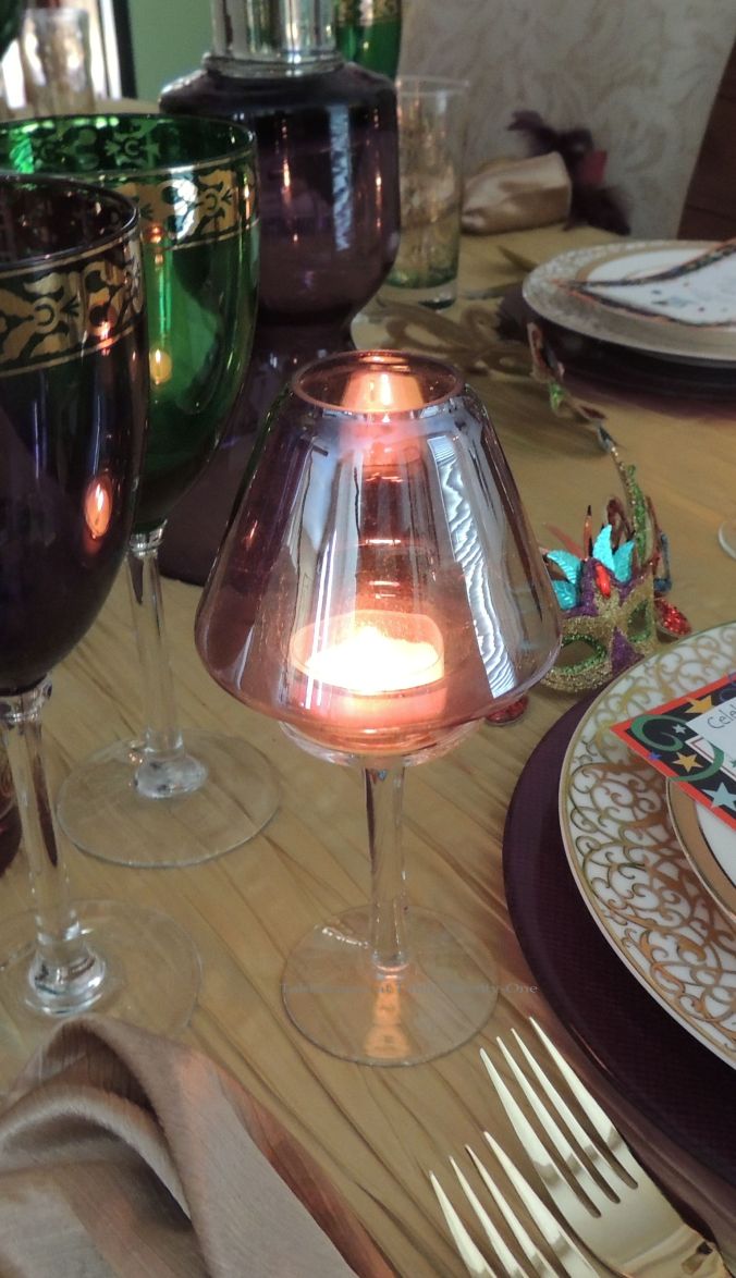
These purple glass cabaret lamps are yet another Pier 1 clearance purchase from about 15 years ago that I have never used until now. I got them in purple, red and clear. What was I waiting for??!??!!! Placed at each individual place setting, they add kind of a nightclub feel to the table.

Tablescapes at Table Twenty-One, www.tabletwentyone.wordpress.com: Celebrate Mardi Gras! - Centerpiece collageThe centerpiece consists of two very dramatic aubergine “Moran” glass vases from Z Gallerie. The 31″ vases are filled with the beads that make Mardi Gras the decadent good time it’s known for and then topped off with glittered palm leaves.

Tablescapes at Table Twenty-One, www.tabletwentyone.wordpress.com: Celebrate Mardi Gras! - Buffet mask surrounded in feathered tassels

Tablescapes at Table Twenty-One, www.tabletwentyone.wordpress.com: Celebrate Mardi Gras! - Buffet mask collage
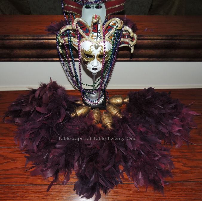
Feathers are a big part of the Mardi Gras celebration from the clothing, to the often elaborate/whacky headdress, to the decor. So I spread them around the room from the table to the buffet top! Here they fan out at the base of this aloof ceramic Jester mask rescued from the clearance section at Home Goods a couple of years ago. I added a handful of beads for color, texture and fun. In retrospect, I probably should have blinged him out a bit more. Well…there’s always next year, God willing!

Tablescapes at Table Twenty-One, www.tabletwentyone.wordpress.com: Celebrate Mardi Gras! - Sconce with Mardi Gras fairy

Tablescapes at Table Twenty-One, www.tabletwentyone.wordpress.com: Celebrate Mardi Gras! - Sconce fairy collageThese fanciful Mardi Gras fairies were included in the same grab bag as the feathered tassels from years ago. I forgot they even existed. They somehow slipped past my trusty computerized catalog system and were still neatly tucked into the original packaging!!!

Tablescapes at Table Twenty-One, www.tabletwentyone.wordpress.com: Celebrate Mardi Gras! - Gumbo

Tablescapes at Table Twenty-One, www.tabletwentyone.wordpress.com: Celebrate Mardi Gras! - Alycia with homemade gumbo & catfishNo, Ramon didn’t pick up some bag lady and bring her home. This is me after a long day of cooking and cleaning, and I apparently have no shame! Isn’t that head a mess? At least I’m wearing Mardi Gras purple! I did a trial run of the food for Fat Tuesday next week. I ended up adding crab and shrimp to this pot, but next week’s guest list includes someone who claims she’s allergic to shellfish…and you know who you are! 😉

I hope you’re all ready for Fat Tuesday with menu and drinks and games already decided! It’s going to be a blast…and then Lent. What are you giving up this year?

Other Mardi Gras tables or tables suitable for Mardi Gras on this site:
Mardi Gras Madness
Mardi Gras Lite
Mardi Gras Mojo
The Peacock Effect

I’m joining Susan over at Between Naps on the Porch again this week for “Tablescape Thursday”, and I hope you’ll come with! You’re bound to find loads of ideas from lots of other talented tablescapers (especially those Southern galsand you know who you are!) for a great Mardi Gras celebration.

Float Like a Butterfly

The color brown has its ups and downs when summer rolls around. We don’t want brown grass or leaves hanging around, but we do want that famed Coppertone® brown skin. (As a doctor’s wife, I’ll fuss at you sun worshipers about the dangers of that at another time! 🙂 ) I don’t think brown is a color we generally associate with summer when it comes to decorating, but I hope to dispel that notion.
(Click on any photo, then click again to enlarge/enhance for fine details.)

INSPIRATION PHOTO - EA BRIDE

INSPIRATION: Photo by Angie Weston of Design and Capture Studio

My work was featured in a local bridal magazine, EA Bride, a couple of years ago. I continue to marvel at the work of other designers whose work appears in the magazine with each passing issue. The photo of this grapevine ball in the Summer 2012 issue of the magazine really caught my attention, and I decided I wanted to create something similar someday. That someday finally came to pass a couple of weeks ago.

Tablescapes at Table Twenty-One: Float Like a Butterfly

Tablescapes at Table Twenty-One: Float Like a ButterflyBrown. Yes, that’s what I said…brown. A brown full-length linen is the foundation of this summer tablescape. Like black, brown is a neutral that has the capacity to make other colors snap, crackle & pop.

Tablescapes at Table Twenty-One: Float Like a Butterfly

Tablescapes at Table Twenty-One: Float Like a Butterfly

Tablescapes at Table Twenty-One: Float Like a Butterfly - Flatware, Rim Shot collageAn April Cornell table runner and napkins marry brown with vibrant, yet muted shades of seafoam blue. Two square acrylic chargers – one in an icy blue, one in a coppery brown – play off of the linens. Soft seafoam blue dinner plates from TJ Maxx round out the stack. The faux mother of pearl-handled flatware is from Target.

Tablescapes at Table Twenty-One: Float Like a Butterfly - StemwareWhen I found this fabulous ocean blue color of stemware at Stein Mart a few years ago, I was absolutely smitten. Still am!

Tablescapes at Table Twenty-One: Float Like a Butterfly - Grapevine balls wrapped with Oasis MEGA Beaded Wire in "Ice Blue"

Tablescapes at Table Twenty-One: Float Like a Butterfly - Grapevine ball wrapped in Oasis MEGA Beaded wire in "Ice Blue", dotted with hydrangea blooms and butterflies

Tablescapes at Table Twenty-One: Float Like a Butterfly - Butterfly, Beading, Urn collageI found the large cream-colored urns at Michaels. A grapevine ball is wrapped in Smither’s Oasis MEGA beaded wire in “Ice Blue”. (This beaded wire comes in 11 amazing colors!!!) I used a dab of hot glue to semi-permanently affix softly-tinted blue & green faux hydrangea blossoms. Pretty hand painted aqua blue silk butterflies generously given to me by the good people at Beau-coup.com “float” about. (These graceful beauties also come in green, lavender and pink!) I love the way they transform the centerpiece and add to the 3-D look!

Tablescapes at Table Twenty-One: Float Like a ButterflyBetween the two urns sits a trio of smaller grapevine balls trimmed in butterflies and beading much like its big sisters. I didn’t even bother to cut the beaded wire…it’s just one continuous string wrapped around the three orbs. (Students…remember our golden Rule of Three? Look at this picture!!!:-)) These would be so easy and economical to make for wedding reception decor!!!

Tablescapes at Table Twenty-One: Float Like a Butterfly - Buddha, Votive, napkin pattern collageTaibei Buddha figurines in seafoam blue from Burlington add to the peaceful aura of the tablescape. Mercury glass votive holders in a blue ombre design are scattered all throughout and around the base of the centerpiece to provide ambient light.

Tablescapes at Table Twenty-One: Float Like a Butterfly - buffet with bonsai trees

Tablescapes at Table Twenty-One: Float Like a Butterfly - Pillar candles with rhinestones from Z Gallerie

Tablescapes at Table Twenty-One: Float Like a Butterfly - Buffet candles collage

Tablescapes at Table Twenty-One: Float Like a Butterfly - Bonsai treeThe buffet is lightly adorned to complement the peaceful nature of the dining table decor. Bonsai trees anchor each end. The center decor is made up of two brilliantly-colored Z Gallerie pillar candles flecked with similarly colored rhinestones. The pillar candles sit atop broad iron candlesticks from Hobby Lobby. A trio of votives, like those on the table, act as a visual connect between the bonsais.

It was much too cold and windy the days I worked on this blue & brown summer tablescape, but imagine it outside at dusk. Thanks to the chocolaty brown tablecloth, everything on top of the table would just kind of float in an ethereal fashion. Like sea foam gently rolling over sand. Cool, huh?

Still don’t think brown is a summer color? 😉

Other blue & brown posts on this site:
“Autumn Blues”
“Zen Garden”
“Mum’s the Word”

Other tablescapes with an Asian-inspired theme on this site:
“Peaceful Peonies”
“Mikasa Daylight”
“Mandarin Bling”
“Copper Zen”
“Morocco for Two”
“Year of the Rabbit”

I’m joining these fun link parties this week, and I hope you’ll come along!:
Jessica’s “A New Creation”
Cuisine Kathleen’s “Let’s Dish!”

Susan’s “Tablescape Thursday”

Also check me out at BeBetsy.com!

Going Green for Spring

IF

INSPIRATION: Fun acid green woven favor boxes from Beau-coup.com

It’s finally starting to feel a bit more like Spring here in the Kansas City, MO area. Hooray! This time of year means a round of Spring cleaning (ugh! :-(), which means it’s time to reduce, recycle and reuse. So here’s a tablescape to remind us to go green (have a garage sale, donate to thrift stores, use old items for new creations, vow to stop shopping…..whoa! Wait a minute! Who threw that last one in there??!?!?!!). In other words, time to go green!!!
(Click on any photo, then click again to enhance/enlarge it.)

IF

IF

IFThis fun green & white table for 8 begins with a fresh white full-length linen from LinenTablecloth.com. I was so happy to once again have a chance to use this fabulous Mikasa “Daylight” dinnerware. With its freshly sprouted leaves on a wispy branch, it says Spring to me like no other dish I have whether it’s for a birthday, a ladies’ luncheon or Sunday brunch! (Click HERE to see these dishes used in another colorful Spring setting AND in a subdued Asian-inspired theme. They’re just that versatile!)

Flatware, stemware, charger collageSimple clear glass stemware from Old Time Pottery doesn’t compete with the flurry of decor on the table.  The “chargers” are rustic grapevine wreaths. (These were also used as chargers for an American Royal tablescape HERE.) Dark faux bamboo flatware from Home Goods works in concert with the chargers and branch design on the plates.

IFThe good folks at Beau-coup.com sent me these eye-popping acid green woven favor boxes. They look terrific “as is”, or you can dress them up with any manner of flourish. Here, to keep the organic look and  theme of recycling to go green, I hot glued pieces of broken from the chargers. Imagine these with a pretty silk posy, a tilted bird’s nest, a pouf of ribbon, or a simple twine bow. Just go wherever your imagination and theme take you! TIP: This shade of green is often hard to “match.” Don’t even try to go there. Take your cue from nature’s variegated colors and strive to complement rather than match.

Agapanthus, butterfly collageI found the squared-off green vases at a nearby wholesale store that always has something fun to tempt me. The shape of these vases lends itself to a variety of looks. On this table the arrangement is merely 3 majestically tall faux agapanthus. (I used these same green vases on the buffet with lots of orchids overflowing HERE.) An oversized acid green butterfly with pretty mesh wings perches on the side. To bring the moppy heads of the agapanthus down closer to eye level, I snipped and plopped a few into sleek white ceramic urns.

Mercury ball on candlestick collageCandlesticks aren’t just for candles! I used these white turned wood candlesticks from Z Gallerie to hold large, heavy mercury balls that sow a little shine into the otherwise unpolished setting.

Rose collageI bought a bunch of these little rose bundles wholesale a while back in several colors. I’ve seen similar ones in stores like Michaels. They look really good massed together as seen here in this white weathered aluminum planter. A single bundle is just enough to fill a smaller white ceramic urn.

Buffet collage

Wreath collageOn the buffet is a massive grapevine wreath that carries on the look of the chargers on the dining table. In the spirit of recycling and looking for something with a funky little beat, I used the stems cut from the agapanthus on the table to create a rambling design on one side of the wreath. The asymmetrical design is balanced a little with the presence of 3 more of the large butterflies. A mercury ball finial brings shine to the vignette, while dessert plates and forks peek out from beneath a floral arrangement.

Tea cart collageOn the tea cart are faux bamboo spoons and gorgeous Mikasa “Daylight” cups & saucers. A Ralph Lauren pierced cake pedestal (Tuesday Morning) holds more of the Beau-coup favor boxes, this time unadorned and filled with cookies for guests to take home. Your choice: favors on the table at each individual place setting, or displayed en masse for guests to pick up on their way out the door.

Many thanks to Beau-coup.com for providing these pretty favor boxes for me to play with! It was tons of fun! Beau-coup has a wonderful variety of “favors, party supplies, gifts, and more for all of life’s celebrations.” (I couldn’t have said it better myself, so I didn’t even try…I just plagiarized it! :-)) Stop by and check them out!

Other posts on this site with green and white tablescapes:
“The Party She Deserves”
“Moss & Manzanitas”
“Ready for My Close-Up, Mr. DeMille”
“Spring Has Sprung”
“Rolling Fields of Green”
“Apple Green Luncheon”
“Upscale Irish”

There are lots of fun blog parties out there with ideas from the creative minds of bloggers all across the United States and around the world. Partying hearty here in the Midwest (U.S.A.) are blog buddies like Marigene “In the Middle of Nowhere“, Lynne at “Lynne’s Gifts From the Heart“, Cindy at “Beaux R’eves“, Cherry Kay at “Entertaining Women” (she had a gorgeous green & white table last week!), Judy at “JBiggs Little Pieces“, sweet Pat at “Back Porch Musings“, “The Home Girl“, and newcomer Christine at “Rustic & Refined“. Join us this week at:
Cuisine Kathleen’s “Let’s Dish!
Susan’s “Tablescape Thursday

Blog parties are a wonderful opportunity for you to learn from tablescapers who do this regularly and have lots of tried and true ideas!

Pumpkins & Peacocks

Here we are once again at the crazy transitional time that calls for us to walk that pencil-thin line between summer and autumn tablescapes. A September tablescape can be one of the most difficult as we teeter on the cusp of the bright colors of summer and the warm, deeper tones that come with the crunch of autumn leaves. This mix of a bright pumpkin color and the flickering jewel tones of peacock feathers is a tablescape that might satisfy the need to meet in the middle. And, as the peacock is the national bird of India, this might also make a fun table for the festival of Diwali which marks the end of the harvest season.
(Click on any photo to enlarge/enhance it.)

The foundation of this colorful Fall tablescape is an attention-grabbing floor-length pumpkin-colored linen from LinenTablecloth.com.

While the layers of the tabletop include more of the bright pumpkin hue, the deepness of the greens and purples ground it a bit more and bring it even closer into Fall.

This table for four features complex layers that speak to the cooler autumn months but don’t abandon what’s left of summer. A double layer of square gold chargers from World Market hosts a French-inspired plate adorned with a gorgeous peacock, his iridescent plumage on full display. The lower right corner of the plate comes alive with brightly colored gloriosa lilies.

Gold-tone flatware complements the orange-y hue of the linens. Around the napkin is a showy purple “gemstone” napkin ring from Z Gallerie, usually reserved for Mardi Gras around here. (See it used HERE and HERE.) The purple in the napkin ring complements the jewel tones in the eye of the peacock feathers.

Inexpensive but nonetheless lovely green Dollar Tree stemware complements the green tones in the peacock feathers and offers another layer of color to the table’s palette.

I didn’t have a lot of gloriosa lilies, but I did have on hand enough of these faux orchid stems that were very close in both color and form. I chose to create a kind of wild, untamed, uncontrolled floral arrangement…much like the demeanor of peacocks! While a faux orchid floral arrangement is used for this demonstration, it would be REALLY cool if your budget allows for real ones!!!

Tiny pumpkin-colored tea light votives candles produce ambient light and extend the surface level girth of the centerpiece.

A simple straight line of votives across the fireplace mantel mimic those on the table.

To see more Fall tablescapes on this site, visit:
Autumn” page (has TEN different posts on one page!!!)
September Wine
Autumn Blues
Autumn White Wedding
Roses in October
Sunflower Simple
Serape High Style
Raining Orchids” (another great transitional table!)

Next week I’ll have photos of one of the four tables I have been laboring to set up for my “Fabulous Fall Tablescaping” class through Longview Community College’s Community Education department. I’m keeping my fingers and toes crossed that I get the requisite number of students so that the class isn’t cancelled. I know people are very busy and that the economy really sucks right now, but I have such great plans for this class!!! I hope it fills up! If you live in the Kansas City, MO area, you have until Friday the 14th to enroll, so give them a call at 816-604-2030. Classes start Tuesday, September 18th.

I am joining Cuisine Kathleen for “Let’s Dish!” starting Wednesday at 6:00 p.m. CDT. Also on Wednesday I will be joining The Style Sisters for “Centerpiece Wednesday“. Then on Thursday, please come along with me to Susan’s “Tablescape Thursday” starting at 9:00 a.m. CDT. I hope to see you then!

Peaceful Peonies

Chinese New Year is January 23, 2012. I love the colorful pageantry associated with this holiday! Last year I created a traditional Chinese New Year tablescape using lots of red and gold with black accents. (Click HERE and scroll down to “Year of the Rabbit” to see last year’s post.) This year, now tired of all the red used for Christmas decorating, I went rogue with a fiery hot pink.
(Click on any photo to enhance/enlarge it.)

One of the great things about this particular tablescape design is that the Asian influence is somewhat understated, thus rendering it suitable for various contemporary-styled occasions such as rehearsal dinners or ladies luncheons (sans the candles, of course). The two-tone linen combo of sizzling hot pink over the more neutral black immediately draws the eye in.

To demonstrate how the same dishes can create an entirely different atmosphere depending on the accessories, compare this setting to that of “Let Them Eat Cake” from a post last year. (Click HERE and scroll down to “Let Them Eat Cake“.) A gold leafed glass charger and gold-rimmed white china from Pier 1 are topped with a an F. Winkel & Co. “Jacobean” salad plate. The vivid coloring and busy pattern of the chinoiserie salad plate are just the right combination to accent the plainer underplates and bring in the black, gold, hot pink and white.

I had my eye on these Buddhas from the moment they hit the store shelves at Z Gallerie last year. I must have chewed half a pound of fingernails waiting for them to go on clearance, hoping there would be enough left over. Jackpot! Got all I needed at 75% off!!! Here they hold a gold mercury glass votive.

My “old reliable” goldtone flatware works well here with its subtle pattern.

I opted for crystal stemware with gold rims, but opaque black stemware like Mikasa’s “Elegance-Black” would work well, too.

I felt the need to break up that searing hot pink surface a bit more. I achieved this by folding the black poly-cotton napkins from Bed Bath & Beyond into a long chevron and placing them beneath each setting, allowing them to extend downward over the pink linen.

I almost always use either white or ivory candles, but I’m getting bolder in my old age! 😉 Long black tapers are set into a trio of 20″H goldtone candlesticks to add height and color down the table’s center.

Black powder-coated ginger jars hold a mix of pink peonies, white alstroemeria, and star blossoms. (Florals used here for demonstrative purposes are faux, but I encourage the use of natural flowers for actual entertaining. If, however, all natural flowers are out of your budgetary reach, try mixing realistic fauxs with fresh. The key there is realistic fauxs that blend well!)

Lined up on each side of the centerpiece are four gold mercury glass votives to add ambient light at the lowest level.

The notably restrained buffet decor is a giant black ginger jar flanked by a pair of the same F. Winkel & Co. plates as used on the table. Florals from the table are extended by simply plopping 3 peonies into a shallow black bowl.

2012 is the Year of the Dragon, so printed menus with the Chinese symbols for dragon – 龙年 – or a dragon watermark, or menus in the shape of a dragon would be another element to make this table special. Specialty stores may carry oversized ceramic dragons which would be a great addition, too! (Or go check out Grandma’s attic for them. These dragons, as well as panthers for some odd reason, were all the rage in contemporary 1960s homes.) A nice substitute for the peonies would be deep pink carnations, orchids or, depending on availability, pink plum blossom branches which symbolize luck. If your budget allows for it, rented bamboo chiavari chairs in black would be the crowning touch!

More tablescapes using hot pink on this site:
Daisy Crazy
Hello, Dahlia
Let Them Eat Cake
Hollywood Fright Night

Another tablescape using peonies:
Peonies & Pearls

Thank you for stopping in! I hope you’ll join me again this week at Susan’s place for Tablescape Thursday! You can also catch me at BeBetsy.com!

Breast Cancer Awareness Luncheon

Finally! After months of “entertaining drought” I finally got the chance to do something at home again!!! Thanks to two dear friends who so generously provided all the food and libations, I was able to host my most cherished annual
Breast Cancer Awareness Luncheon.

This is always a very intimate event, but one of the very biggest in my heart as the same friends gather each year to celebrate the battle won for one of us.

Again this year we dined out on the deck, basking in the sunny warmth of a perfect 72 degree autumn day.

A generous layering of brown, pink and white linens is the starting point.
I chose to use an 85″ x 85″ square top layer over the round ones beneath to provide a little more visual interest.


Glossy silverplate chargers are topped with deep chocolate brown and white silver-rimmed “Delfina” china from Z Gallerie. (Click here and view “Just Us Girls” to see this china used in another pink, brown & white tablescape.)

Soft pink cotton napkins are fashioned into replicas of the much-recognized pink ribbon that is the international symbol for breast cancer awareness.

Godinger “Dublin” highball glasses are used to serve pink lemonade, while two Cristal D’arques goblets await wines served with the appetizer and entrée.

“Royal Danish” sterling silver flatware.

Pink organza bags of Good & Plenty licorice candies are a sweet treat for each guest.

I used an adjustable height bust form from my dressing room as the foundation for the centerpiece.
I chose to keep her uncovered so as to “expose” us all to breast cancer awareness.

A fragrant combination of fresh roses, hydrangea and Gerbera daisies along with some faux pink wisteria creates a dramatic “head” on the bust form centerpiece that symbolizes flowery, upbeat thoughts! (I wired together the flowers, then just removed the bust form’s cap and stuck the stems down the neck. Easy peasy!)

As many ladies do for luncheon, this bust form is adorned in a triple strand of pearls. The necklace peeks out from beneath a pink ribbon arranged to mimic the international symbol.

Clumps of fresh and faux flowers are arranged on a large silver tray at the bust form’s foot.

To bring a touch of autumn to the table, I bought 4 mini pumpkins from the local grocer (just $.50 each) and spray painted them in Krylon’s “Ballet Slipper.” After a day of drying, I painstakingly (and I do mean painstakingly!!! :-() blinged out the pumpkins by adding tiny pearlescent beads purchased at Hobby Lobby. I used clear Elmer’s Glue for those on top and a great little newly discovered product called Zap-A-Gap on the sides. (I strongly recommend wearing gloves when working with this stuff. Even nail polish remover wouldn’t get it off my fingers!!!)

A small side table dressed in pure white linen offered sweet pink lemonade on a silver tray and two kinds of chocolate dessert cookies on silver beaded edge pedestal trays. A diminutive bouquet of pink roses and a Gerbera daisy was arranged in a tiny Mikasa “Petit Points” crystal vase.

After the luncheon, each guest went home with a pumpkin and this note to remind her to get that all-important mammogram. Additional bling pumpkins were delivered a few days later to beloved neighbors.

Please be sure to schedule that yearly mammogram, ladies! (Guys, encourage the women in your life to go! And as for you fellas, uh….prostate check!!!) It could be – as with my friend who was diagnosed early – a true matter of life and death.
Choose life. Get that mammogram!

More tablescapes on this site using shades of pink that could serve to honor Breast Cancer survivors:
Showered in Pink
Pinky Peter Cottontail
Pleasant Under Glassgo to page & scroll down
Au Revoirgo to page & scroll down
Coming Up Rosesgo to page & scroll down
Just Us Girls
Tea Rosesgo to page & scroll down
Princess Pink Birthday Dinner
Pink Plaid & Posies
Peonies & Pearls
Blushing Bridal Shower
Pretty In Pinkgo to page & scroll down
Peony Power

Join us, won’t you, for Tablescape Thursday at Between Naps on the Porch and Bev’s “Pink Saturday” at How Sweet the Sound! And don’t forget to check us out on BeBetsy.com!!

Blessings, thanks, peace & love to Liz at Infuse With Liz
for helping me to spread the word!

Mandarin Bling

Regained a smidge of my creative mojo, y’all!
This is the first tablescape I have created since…well, you know! 😉

I’ve been in a creative slump lately, drowning in the cesspool of the last couple of months. I recently decided to surface, catch my breath, and get my hips back to tablescaping!!! 🙂 I drew inspiration from Alberto Pinto’s book “Table Settings”. (Click here or on the “Books That Make You Go Ooh!” tab above to read my review.) I was drawn to his continental style that is markedly different and quite dramatic. Hence, the color palate used here is bright Mandarin orange, blue and white.


To create this Oriental tablescape with European style, I started with a starched white floor-length cotton table linen. Floor-length in this case was a must to convey the relative formality of the evening. A 13″ round mirrored charger is topped with Ralph Lauren’s “Mandarin Blue” dinner and salad plates. The plates have two separate but complementary designs. Other pieces in Lauren’s “Mandarin Blue” have orange flourishes.

IMG_1116WM

I created the menus using a lightweight neon orange cardstock layered with white. A clip art Mandarin symbol adorns the front of each and separates the listed courses.

Now that my mojo is back, my love of energetic color has returned as well. Cobalt blue water goblets from Pier 1 team up with Crystal d’Arques wine glasses and fun orange martinis in which dessert would be served. (Orange martinis found at Old Time Pottery.) This eclectic but complementary mix is typical Alberto Pinto style.

With dishes in a pattern called “Mandarin Blue”, it seemed fitting to use flatware with an Asian influence. Adding a pair of chopsticks alongside the bamboo stainless flatware offers those with the necessary skills a chance to eat in an authentic manner.

IMG_1172WM

IMG_1179WMThe centerpiece is composed of 29″H clear pilsner vases topped with bright orange rose balls that are visually “connected” by crystal garlands. A single crystal prism, suspended from the bottom of the rose ball, dances in the light of 25″ Paradise candles. (Click here to see another table decorated with rose balls. Click here or on the “Table Tips” tab above – Tip #27 – to see how the prisms are discreetly attached.)

Gilded servants from Z Gallerie offer another level of intimate candlelight.

IMG_1121WMThe buffet display has a Z Gallerie 24″ orange wooden tray tucked behind an oversized ginger jar from Home Goods. More servants with votive candles stand guard in front of the display. Tea service uses “Mandarin Blue” cups and saucers along with a simply designed teapot from Home Goods.

Though very non-traditional in color & style for the holiday, this tablescape would be great for Chinese New Year!

So…who says eating Chinese takeout is just for college students and sitcom characters? “Homey don’t play that!” 🙂 For me, it’s all about the Mandarin Bling!!!

Other Asian-inspired tablescapes on this site:
Year of the Rabbit
Peaceful Peonies
Copper Zen
Mikasa ‘Daylight’ Giveaway

You are invited to join Susan at Between Naps on the Porch along with a bevy of wonderfully talented tablescapers for Tablescape Thursday. You can also catch me over at BeBetsy.com. See you there!

Tropicana

Acclaimed Japanese writer Haruki Murakami wisely wrote, “And once the storm is over, you won’t remember how you made it through, how you managed to survive. You won’t even be sure whether the storm is really over. But one thing is certain: When you come out of the storm, you won’t be the same person who walked in. That’s what this storm’s all about.”

That’s how I can best sum up my feelings about what happened when we recently packed up our lives and moved to Georgia, only to move back within the week. And while we are still weathering that storm, trying to make sense of it all, trying to learn from its harsh, hurtful, and very expensive lessons…I know that storms are a mere hiccup and that sunny days will prevail.

That being said, I want to celebrate my return to Blogland after a two-month absence with a bright, colorful, cheerful summer tablescape.IMG_3315WM

 IMG_3330WM
We’re not quite completely settled back in yet and we probably won’t be entertaining guests for awhile, so I thought I’d share photos of a dinner party from last summer that I never published. (Believe me: In this record breaking heat, we would not be eating outside anyway!!!)

Summer is definitely a time for bright, tropical-flavored colors. This table for four started with a shockingly pink floor-length table linen from LinenTablecloth.com. (A word of caution about LinenTablecloth: In my experience, their customer service is just horrible at times, so choose wisely and read the fine print!) A pair of Pier 1 multi-colored matchstick table runners crisscross to anchor the setting.

A trio of paper parasols from Hobby Lobby extend the table colors across the deck.

These have got to be among my favorite summer dishes: ruffled melamine chargers in aqua (Crate & Barrel), topped with a simple white Corelle dinner plate to break up the color a little, finished off with a fun tropical-themed salad plate from Pier 1. The stainless “bamboo” flatware is from Target.

IMG_3327WM

Exotically swirled aqua in the Pier 1 stemware reminds me of the ocean. The butterfly-meets-flower straws are also from Pier 1.

I chose pure white cotton napkins to give the eye another little break from all the color. Each napkin, folded in a compact square, is topped with a seashell toting a fresh orchid bloom. (The great thing about fresh orchids – besides how insanely great they look – is that they can thrive without water for several hours!)

The towering white bamboo vase is from my favorite store….let’s all say it together….Z Gallerie! Mounds of seashells collected over the years add a little girth to the bottom of the centerpiece to balance it out with the top. Tucking a few orchid blooms and brightly hued cockscomb here and there amongst the seashells adds color and extends the floral theme. (I just love decorating with seashells!)

This lush profusion of fabulous orchids – courtesy of my dear friend Craig Sole of Craig Sole Designs – are arranged in an untamed fashion along with curly willow branches that lend height and texture.

I’ll end this post with one more quote (expletives redacted) from author Kelly Cutrone:  “This is an important lesson to remember when you’re having a bad day, a bad month, or a [$&!##%] year: Things will change. You won’t feel this way forever. And anyway, sometimes the hardest lessons to learn are the ones your soul needs most. I believe you can’t feel real joy unless you’ve felt heartache.” Amen, sister!

Other tablescapes on this site using paper parasols:
Daisy Crazy
Oopsy Daisy

More tablescapes on this site using seashells:
Summer Breeze
“Old Navy Seafood Cruise”

More tablescapes on this site using orchids:
Raining Orchids
Love & Orchids
Upscale Irish
Autumn Orchids
Happy Mother’s Day, Senator Mom
Happy Birthday, Barf

It’s great to be back! Thank you for stopping in, and please be sure to join me this Thursday for Tablescape Thursdays hosted by Susan at Between Naps on the Porch. You’ll be glad you did!

Proud As a Peacock!

Those of you who have visited this blog in the recent past know that I was recently selected as one of five designers to create a tablescape for the winter 2011 issue of EA Bride Magazine. All I had at the time the magazine hit the newsstands in December were some photocopied images straight from the magazine that I shared with you here. The kind folks at Phoenix Photography have since graciously provided me with scenes from the photo shoot which offer a much clearer view. (Or you can click HERE to go straight to the EA Bride magazine website to see the pages.)


Depicting a winter wedding table in these brilliantly bold hues was a bit of a challenge, but I certainly enjoyed it! When the creative director for EA Bride Magazine approached me for this Winter 2011 edition’s “Design Challenge” tablescape along with four other designers, it was a thrill to be considered.

Borrowed from Celebration Party Rental in Lee’s Summit, Mo., were the table, cool clear-seated silver-back chiavari chairs, ruby-red diamond pintuck table linen and matching napkin. From my personal collection I chose a square silver wooden charger from World Market, a fabulously intricate teal and silver charger from Home Goods, to-die-for rhinestone-studded silk napkins from Z Gallerie, and exquisite rhinestone-flecked snowflake napkin rings from Pier 1. I borrowed the snowflake from the creative director’s stash at the last-minute just before the shoot began. My Mikasa “Jamestown Platinum” stemware, International Silver “Royal Danish” sterling flatware, and intricately carved aperitif goblet. (Note: Yes, I know the champagne flute is on the “wrong” side, but aesthetically…it just looked so much better! To those of you who are purists on this matter, I humbly apologize! :-))

The 25″H mercury glass vase purchased from my friend Dana Nigro’s Village Gardens in Blue Springs, Mo., offered the perfect combination of vintage and modern. By slipping on a few borrowed crystal ornaments, the vessel was subtly transformed for our winter wedding. Arranging the 52″H peacock feathers from my own collection at staggered heights in the vase rendered a centerpiece that stood a total of 58″ tall!!! Perfect for rooms with tall ceilings!

Each of the 3 small arrangements surrounding the main centerpiece were created by Anne Kelly Acock of the Monarch Flower Company in Lee’s Summit, Mo. The diamond head centers remind us of both the occasion and the iciness of winter, while the peacock feathers bring the colors and texture of the peacock feathers towering overhead down to eye level.

After the photo shoot, we all paused for a few moments of relaxation and goofing around before going about the business of tearing down our very temporary creations. From left to right: Ashley Hotka of Good Earth Floral Design Studio, Heather Medley of Notting Hill Design Studio, Anne Kelly Acock of Monarch Flower Company, and li’l ol’ me. (Not pictured: Meghan Perlow of Poppy Floral.)

This was a really fun and educational experience for me. But seriously….I am out of the wedding business. I am retired! Seriously. 😉

Many, many, many special thanks to

EA Bride Magazine, Phoenix Photography, and Lone Summit Ranch

Magazine cover shot by Blixt Photography, Kansas City, MO

Photo by Phoenix Photography

The Winter 2011 issue of EA Bride is on sale now through March 15 at Barnes & Noble, Price Chopper, Hy-Vee, Hen House, Wal-Mart and several local hospital gift shops.

 Other tablescapes on this site with a peacock theme include:
The Peacock Effect
Simply Peacock Garden
Pumpkins & Peacocks
Peacock Pizzazz
Pheasants & Peacocks

I hope you enjoy! Don’t forget to also take a look at tablescapes from all over the world on Susan’s Tablescape Thursdays!!!

Something New! Resource Profiles

I don’t want to keep all the secrets to myself! I hung out back in July with Thomas at the Holy Grail of tabletop shopping, Z Gallerie, in the One Nineteen Shopping Center in Leawood, Kan. Starting this week, I will occasionally chat with the people I know at the places I love to shop for all the cool stuff that pulls a tablescape together. I want you to get to know them, too! 

Photo by Sheri L. Grant


Kicking off – and coincidentally in alphabetical order on my links – is All Seasons Event Rental. Sheri came along to shoot some photos you may enjoy. Just click here or on the Resource Profiles tab above!