Happy Birthday, Barf!

You know how kids pick at each other and give each other a lot of grief, but then grow out of it in later years? All that applies to my sister and me…except the growing out of it part. I lovingly bestowed the nickname “Barf” on my big sister about 40 years ago, and it just kinda stuck. Barf this, Barf that, Barf the other….regardless of the name on her birth certificate, to me she is simply “Barf.”

Barf and her sweet friend, DeEtta, visited Kansas City a little over a week ago on their way to Columbia, Mo. Barf is an October baby and was on her way to an annual October babies celebration with other family & friends.  Because she was turning 100 or 150 or something like that on this birthday, she was pooped out from all the driving. So we held a jazzed up little “come-as-you-are” birthday dinner party at our house.

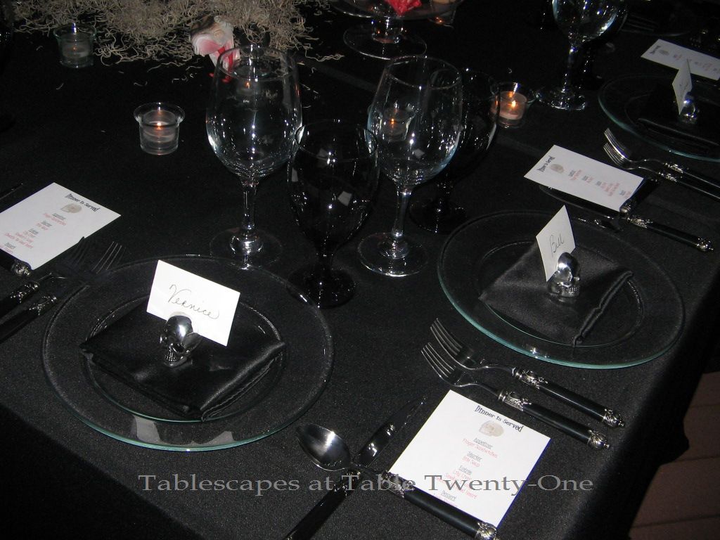
Everyone was dressed comfortably and casually, but I wanted to do something kind of swanky for the table. Barf and DeEtta had already traveled quite a distance from Minnesota and still had another two hours to drive after dinner to get to Columbia. I wanted the table to be something she would enjoy but that would also be easy to put together since I was feeling particularly lazy. So I went with spiffed up basic black.

IMG_2740WM

Silver metal chargers and Noritake “Spectrum” china are my “go to” pieces that take a lot of guesswork out of the whole thing.

IMG_2718WMBlack napkins folded into a neat little square with an orchid bloom for a shot of color.

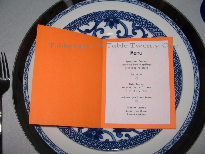
The menu card has a photo of Barf at 6 months old. Wasn’t she a cutie patootie? (Speaking of patooties, I tried to cover hers a little here with my watermark! :-)) Creating these menus was my favorite part of the whole set-up!

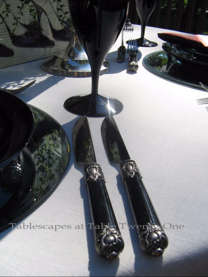
I went with J.A. Henckels “Bellaserra” flatware…just because. 🙂

IMG_2732WMAnother great “go to” is my Mikasa “Jamestown Platinum” stemware. I love it for its timeless beauty, its incredible versatility, and the way it feels in my hand. It’s perfect!

IMG_2767WM

I bought these cool triple-decker bling mirrors a while back at Hobby Lobby. Yes…Hobby Lobby! They’re very sturdy and reflect a lot of light. While they are meant to be hung on a wall, I decided they would make much better centerpiece trays. The neatly lined votive candles and 25″ metal case candles (much safer taper if you don’t want candlewax everywhere!!!) double back in the mirrors. My Dad was quite intrigued with the design.

Mirrored cylinders hold a mix of bright green cymbidium orchids, dusty miller (rescued from the back yard before the frost got to it!), and raw coffee bean clusters.

IMG_2766WM

I wanted something lush for a buffet piece that leaned toward fall without screaming it out loud. “Peacock White” flowering kale had both just the right color and texture I wanted mixed with the dusty miller, cymbidium orchids, and raw coffee beans. This heavy 4-light silver epergne (also seen here filled with mounds of baby’s breath at the “Princess Pink Birthday Party“) is a great buffet or centerpiece item, and it has a removable bowl for easy arranging and cleaning.

Candles and a small floral on the china cabinet.

L to R: Mom, Me, Daddy, DeEtta, and the Birthday Girl…Barf!!!

I’ve done a lot of teasing here (as always, because what are sisters for? ;-)), but I really do love my sister. She’s a very warm, kind, giving person with a heart as big as all outdoors.  Yes, she’s weird and goofy…but she’s mine.
Happy Birthday, Barf! 🙂

Note: This would make a great New Year’s Eve tablescape, too!!!

Other tablescapes on this site using a mirror centerpiece include:
Shake, Rattle, & Roll ‘Em!
Happy Birthday, Barf!
Hooray For Vodka!

Breakfast at Tiffany’s
Contemporary Christmas – Fire & Ice
Roses In October
Princess Pink Birthday Dinner

As is always my distinct pleasure, I am joining Susan and the other talented tablescapers from around the world for Tablescape Thursday this week. Won’t you come along?

Serpents & Skullduggery

Halloween is a week away!

I will admit it: Halloween is not my favorite. As a kid I wondered why we had to go from door-to-door like street urchins. Why couldn’t all the neighbors just toss all their candy into a huge cauldron in the center of the subdivision and let kids take turns dipping it out? Walking from door to miserable door, enduring the snarky “And what are you dressed as?” remarks, shivering in the inevitable cold because I didn’t want to wear a coat that covered my costume, being frightened half out of my wits (which explains a lot!) by older bullies who thought it was funny to make little kids pee their pants…ugh! To make Halloween that much crazier, my parents would “inspect” our candy before we got to eat it. “Inspect.” Yeah…right. Whatever.

Having said that, I put together a table just the same for your Halloween pleasure/fright. Whatever. I’m going to the store to grab a couple of bags of candy to “inspect” while you look at the pictures!

IMG_2863WMA full-length black linen creates the appearance of a ghostly “floating” tabletop design.

IMG_2840WM

IMG_2818WMThe use of clear glass and black tabletop accessories further lends to the ethereal “floating” effect. You can pick up clear glass dishes at places like Bed Bath & Beyond or Old Time Pottery. The black stemware used here is just $1 a stem at the Dollar Tree store. Gotta love that place! Lots of bang for the buck…especially in this economy!!!

 IMG_2879WMThe close placement of the flatware creates a “chain link fortress” around the table.

Yes…I used the names of some close blogger pals like Vernice at We Three Dogs & Me for place cards. If I have to suffer through this, I’m taking you guys with me! I found the fun little skull place card holders at TJ Maxx.

The dinner menu, of course, has to be pretty nauseating to be effective! The design on the end of the Hampton Silversmith’s black “San Remo” flatware works well with its almost Gothic look.

I have a couple of wrought iron “trees” that come in handy for various centerpieces, and Halloween seems a pretty likely opportunity. The tree holds 20 votives in its “branches.” To give it a spooky look, I added clumps of Spanish moss, lots of skulls from Michaels craft store, and a 6-ft. python slithering from top to bottom. I bought this tree wholesale several years ago, so I can’t tell you where to buy one. Curly willow branches, manzanita branches, or any type of small tree would work just as well, though, to achieve the look.

Lots of delicacies under glass from Dollar Tree including “finger sandwiches” on white with a bit of herbed mayo. Hmmm…this food looks a bit undercooked! The glass covered pedestals are from Hobby Lobby and Marshalls. (Dollar Tree and Deal$ – owned by the same company – are both GREAT resources for fun, affordable props!)

Votive candles lined up along the deck ledge with a skeleton here and there provide a little more ambience.

A look from below.

As if on cue as I finished up, a huge black cat darted from under the deck, across the yard, over the fence and into the neighbor’s yard. Oh, crud. The bully made me pee my pants…again!

Other Halloween tablescapes on this site:
Ravenous Raven Graveyard Feast
Hollywood Fright Night

I’ll be joining my spooky pals at Susan’s Tablescape Thursdays again this week, so please stop by to see how much they enjoy decorating for Halloween!

One Shoe Can Change Your Life!

Just a reminder…
If you have not already entered, you still have until 7:00 a.m. CDT tomorrow (October 18, 2011) to let me know you’d like to have your name dropped in the bowl for the silver pedestal bowl drawing. If you missed that post, click here for details! Good luck!!!
The winner will be announced tomorrow afternoon!

UPDATE 10/19/11: Click here to see the winner!!!

I love to hear from readers asking for tips!!! This week I set a table based on a reader request for a “shop-’til-you-drop” table. I’ll fess up and say that I pulled one idea from a real-life table I created several years ago for a few friends to enjoy a light supper after an all-day shopping excursion. The sign (bought at Stein Mart) says it all!

This one goes out to my husband who has always let me shop ’til I drop!

IMG_2177WMI like to double or even triple linens for a fuller skirt and to add lots of dimension and color to the table. Here I used just a black full-length with an ivory cotton overlay, but a bit of red peeking out between them would have been nice, too.

Once the linens are set, the rest is cake! Not a lot of time for fussing over the table when you’re just back from a day on your feet in the shopping trenches. Easy but elegant is the way to go!

Jet black dishes reflect in the mirrored shine of a sleek silver charger. Basic white dishes are a must for easy decorating options, and I feel the same about black. Black is a neutral that never disappoints and that presents light-colored food beautifully.

A fun little menu at each place setting is always appreciated by guests. The fare on this menu (a replica of the one I created for my little get-together a couple of years back) is mostly food that can be made ahead of time. I brought in a little red fabric with these black-edged red silk napkins from my friend, Monica.

One shoe can change your life, and that includes these fun little pewter shoe place card holders! Sorry..I have NO idea where I bought these little gems, but I’m sure something similar can be found on the Internet.

Sexy and sleek Mikasa “Elegance – Black” iced tea stems brazenly pilfered borrowed from my Mom are the perfect match for the place settings! Their shape, style and color are reminiscent of the sultry “little black dress” we all have in our closets.

IMG_2180WMHampton Smith “San Remo” stainless flatware finishes out the look. The Baroque detailing on them keeps the mostly black place setting from going flatline.

IMG_2182WMThe unusual hatbox centerpiece is the star of the table! It’s easy to assemble and reminds me of merchandising elements used on the shelves of chic boutiques.

What says “shopping” better than shoes, shoes, and more shoes? Uh….nothing! Duh!!! I bought these cool square shoe/hat boxes (usually displayed on the shoe shelves in my dressing room) at Gordman’s a few years ago. I think they have that Doris Day/Holly Golightly/Marilyn Monroe (or Tony Curtis!)-in-“Some Like It Hot”-look from the 1950s. (Still not sure what I’m talking about? Click here to see Susan’s take on this iconic look from her 9/14/11 post on Doris Day Movie Fashion Style.)

Filled with sumptuous red roses, hypericum berries, and trailing seeded eucalyptus, the shoe/hat boxes are a fun alternative to a ho-hum vase. (The florals are actually in water-filled vases hidden in the boxes. You can give the little vases of flowers to each guest afterwards as a take-home favor!)

IMG_2168WMA trio of multi-level candle lamps are created with A-line black shades over silver candlesticks. A small LED candle buried inside provides subtle, sexy light as the shadows fall.

Actor James Brolin (now married to Barbra Streisand) once quipped, “Any girl that’s got a $500,000 table and $5 shoes, I’m in love with.” Uh, Mr. Brolin…do you not understand that we’ve gotta have both?!?!!? 🙂

So…..the table….easy enough? I hope so! This look would also be well-suited to a ladies luncheon (sans the candlestick lamps) or even a fun bridal shower, especially if the bride is gifting her attendants with shoes for the ceremony!

Don’t forget to join me at Susan’s Tablescape Thursday to see what the other tablescapers out there in blog land are up to this week!

Giveaway & Roses in October

I miss my husband. He’s gone for a whole week to a conference, and I’m miserable without him. To make matters much, much worse….he’s a world away and our “official” wedding anniversary is today. I say “official” because we actually count from the day and time we met, May 3, 1991, 7:41 p.m. CDT. We were married in our hearts, even if we didn’t get Uncle Sam involved until 6-1/2 years later.

Ramon, you are everything to me. I love you with all my heart, and I always will. Our marriage vows are sacrosanct, and I thank God we finally found each other.

With that in mind, I created the table we would be sharing under the stars with special friends and family if you were here.
Happy 14th “Official” Anniversary, Ramon!
(Readers….HUGE giveaway surprise toward the end of this post!!!)

IMG_2515WMAlthough I love color, I have an affinity for clean, white table decor for personal wedding or anniversary celebrations. That’s the “old school” in me shining through. White for weddings is appropriate year-round and according to Billy Idol “It’s a Nice Day for a White Wedding”, so white wedding anniversary dinner party tablescape it is! (This would also make a fabulous New Year’s Eve tablescape!!! Substitute red roses and petals, and this would be a fabulous table for a Kentucky Derby dinner party!!! Make ’em pink, and it’s great for Valentine’s Day!)
(Click here for more wedding-related tablescapes!)

On full-length white cotton linens are shiny silverplate chargers topped with one of the greatest bargains ever. My weekly pilgrimage to the thrift stores finally paid off after more than a year. I’ve never found anything good…ever! My luck changed a couple of weeks ago when I snatched up this pristine 32-pc. set of platinum-rimmed Noritake “Crestmont” china for….drum roll…$10.74!!! SO worth the wait!!!!!!!

IMG_2551WMThe menu…food I will lovingly prepare upon Ramon’s return home.

IMG_2563WMOf course, hemstitch linen napkins with our surname initial.

img_2540wm.jpgThe first flatware I bought for our home at an estate sale. (Note to Entertaining Women’s Cherry Kay and Bill at Affordable Accoutrements, Queen and King of Estate Sales…this is the only good thing I’ve ever found at an estate sale, but I’m not giving up!)

IMG_2510WMWedding crystal, Mikasa’s “Jamestown Platinum”, which complements about half of the formal china sets we own.

Who wouldn’t want a piece of the cake to take home for a midnight snack? Favor boxes adorned with white silk roses are perfect!

IMG_2518WMThe centerpiece is anchored with a frameless mirror from our old house that was headed to the trash pile before I rescued it. It’s the perfect size for these horizontally doubled 6-ft. oblong tables.

Small floral arrangements of white roses, orchids, ranunculus and waxflower in shiny silver tube vases anchor each corner. The profusion of votive candles (26 in all!) adds a lot of drama and is doubled back in the mirror. When it comes to tablescaping, candlelight and mirrors are my friends! 😉

The main centerpiece is a massive Two’s Company silverplate pedestal bowl filled with white rose petals. (I recommend piling something like Styrofoam popcorn on the bottom, then adding a layer of rose petals. Your floral bill will be quite a bit less, AND you don’t risk crushing & bruising the bottom-most layer of petals in case you want to use them to toss in the bath later.) This bowl measures 17-1/2″H and is a full 19″ wide which makes it perfect for all kinds of decorating possibilities like these:

Premiere centerpiece floral WM


Premiere centerpiece buffet WMWhich leads me to the really good part…

I own twenty of these beautiful silver pedestal bowls ($275 retail value). Even though the traditional gift for the 14th anniversary is ivory, to celebrate our “official” anniversary…I am giving one away!!!* If you’d like to have one, here are the rules for eligibility:

  1. Be or become a subscriber to this blog. (To become an official subscriber/follower, click on the “Sign Me Up!” button located in the upper far right-hand column of this page under BECOME A FOLLOWER. You will receive weekly design posts AND be officially entered for the drawing!)
  2. Leave a comment that let’s me know you’d like to have one. (Everyone is welcome to leave a comment, but I need to know you are interested to be eligible for the giveaway.)

That’s pretty much it. You have until October 18, 7:00 a.m. CDT to enter. I’ll have Ramon pick the winner’s name out of the bowl that morning before he leaves for work. Please be sure I have your email address so I can contact you! The winner will be announced on October 18.

Other tablescapes on this site with a mirrored centerpiece include:
Happy Birthday, Barf!
Hooray For Vodka!
Breakfast at Tiffany’s
Contemporary Christmas – Fire & Ice
Shake, Rattle, & Roll ‘Em!

Please join me at Susan’s Tablescape Thursday to see what talented tablescapers around the world are up to this week!

*Winner must pay shipping, approximately $20 U.S. only
(overseas shipping costs TBD)

Autumn Blues

This week – September 22 to be exact – I celebrate one year of sharing my craft with all the other tabletop enthusiasts who look forward to Susan’s Tablescape Thursdays at Between Naps on the Porch. I have made some incredible connections through my association with this group, and it has been a wonderful journey down a road paved with the exchange of neat ideas. Beyond that, it has been an experience that has created truly supportive and caring friendships with people I have never had the pleasure (yet, anyway!) to hug in person. I am further beholden to all of you fabulous folks who have so graciously become a follower. You guys rock, and I thank you!

A happy and very unexpected extra this week: I discovered this morning that I am the winner of Yvonne’s StoneGable Giveaway!!! The prize is English Transferware from Nancy’s Daily Dish!!! Thank you to Yvonne for hosting the giveaway and to Nancy for her incredible generosity!!! I feel like Melissa McCarthy at this year’s Emmy Awards!!! 😉

I have posted some fairly over-the-top tablescapes the last several weeks. This week I am toning it down just a bit for a more laid back summer-into-fall transitional tablescape that is easy to replicate and that I hope you will enjoy.

This tablescape is one that would work well for an intimate evening with close friends or sharing a meal with another couple. It deliberately strays from the trappings of a traditional autumn table so that it can simultaneously represent the official close of summer.

The full-length table linen transitions from summer white to a deep ivory. A pretty April Cornell table runner from TJ Maxx brings color as well as the only floral element needed to the table. The runner’s brown background captures the essence of autumn while the varying shades of blue keep a foothold on the last bastion of summer.

A deep brown charger is topped with creamy ivory dishes with a scalloped edge from Pier 1. (These were purchased 6 or 7 years ago.)

The menus were created on my desktop computer using a soft blue lightweight cardstock backed by a deep brown heavier weight. The pages are secured using simple silver brads purchased at Hobby Lobby.

Beneath the menus are April Cornell napkins folded in the easy “Double Ring” style as illustrated on page 17 of Denise Vivaldo’s book “Perfect Table Settings“. This easy napkin fold allows the menu to enjoy a cushioned pedestal rather than lying flat. This particular fold just happened to yield a really interesting design!

The flatware is a faux mother of pearl from Target.

While using the same pattern of stemware for a setting is lovely, it’s often just as pretty (and sometimes prudent!) to mix the colors and patterns. Here a single deep blue stem from TJ Maxx dutifully breaks the monotony of the clear glass at its sides and mirrors the blue in the runner, napkins and menus. The trick when mixing is to identify some fundamental element of the stemware that either matches or complements.

Individual salt & pepper shakers are always a nice touch.

Sometimes simple is better, and in this case that certainly rings true. The centerpiece is composed of a clear glass globe set atop a very traditional lacquered wood stand from Old Time Pottery.
(To see another tablescape using glass globes, click here.)

IMG_1950WM

Fresh curly willow nestled in the bowl resembles the meandering vines found in the runner and napkins. To achieve this simple, inexpensive (and totally reusable!) look, wind fresh curly willow tips tight enough to slip past the mouth of the bowl. That’s it! The willow will stay green for several days and darken gracefully with time. It’s beautiful either way. I store several bowls with the willow still inside it so that I don’t have to buy fresh every time!

One of my dearest friends, Monica Goodwin, gave me these fabulous (and very heavy!) carved candlesticks for Christmas one year. I like the height they provide without taking up a lot of space. Here’s another fun little trick: If you prefer chunky pillar candles as seen here instead of slim tapers, simply use a bit of Cling or other floral adhesive to temporarily adhere the candle to the top of the candlestick to steady it. On particularly breezy evenings I suggest taking the safety measure of using LED pillar candles as seen here.

Well, that’s another one for the books! Thank you again to Susan, my blogging colleagues, and all of you who stop in each week to let me know how I’m doing.
Happy Almost Fall! 🙂

More tablescapes on this site using curly willow:
Copper Zen
Welcome Back, Joel
Blushing Bridal

Won’t you please join Yvonne, Nancy and the rest of us for Tablescape Thursday again this week? You’re always a welcome guest!

September Wine

Not to take anything away from anyone else, but I honestly think I have the best neighbors in the world. They are kind-hearted, generous of spirit, supportive, talented, and an absolute hoot to boot. When I asked my next-door-neighbors to the east of us if I could borrow their tree-filled back yard for a photo shoot, they generously obliged and even helped out with the 7-hour process. The lady of the house pitched in with styling the table, and the neighbors behind us came over to help with breaking it all down. Such sweethearts!!!

After all that work, we deserved a good meal and a crisp, refreshing glass of September wine!


Given the sultry temps we continue to experience in the Midwest, it’s hard for me to break out the pumpkins just yet. This late summer/early autumn tablescape (what I like to call “summer adjacent”!) has rich, deep hues tempered by creamy ivory in the full-length underlay, background of the overlay (a 6-yard length of fabric purchased from a remnant table several years ago), candles and other tabletop elements.

No charger used here so as to allow more of the overlay design to show. Clear glass dinner and salad plates from Bed, Bath & Beyond are the perfect choice to do just that! Clear chargers – perhaps with a colored edge – would work great here if you have them.

Click here to see another fun way to use clear glass plates.


Two-tone cotton napkins from Pier 1 are folded to expose a generous portion of both colors thanks to my neighbor, Barbara, who also nailed the placement of the napkins on the plate. The menu is simply deep ivory lightweight cardstock embellished with grape clusters that pick up the pattern & color in the overlay. Leaves I plucked from Barbara’s sycamore tree resemble a grape leaf.

Clear glass stemware for lots of wine tasting during dinner! Inexpensive all-purpose glassware can be purchased on sale at stores like Pier 1 or Old Time Pottery.

Lightweight and versatile faux mother of pearl flatware from Target.

Breadsticks are displayed in clear glass stemware.

The much-maligned clear glass hurricane sleeve is actually one of my best decorating friends. I have them in various sizes, and I find they can dress a table up in a heartbeat. Here a mix of 24″H and 17″H hurricanes from Pottery Barn create the desired high/low look. The 2 outside hurricanes are placed in huge metal-banded wooden bowls that are filled with fruits and a profusion of faux leaves that mimic the design in the fabric overlay. Centerpieces using fruit continue to be a favorite of mine for autumn tablescaping. (These black seedless grapes from Costco were inexpensive and SO tasty!!!) An ivory pillar candle elevated on a bronze candlestick provides a subtle glow.

Click here for “Simply Bittersweet”, another table using varied hurricane sizes.

A side table dressed in a full-length ivory linen holds pre-dinner party sips & nibbles.

Flavorful cheeses are displayed under multi-sized cloches.

Wines are displayed on a wine barrel Lazy Susan from Pottery Barn.


I like to think of different ways to display simple things. Loaves of crusty bread take center stage in an ivory-napkin lined stone urn.

Suggested chairs for this table: dark wood chiavaris with an ivory pad.

Check out “Brilliant Italian” for another wine-inspired tablescape!

I’ll be joining Susan at Between Naps on the Porch for the 160th Tablescape Thursday, and I hope you will, too!

Show Me State Dinner

This post is dedicated to my Mom, Senator Yvonne S. Wilson (Retired)

If the past couple of months have taught me anything, it’s that LIFE HAPPENS. Everything you know – or think you know – can change in the blink of an eye. Even though I know better, for some reason I forget that from time to time, and I procrastinate. For the entire time my Mom served in the Missouri House and Senate, I put off hosting a dinner for her and her colleagues. I threw her birthday parties, parties for the Governor’s Ball, parties for the Legislator’s Ball…heck, I even put my decorative touch on her retirement party. But never in all that time did I engineer an intimate sit-down dinner that would allow her to enjoy a relaxed evening with just a few of her colleagues in the comfort and quiet of home. Bad, bad daughter!

Could have, would have, should have….didn’t. Here’s a look at the “Show Me State” dinner that never was!

I take my cue from “For the Royal Table – Dining at the Palace” by Kathryn Jones. Love this book! Yes, I realize this country does not have a monarchy. Borrowing tidbits of style and protocol from the palace, however, lends a touch of ceremony that I think my Mom deserves. If this were the real deal, I would most definitely rent gold ladderback chairs for the occasion.

Homage is paid to our great state with Missouri’s official seal.

img_1249wm.jpg

Nearly every party I have ever thrown in my Mom’s honor has been in hues of pink and green. This one in red & white, however, takes on colors consistent with those of our national and state flags. (Crimson and cream are also the colors associated with my Mom’s sorority, Delta Sigma Theta. Close enough!)

IMG_1269WM

Royal Scotland china sits atop goldleafed glass chargers.

Linen dinner napkins emblazoned with the state seal.

IMG_1238WMI would undoubtedly want to serve several courses. The table, therefore, would creak under the weight of goldplated flatware brazenly pilfered borrowed from my Mom and Dad’s house. (It’s her own fault, really. She needs to learn to frequently change the locks and alarm code! :-))

Borrowing another idea from “For the Royal Table”, the menus are simple and staid. The outside bears the State seal in gold. The inside bears the same seal as a watermark located between the date of the event and the place in which it was held. (Sorry, no castle here…just a lowly subdivision!) The dessert would include our official State nut – the black walnut – and, of course, all wines would be from local wineries.

I chose these water glasses because they have a very courtly look to them, and the embellishments complement the design on the china. The wine glasses, from my Mom’s collection, are etched with the state seal.

Our official state flower is white hawthorn blossom which is a member of the great rose family. Red roses grace the table, however, because I could not find white hawthorn blossom at any local nursery. Go figure. These are displayed in simple glass vessels made a bit more special with the addition of a beautiful crystal bobeche. Who says bobeches are just for candlesticks? Not me! Go on and bling up those vases!!!
(Click here and scroll to Table Tip #24 to learn how to easily strip thorns from roses.)

IMG_1255WMIn 2003 the Norton/Cynthiana grape was adopted as Missouri’s official grape. My parents used to grow them in a small orchard on their property. They are prized by many Missouri vintners who produce lush dry premium red wines of world-class quality and distinction. Again, unable to get my hands on any Norton/Cynthianas close to home, I settled for their juicy cousins displayed in beautiful gold and crystal compotes borrowed from my Mom. The Limoges salt & pepper cellars are a gift from my Mom.

And there you have it: the “Show Me State” dinner that never was.
Here’s to you, Mom!

Substitute the Missouri State seal for Kentucky’s and deep-six the flags, and you have yourself a wonderful Kentucky Derby tablescape!

Other patriotic-themed tablescapes on this site:
“Stars & Stripes”
“All-American Seafood Boil”
“Lauren in the Library”
“4th of July Coastal Style”
“Red, White & Blueberries”
“American Royal Tablescape”
“Peacefully Patriotic”

Thanks to Susan at Between Naps on the Porch for once again hosting Tablescape Thursdays!
Join us, won’t you? And please…In support of our troops and their families, join me for The Coconut Head Survival Guide’s “Memorial Day Patriotic Palooza Party”!!!

Mandarin Bling

Regained a smidge of my creative mojo, y’all!
This is the first tablescape I have created since…well, you know! 😉

I’ve been in a creative slump lately, drowning in the cesspool of the last couple of months. I recently decided to surface, catch my breath, and get my hips back to tablescaping!!! 🙂 I drew inspiration from Alberto Pinto’s book “Table Settings”. (Click here or on the “Books That Make You Go Ooh!” tab above to read my review.) I was drawn to his continental style that is markedly different and quite dramatic. Hence, the color palate used here is bright Mandarin orange, blue and white.


To create this Oriental tablescape with European style, I started with a starched white floor-length cotton table linen. Floor-length in this case was a must to convey the relative formality of the evening. A 13″ round mirrored charger is topped with Ralph Lauren’s “Mandarin Blue” dinner and salad plates. The plates have two separate but complementary designs. Other pieces in Lauren’s “Mandarin Blue” have orange flourishes.

IMG_1116WM

I created the menus using a lightweight neon orange cardstock layered with white. A clip art Mandarin symbol adorns the front of each and separates the listed courses.

Now that my mojo is back, my love of energetic color has returned as well. Cobalt blue water goblets from Pier 1 team up with Crystal d’Arques wine glasses and fun orange martinis in which dessert would be served. (Orange martinis found at Old Time Pottery.) This eclectic but complementary mix is typical Alberto Pinto style.

With dishes in a pattern called “Mandarin Blue”, it seemed fitting to use flatware with an Asian influence. Adding a pair of chopsticks alongside the bamboo stainless flatware offers those with the necessary skills a chance to eat in an authentic manner.

IMG_1172WM

IMG_1179WMThe centerpiece is composed of 29″H clear pilsner vases topped with bright orange rose balls that are visually “connected” by crystal garlands. A single crystal prism, suspended from the bottom of the rose ball, dances in the light of 25″ Paradise candles. (Click here to see another table decorated with rose balls. Click here or on the “Table Tips” tab above – Tip #27 – to see how the prisms are discreetly attached.)

Gilded servants from Z Gallerie offer another level of intimate candlelight.

IMG_1121WMThe buffet display has a Z Gallerie 24″ orange wooden tray tucked behind an oversized ginger jar from Home Goods. More servants with votive candles stand guard in front of the display. Tea service uses “Mandarin Blue” cups and saucers along with a simply designed teapot from Home Goods.

Though very non-traditional in color & style for the holiday, this tablescape would be great for Chinese New Year!

So…who says eating Chinese takeout is just for college students and sitcom characters? “Homey don’t play that!” 🙂 For me, it’s all about the Mandarin Bling!!!

Other Asian-inspired tablescapes on this site:
Year of the Rabbit
Peaceful Peonies
Copper Zen
Mikasa ‘Daylight’ Giveaway

You are invited to join Susan at Between Naps on the Porch along with a bevy of wonderfully talented tablescapers for Tablescape Thursday. You can also catch me over at BeBetsy.com. See you there!

Blushing Bridal Shower

I want to say a great big THANK YOU to all of the people who have sent emails requesting specific ideas for upcoming events! While I’m not able to do pictorials on each and every one, I hope the emails and photos I’m able to send to you are of help. Keep ’em comin’! Right now is a great time since our personal social calendar has slowed a bit!

Meanwhile, I have created a very special idea table for a very special occasion. In honor of the blushing bride, her maid-of-honor requested ideas for a do-it-yourself table that could easily work with the existing dinnerware and other set-up items provided by the venue. To get an idea of what that could look like, I set up a tablescape depicting an easy DIY pink and white wedding shower/luncheon. A huge shout out to Cindy King at The Stanley Historic Event Space in downtown Lee’s Summit, Mo., for allowing us to come in and use her beautiful space for our demo table.

Photo by Sheri L. Grant

Photo by Sheri L. Grant

The maid-of-honor wants all 24 guests to sit at a single table, so we put two 6-ft. tables end-to-end and draped them with floor length white linens. This demonstration seats 12, so simply double it. I recommend the use of floor length linens whenever possible for “dressy” events. When entertaining at home, you can get away with lap length, although it’s nice to go all the way to the floor if you can. Affordable floor length linens in many colors and sizes can be purchased at online stores such as Linen Tablecloth.com. (Beware, though…the customer service at LinenTablecloth.com sucks!)

Like The Stanley, many venues have soaring ceilings. Unlike The Stanley, however, not all venues’ ceilings look the greatest. To “fill up the dead space” without overwhelming the table, try using a tall, airy centerpiece as demonstrated in these 20″H white glass vases. So as not to deliberately draw attention to the unattractive ceiling, though, do not exceed half the height to the ceiling for your centerpiece. The idea is to psychologically cut the eye’s interest off at the top of the arrangement. Using branches like fresh curly willow, which is both popular and easily obtained, keeps the look light and see-through. (Another example of this is seen here.) This is also a good place to add touches of the prevailing color. Again, a few branches with blooms dispersed amongst the curly willow will easily and inexpensively achieve that goal.  You’ll also want to bring color closer to the table which can be achieved by using smaller vases of the same color with compact bouquets. In this instance, we used pink sweetheart roses.

Photo by Sheri L. Grant

If your venue has windows, carry the flavor of the table to those windows with additional bouquets. Depending on the look you want, use either short and compact bouquets as shown above to achieve this more demure look or, for a more dramatic feel, taller arrangements that have the same wispiness as the tall ones on the table. Displaying arrangements in the windows gives guests a little hint of what’s to come as they approach the building. Just be careful not to totally obscure the view. That’s part of the charm and attraction of a room with a view!

Photo by Sheri L. Grant

 For a clean, classic look, it’s all about repetition. With this particular look, everything must be lined up perfectly so that photos present the table in its best light. See here about measuring.

Photo by Sheri L. Grant

Most venues provide as a part of their package either round or oblong dining tables with basic white, black or ivory linens. Not all venues provide floor length as a standard, but can provide them with an upcharge. White plates – usually round, but sometimes square in these modern times – are also a staple, as is plain flatware. To make the most of it, work with the colors provided by adding lots of a complementary color of your choice. Here, pink is the bride’s signature color. It is repeated in the florals, the napkins (for which a nominal upcharge of about $1.50 would likely be applied), and the menus for maximum punch. The napkin fold here is kept simple, across the plate and uniformly dropping over the side. Although this fold is simple, a ladies’ luncheon is the perfect time to experiment with fun or lavish styles.

Photo by Sheri L. Grant

Standard clear glass stemware is also a staple at most venues. Not to despair…as long as it has a classic shape, it will have plenty of appeal!

Photo by Sheri L. Grant

Photo by Sheri L. Grant

The oblong table used by most venues are only 30″ wide, so space is at a premium. To make the most of the available real estate, try combining your menu and place card as seen above and place it on the plate. DIYers can create something on your home computer or use pre-made note cards. The pink floral theme is continued on the front of this card in the shape of a heart.

Photo by Sheri L. Grant

To avoid monotony, add an unexpected but coordinating color in either tiny bits or in one big wallop. Here, a cake plate stacked high with bright green Granny Smith apples in the dead center of the table does the trick. Decorating with fruit is an easy and cost effective way to add color, texture and contrasting shapes to your tablescape.

I hope this helps! Pink and white wedding decor is my all-time favorite, so this was fun to do. Best wishes for a magnificent bridal shower! More tablescapes using curly willow on this site:
Copper Zen
Welcome Back, Joel
Autumn Blues

Just Us Girls

This week’s post is of a quiet, simple dinner for “Just Us Girls” when we want to relax, unwind, jibber-jabber, and have a good time in an elegant setting with minimal fuss. I hope you enjoy its simplicity.

Getting together with “the girls” is always fun. I have such a good time with them just relaxing, rehashing old stories from days gone by, and dreaming about the future. No better way to do that than over a hot meal in a quiet, relaxed atmosphere. Music for tonight: Soundtracks from “First Wives Club” and “Something’s Gotta Give”, a little Billie Holliday, and Patsy Cline.


Soft pink and velvety rich chocolate brown on a white background is the color scheme. It is a little on the contemporary side. A large round mirror anchors each place setting. Next comes a silver beaded edge charger. Then my favorite…fabulous glossy chocolate brown and white “Delfina” dishes with a silver rim from Z Gallerie! How I longed for these dishes!!! I was finally able to buy them a few months ago. They are classically clean-looking without fussy adornment. I love them! The rim of the Mikasa “Jamestown Platinum” stemware is a perfect match. The menus – generated on my home computer – are a brown underlay and a soft pink vellum overlay with pink velvet ribbon.


A peek at the plate. A bit difficult to pick up on the actual color, but believe me…to die for!!!


Keeping with the contemporary look, I chose these unusually shaped silver napkin rings. They remind me of a gentleman’s cuff link. Very snazzy!

The curvy J.A. Henckels “Bellaserra” stainless mimics the lines of the napkin ring. I love the way the knife sits on its edge.

The centerpiece is kept simple and streamlined. Pairs of clear oyster votive cups punctuate the “lamps” made of clear glass pilsner vases topped with a squared off bell shade in chocolate brown (from Walmart!). Click here and scroll down to Tip #21 see how the lamps were put together. While it is not completely evident from these photos, I must share with you a little secret: When using a clear lamp base such as this, try turning the LED votive used for illumination upside down. In doing so, you illuminate the shade and cast the light down into the glass which looks so cool!!! While I used white for this tablescape, it’s even cooler if you use a colored LED votive!  Try it and see what it does for the lamp and your adjacent florals! (For more candle lamps on this site, seeRaining Orchids“, “All A’Bloom In Pink for Spring“, “Should Have Put a Ring On It“, and “It’s All About Me!“.)

The contemporary look and feel is completed by a mass grouping of petal pink calla lilies in a simple clear glass vase. Nestled between the taller lamps, it brings a soft dash of color to the table.


Other pink & brown tablescapes on this site include:
Chocolate Traditional
Au Revoir!
Breast Cancer Awareness Luncheon


Be sure to check out the newest Table Twenty-One Table Tip, too! Coincidentally, it’s #21 on the tip page! Click here to find it or on the “Table Tips” tab above. Once on the page, just scroll down to Tip #21!

  Remember to check out my other tablescaping pals at Between Naps on the Porch for more tabletop ideas!

I am joining Susan and the bunch at Between Naps on the Porch for Tablescape Thursday.