Chinese New Year is January 23, 2012. I love the colorful pageantry associated with this holiday! Last year I created a traditional Chinese New Year tablescape using lots of red and gold with black accents. (Click HERE and scroll down to “Year of the Rabbit” to see last year’s post.) This year, now tired of all the red used for Christmas decorating, I went rogue with a fiery hot pink.
(Click on any photo to enhance/enlarge it.)

 One of the great things about this particular tablescape design is that the Asian influence is somewhat understated, thus rendering it suitable for various contemporary-styled occasions such as rehearsal dinners or ladies luncheons (sans the candles, of course). The two-tone linen combo of sizzling hot pink over the more neutral black immediately draws the eye in.

 To demonstrate how the same dishes can create an entirely different atmosphere depending on the accessories, compare this setting to that of “Let Them Eat Cake” from a post last year. (Click HERE and scroll down to “Let Them Eat Cake“.) A gold leafed glass charger and gold-rimmed white china from Pier 1 are topped with a an F. Winkel & Co. “Jacobean” salad plate. The vivid coloring and busy pattern of the chinoiserie salad plate are just the right combination to accent the plainer underplates and bring in the black, gold, hot pink and white.
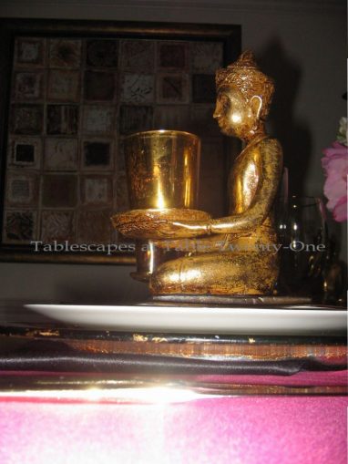 I had my eye on these Buddhas from the moment they hit the store shelves at Z Gallerie last year. I must have chewed half a pound of fingernails waiting for them to go on clearance, hoping there would be enough left over. Jackpot! Got all I needed at 75% off!!! Here they hold a gold mercury glass votive.
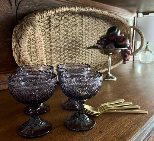
 My “old reliable” goldtone flatware works well here with its subtle pattern.
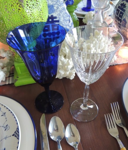
 I opted for crystal stemware with gold rims, but opaque black stemware like Mikasa’s “Elegance-Black” would work well, too.
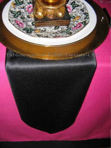 I felt the need to break up that searing hot pink surface a bit more. I achieved this by folding the black poly-cotton napkins from Bed Bath & Beyond into a long chevron and placing them beneath each setting, allowing them to extend downward over the pink linen.
 I almost always use either white or ivory candles, but I’m getting bolder in my old age! 😉 Long black tapers are set into a trio of 20″H goldtone candlesticks to add height and color down the table’s center.
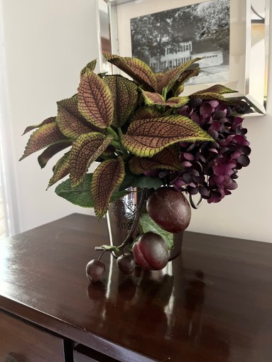
 Black powder-coated ginger jars hold a mix of pink peonies, white alstroemeria, and star blossoms. (Florals used here for demonstrative purposes are faux, but I encourage the use of natural flowers for actual entertaining. If, however, all natural flowers are out of your budgetary reach, try mixing realistic fauxs with fresh. The key there is realistic fauxs that blend well!)
 Lined up on each side of the centerpiece are four gold mercury glass votives to add ambient light at the lowest level.
 The notably restrained buffet decor is a giant black ginger jar flanked by a pair of the same F. Winkel & Co. plates as used on the table. Florals from the table are extended by simply plopping 3 peonies into a shallow black bowl.
2012 is the Year of the Dragon, so printed menus with the Chinese symbols for dragon – 龙年 – or a dragon watermark, or menus in the shape of a dragon would be another element to make this table special. Specialty stores may carry oversized ceramic dragons which would be a great addition, too! (Or go check out Grandma’s attic for them. These dragons, as well as panthers for some odd reason, were all the rage in contemporary 1960s homes.) A nice substitute for the peonies would be deep pink carnations, orchids or, depending on availability, pink plum blossom branches which symbolize luck. If your budget allows for it, rented bamboo chiavari chairs in black would be the crowning touch!
More tablescapes using hot pink on this site:
“Daisy Crazy“
“Hello, Dahlia“
“Let Them Eat Cake“
“Hollywood Fright Night“
Another tablescape using peonies:
“Peonies & Pearls“
Thank you for stopping in! I hope you’ll join me again this week at Susan’s place for Tablescape Thursday! You can also catch me at BeBetsy.com!