If it’s as hot where you are as it is here in the Kansas City, MO area, please know I empathize. Gee WHIZ, it’s scorching!!!!!🥵 I can’t entertain the notion of setting up outdoors as even the mornings are intolerably muggy. This is not what June is supposed to feel like! So I’ve been “monkeying around” in the dining room with blue and white with a dash of orange.
The inspiration for this tablescape came from a pair of lumbar pillows I bought last year from Sew Gracious. (I’m not compensated in any way for mentioning this or any other site. I just love to share!) So perfect for our dining room!!!
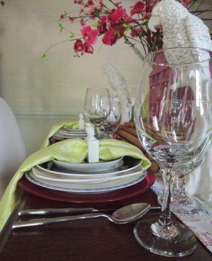
I started each place setting with an orange glass Bormioli Rocco charger and Kate Spade for Lenox “Rutherford Circle – Navy” plates and bowls. The Ralph Lauren “Mandarin” salad plate brings visual texture to the setting.
I bought these monkey napkin rings years ago at Z Gallerie. He looks as if he’s holding on to that napkin for dear life!😆
Nell Hill’s. I mean…!!! I LOVE that place! The planters I happed upon while one of the showroom designers was setting a table there are perfect! (Yes, I took them right off her assembly cart…with her kind permission, of course!) I found the pots of spiky greenery there at Nell Hill’s on another shopping trip and added faux agapanthus.
Monkeys and gold-tone planters from The Painted Sofa in Kansas City, Missouri’s West Bottoms shopping district. (Visited there over this past weekend. They are TEEMING with product, y’all!) The blue and white biscuit jars are from Nell Hill’s.
On the vitrine sits a Nell Hill’s blue and white foot tub filled with juicy oranges. The tub is surrounded by a trio of finial jars, a miniature vase, and a couple of ginger jars, also from Nell Hill’s.
If you’re as much a lover of blue and white or chinoiserie as I am and would like to see more of it on this blog, check out the posts below. And don’t forget to follow me on Instagram!
Bold color. That’s what late summer calls for. We’re broiling right now here in the Midwest, and it’s taking its toll on my beautiful flower beds. (Dear Mother Nature, Please take note: This is Missouri, not Hell!🔥🥵) So if crippling heat wants to suck the life out of what I’ve created outside, I guess I’ll just have to compensate inside!
Our dining room, awash with shades of white punctuated with blue most of this summer, has been taken over by bright hues of pink and green.
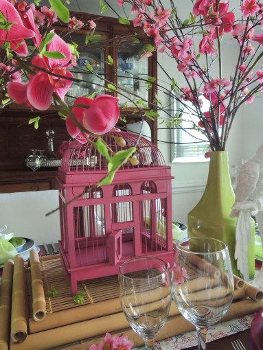
The inspiration for this tablescape came in part from this gorgeous custom pillow made by Sew Gracious Monograms on Etsy. A pink pagoda is right up my alley! Thanks, Pam!
The other part of the inspiration came from a pair of these GORGEOUS tea towels from Nell Hills in Kansas City, MO, fashioned into a table runner. Because our dining room is decorated in blue and white, the addition of pink and extension of blue via the fabulous pagodas in the runner and pillows is fabulous!
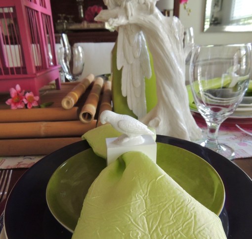
Each place setting starts with a hot pink Bormioli Rocco “Inca” glass charger, followed by a Ralph Lauren “Mandarin” dinner plate rimmed in blue, a square white B. Smith plate, a Kate Spade for Lenox “Rutherford – Navy” salad plate, and is topped off with a Granny Smith green Mikasa appetizer plate from their “Daylight” collection. Sleek stainless Hampton Forge bamboo flatware, a citrusy crushed silk napkin cinched with a Z Gallerie parrot napkin ring, and simple stemware round out the setting.
I went REALLY big and showy on the floral pieces using a mix of beautiful fauxs that tower above and around the painted pink birdcage that (somewhat) resembles a pagoda. To give the birdcage a larger presence, I perched it atop a stack of natural (to break up the profusion of color a bit) bamboo trays. Large white Z Gallerie parrots stand sentry in front of the floral arrangements.
This is a wonderful and welcome departure from the staid wash of white we have enjoyed the last couple of months. My way of easing into the deeper jewel tones of fall which is fast approaching.
Thank you for stopping in to visit! I appreciate it and welcome you to leave a comment if you wish. Have a glorious end of summer, and I hope to see you back here again soon. Meanwhile, if you would like to see other creations in pink and green on this blog:
This 4th of July (and always) I pray for peace, true freedom, liberty and justice for all souls on this earth.
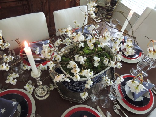
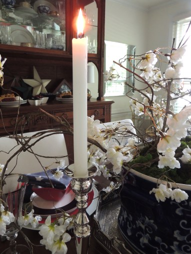
Placing the ceramic foot bath on a silver gallery tray adds another dimension and a bit of formality to the centerpiece.
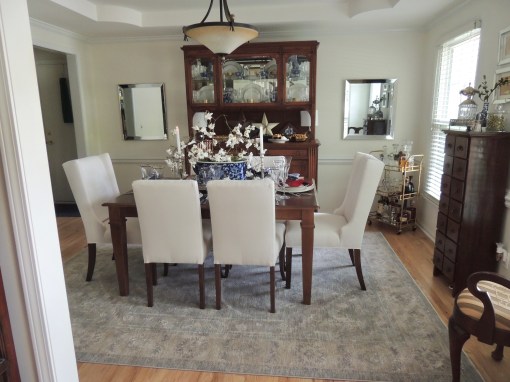
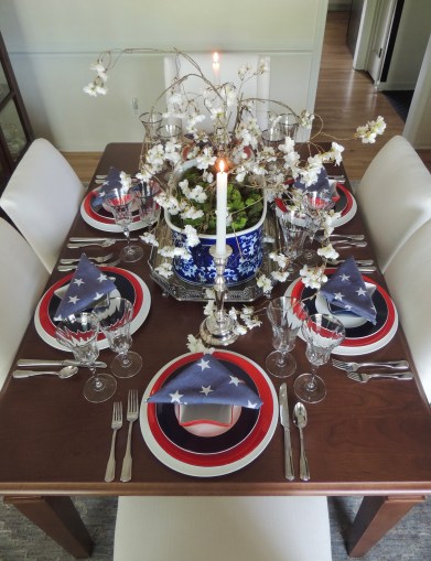
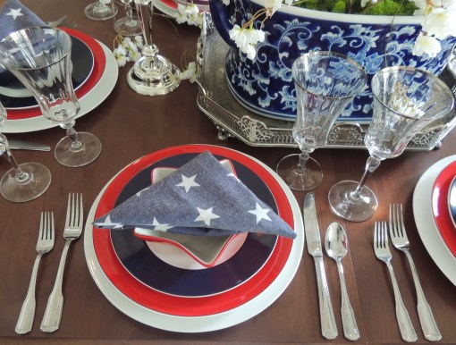
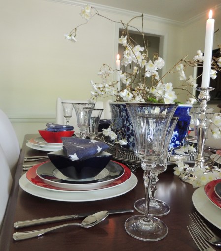
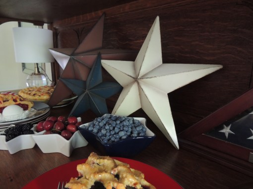
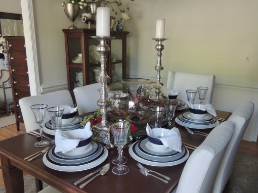
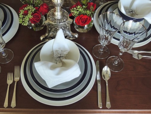
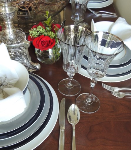
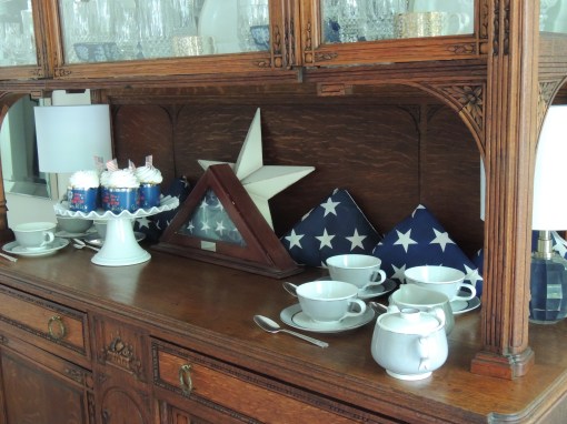
Kate Spade for Lenox “Rutherford Circle – Navy” salad plates and “Rutherford Circle – Red” dinner plates atop white ceramic chargers. A mix of alternating red and blue Pier 1 star shaped bowls and a star-studded napkin folded flag style round out the place setting. I first did this napkin fold for “4th of July – Coastal Style” back in 2014.
Hampton Silversmiths “Patriot” flatware.
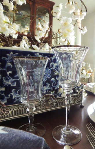
Mikasa “Jamestown Platinum” stemware.
Faux floral stems and blue & white chinoiserie foot bath from Nell Hill’s (Kansas City).
My Mother’s American flag is displayed on the vitrine in her honor.
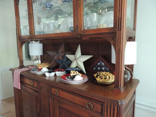
Don’t forget to share in the abundance of the season including fresh fruits and pies! My favorite: blueberry! What’s YOURS?!!
To see other patriotic tablescapes on this blog, just click below. Have a safe and happy 4th!
Juneteenth now has now established its place in history. With origins in Galveston, TX, it commemorates the emancipation of people enslaved right here on American soil as it simultaneously celebrates African American culture. Though not a part of the general American curriculum, it has been celebrated on June 19 of each year since 1866, and it has just been declared a federal holiday. African American history is AMERICAN HISTORY. While the colors of the Pan-African flag – red, black & green – have been more recently associated with Juneteenth, the official flag was red, white & blue as it declared that all previously enslaved American people and their descendants are indeed AMERICANS. Nothing less. The uniforms of the Civil War (1861-1865), fought in part over slavery in American society, eschewed both of these color schemes in favor of bluefor the Union (North) and grey for the Confederates (South). My celebration of Juneteenth, lest we forget, unites those uniform colors in harmony and embraces the red, white & blue that stands for ALL AMERICANS in the ongoing, often painfully elusive pursuit of “one nation under God” with “liberty and justice for all.”
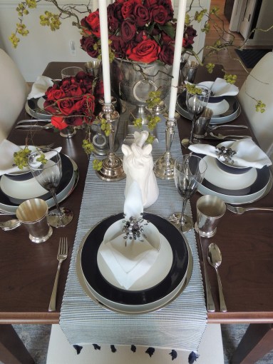
I paired my Mother’s beautiful light grey/white center/platinum rim Easterling “Majestic” china with the more contemporary Kate Spade for Lenox “Rutherford Circle Navy” pattern. I love the simplicity of both patterns that transcend time and levels of formality. To lean in the more formal direction this go round I used my Mom’s “Lady Esther” by Queen Esther silverplate flatware and my own Noritake “Spectrum” platinum-rimmed stemware. White ceramic chargers create a unified look around the table.
Crisp white hemstitch napkins are gathered with a floral starburst ring.
The centerpiece is made up of a silver reticulated gallery tray topped with a massive glass globe filled with curly willow branches that encircle a pair of American flags. (My first thought was that the branches represented the branches of our American government, but that got WAY too deep…even for me!🤔) Flanking the bowl are smaller glass globes filled with beautiful red roses from my friend/neighbor, Barbara, and a pair of tall, intricately engraved candlesticks. (That Barbara…she always knows how to cheer me up!🥰)
I absolutely LOVE these Kate Spade bowls! Classic and chic!
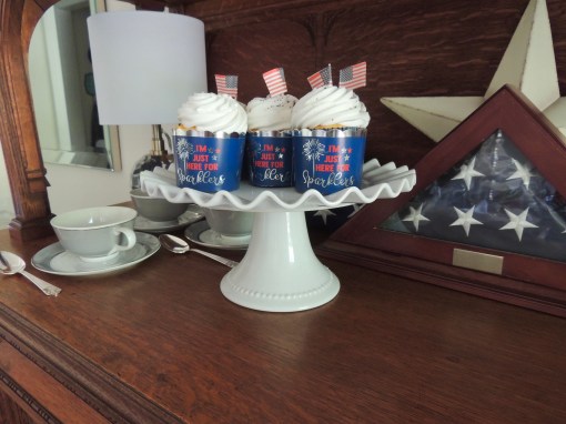
On the vitrine, coffee and dessert (I am LOVING all the cool new baking cups found at Home Goods/TJ Maxx/ Marshalls!!!) are served up in high Americana style. I ceremoniously fold and save every flag that we fly on our house, then dutifully drag them out each summer to put on display in our home. The one in the center was given to my Mom upon her retirement from the Missouri Senate.🇺🇸
If you’d like to see more patriotic tablescapes on this blog, check these out:
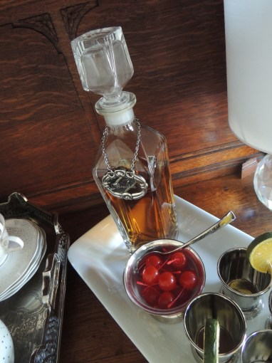
Can I just start with this?: BOURBON ROCKS🥃!!! Neat, up, or on the rocks…it ROCKS!!! Now on to our regularly scheduled program.
🏇Kentucky Derby 2021, No. 147 in the famed race history, is just a couple of short days away🏇!!! I’m putting my (fake!) money on Bourbonic because anything with the the word bourbon in it is a favorite of mine!
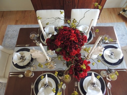
I’ve posted several Derby tablescapes over the years, but this one is a little less…mmmm, shall we say…over the top! No towering show horses in the middle of the table this time! Nonetheless, I hope you will enjoy and garner some ideas from this year’s installation. (And, yes, those are my long-awaited new chairs and area rug. Thank you for asking!)
The tablescape was built around a runner I found at Nell Hills that resembles a gentleman’s seersucker or pinstripe suit one might see at the Derby. I added Kate Spade for Lenox “Rutherford Circle Navy” dishes on gleaming nickelplate chargers along with the contemporary J.A. Henckels “Bellaserra” stainless flatware. Stemware from Pier 1 Imports (gosh, I miss their physical stores!!!) and the obligatory silver mint julep cup along with a hemstitch cotton napkin cinched with a Pier 1 napkin ring rounds out the place setting. I like these napkin rings in this setting because they mirror the mix of silver and aluminum elements on the table.
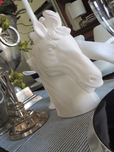
I’ve amassed a few of these wonderful aluminum “trophy” vessels over the year and find them great for decorating all around the house. Here they spill over with red roses and whatever these cool wispy, green, furry branches are that I found at The Painted Sofa and Very Violet Boutique. I have a collection of horse-related decor because I live in Longview Farm, a subdivision where a famed horse farm once stood. These probably came from Home Goods some years ago. Tall metal case candles in staggered heights (am I the only one besides the church that still uses these?) tower above.
Dessert – a very Southern red velvet layer cake – and a whiskey sour station using miniature julep cups are set up on the vitrine behind the dining table. I’ve “had to” taste a lot of bourbon these past couple of weeks to decide which would be best for the mint juleps (Knob Creek 9 Year Single Barrel won in this category) and which for the sours (Old Forester Kentucky Straight by a nose over Elijah Craig Small Batch!).
If you’d like to check out other Kentucky Derby posts on this site (or posts that would be suitable for it if you just make a few tweaks), click on the link below!