Autumn White Wedding

I recently received a request for ideas on an autumn wedding. Not that I have anything against fall colors, but sometimes it’s fun to march to the beat of your own drum. Try instead an autumn rehearsal dinner, bridal shower or wedding reception using the more unlikely colors of white, cream and chartreuse with touches of earthy brown for good measure. (For more wedding table ideas click here!)

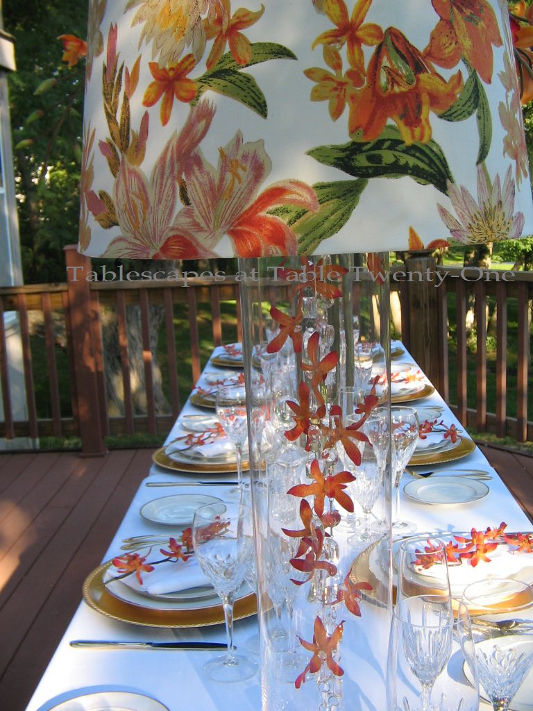
If the weather is still warm enough in fall to do an outdoor wedding event, go for it! When you set up outdoors, the sky is the limit where your decorating options are concerned!!!

A full-length ivory table linen is topped with a satiny brown runner to add color and dimension to the tabletop. The place settings are fairly traditional with glossy silver chargers and ivory dishware from TJ Maxx. (One huge no-no is to use items that will upstage the reception decor on “The Big Day.”)

The napkin (Bed Bath & Beyond) is very simply folded across the dinner plate and tucked beneath. A white mini pumpkin is centered on each napkin. While a faux pumpkin is used for this sample setting, I suggest using the real thing. Mini pumpkins can be purchased at the grocer this time of year for around 50 cents apiece, and they make a great little take-home gift. (Or you can take the leftover pumpkins to bling them up and use them in a fall arrangement like here.) If you know a calligrapher or someone with exceptional handwriting skills, ask them to pen the names of each guest onto the pumpkins! Cooler yet….have them inscribe the monogram of each guest. That’s really different and kinda fancy to boot! 🙂

Keep the flatware along the same line of formality as the rest of the setting. The design on this flatware is similar to the pattern on the rim of the dinner plate. I went with Cristal d’Arques “Longchamps” crystal that offers a lot of bang for your buck.

Long tables offer an opportunity to do so many cool things with the centerpiece!
A mix of high and low arrangements fill out this 12-ft. table. For even longer tables (so cool to see 18-, 24-, or even 36-ft. tables!!!), add more high ones to balance it out. For this table, I used a little wrought iron number I bought earlier this year. It’s reversible…or at least I made it that way by accident! Lesson learned? Play with your toys…don’t just use them the way they were displayed at the store!!!

This is the way it’s used here, but it’s actually upside down and missing some parts!

This is how it’s supposed to look. I finally figured out what all those “extra” mystery pieces were for!

I outfitted the top of the centerpiece with a grapevine wreath bought at Hobby Lobby. I secured it with  floral wire. Next came lots and lots of flowers including chartreuse and creamy white hydrangea, white roses, and a few orchid blooms. (Sprigs of green hypericum berries, unripened coffee beans or unripened raspberries would really look slick and add more texture, too!) Hydrangea quickly wilts, so the trick is to put the water vial on the end of the floral stem immediately AFTER it is inserted into the wreath so it doesn’t wiggle loose. (Took me half the doggone wreath to figure that one out! :-() Use floral tape to secure the vials to the twigs so they don’t poke out or fall off during dinner…which would be highly embarrassing! Tuck in bits of fabulously bright chartreuse reindeer moss to help hide the mechanics of your arrangement, and finish it off with a plump white pumpkin. (Hint: When you go wreath and pumpkin shopping, take the centerpiece you’ll be working with along to make sure the wreath is the right size and that the pumpkin won’t overwhelm or topple it.)

The ugly little spindly legs on the bottom part of the centerpiece are camouflaged with mounds of florals accented with reindeer moss and a white mini pumpkin.

A mini pumpkin rests comfortably on a cushy bed of reindeer moss. I like the moss to look a little bit messy as nature would have it.

The side globes hold a single orchid bloom atop more reindeer moss.

The smaller components of the extended centerpiece correspond with the main piece. Iron candlesticks with fat pillar candles are flanked by small rose-filled globes stuffed with reindeer moss to keep a consistent look.

This same concept could easily apply to a winter wedding by swapping out the pumpkins with oversized ornaments. The look also works well indoors so long as the height of the centerpiece doesn’t interfere with overhead lighting, fans, etc.

I’m hooking up with my pals at Susan’s Between Naps on the Porch for Tablescape Thursday again this week. If you’ve never visited, you really must! Lots of talent out there!!!

A special shout out and great big thank you to Angie over at Echoes of Laughter who helped me figure out how to get rid of the bothersome “no reply” feature when I leave comments on other blogs. Teamwork paid off!!!

Breast Cancer Awareness Luncheon

Finally! After months of “entertaining drought” I finally got the chance to do something at home again!!! Thanks to two dear friends who so generously provided all the food and libations, I was able to host my most cherished annual
Breast Cancer Awareness Luncheon.

This is always a very intimate event, but one of the very biggest in my heart as the same friends gather each year to celebrate the battle won for one of us.

Again this year we dined out on the deck, basking in the sunny warmth of a perfect 72 degree autumn day.

A generous layering of brown, pink and white linens is the starting point.
I chose to use an 85″ x 85″ square top layer over the round ones beneath to provide a little more visual interest.


Glossy silverplate chargers are topped with deep chocolate brown and white silver-rimmed “Delfina” china from Z Gallerie. (Click here and view “Just Us Girls” to see this china used in another pink, brown & white tablescape.)

Soft pink cotton napkins are fashioned into replicas of the much-recognized pink ribbon that is the international symbol for breast cancer awareness.

Godinger “Dublin” highball glasses are used to serve pink lemonade, while two Cristal D’arques goblets await wines served with the appetizer and entrée.

“Royal Danish” sterling silver flatware.

Pink organza bags of Good & Plenty licorice candies are a sweet treat for each guest.

I used an adjustable height bust form from my dressing room as the foundation for the centerpiece.
I chose to keep her uncovered so as to “expose” us all to breast cancer awareness.

A fragrant combination of fresh roses, hydrangea and Gerbera daisies along with some faux pink wisteria creates a dramatic “head” on the bust form centerpiece that symbolizes flowery, upbeat thoughts! (I wired together the flowers, then just removed the bust form’s cap and stuck the stems down the neck. Easy peasy!)

As many ladies do for luncheon, this bust form is adorned in a triple strand of pearls. The necklace peeks out from beneath a pink ribbon arranged to mimic the international symbol.

Clumps of fresh and faux flowers are arranged on a large silver tray at the bust form’s foot.

To bring a touch of autumn to the table, I bought 4 mini pumpkins from the local grocer (just $.50 each) and spray painted them in Krylon’s “Ballet Slipper.” After a day of drying, I painstakingly (and I do mean painstakingly!!! :-() blinged out the pumpkins by adding tiny pearlescent beads purchased at Hobby Lobby. I used clear Elmer’s Glue for those on top and a great little newly discovered product called Zap-A-Gap on the sides. (I strongly recommend wearing gloves when working with this stuff. Even nail polish remover wouldn’t get it off my fingers!!!)

A small side table dressed in pure white linen offered sweet pink lemonade on a silver tray and two kinds of chocolate dessert cookies on silver beaded edge pedestal trays. A diminutive bouquet of pink roses and a Gerbera daisy was arranged in a tiny Mikasa “Petit Points” crystal vase.

After the luncheon, each guest went home with a pumpkin and this note to remind her to get that all-important mammogram. Additional bling pumpkins were delivered a few days later to beloved neighbors.

Please be sure to schedule that yearly mammogram, ladies! (Guys, encourage the women in your life to go! And as for you fellas, uh….prostate check!!!) It could be – as with my friend who was diagnosed early – a true matter of life and death.
Choose life. Get that mammogram!

More tablescapes on this site using shades of pink that could serve to honor Breast Cancer survivors:
Showered in Pink
Pinky Peter Cottontail
Pleasant Under Glassgo to page & scroll down
Au Revoirgo to page & scroll down
Coming Up Rosesgo to page & scroll down
Just Us Girls
Tea Rosesgo to page & scroll down
Princess Pink Birthday Dinner
Pink Plaid & Posies
Peonies & Pearls
Blushing Bridal Shower
Pretty In Pinkgo to page & scroll down
Peony Power

Join us, won’t you, for Tablescape Thursday at Between Naps on the Porch and Bev’s “Pink Saturday” at How Sweet the Sound! And don’t forget to check us out on BeBetsy.com!!

Blessings, thanks, peace & love to Liz at Infuse With Liz
for helping me to spread the word!

Raining Orchids

Yes, I am going to be stubborn about this. SUMMER IS NOT OVER YET!!! Temperatures have cooled from the horrific triple digits in most parts of the United States to something that feels like autumn, but I assure you it is temporary. It’s a fluke. A hiccup. An anomaly. The autumnal equinox doesn’t start until September 23 for countries in the Northern Hemisphere, so for the next two weeks I’m going to party like it’s 1999!!!

"Raining Orchids" - Tablescapes at Table Twenty-One, www.tabletwentyone.wordpress.com

The one concession in my quest to savor the last days of summer will be a move toward deeper colored flowers. A profusion of richly hued orchids (accented with Asiatic lilies on the lamps) are the star of this September/late summer tablescape.

"Raining Orchids" - Tablescapes at Table Twenty-One, www.tabletwentyone.wordpress.com

I decided to go with relatively simple pieces down low on the table to allow the higher pieces to fully shine. Standard white full-length poly-cotton table linens are topped with braided edge gold chargers. The gold-banded white china here is from Pier 1.

"Raining Orchids" - Tablescapes at Table Twenty-One, www.tabletwentyone.wordpress.comThe white cotton monogrammed napkins are laid upon the plates with a simple fold. Each is topped with a stem of orchids. Because my wallet is lighter than usual these days and this is a demo table, faux orchids are used here. I would, however, recommend the real deal for guests. Orchids can last for hours and hours out of water under temperate conditions.

Bright gold flatware with a barely there pattern is right in line with the simple design.

"Raining Orchids" - Tablescapes at Table Twenty-One, www.tabletwentyone.wordpress.com

The stemware is from Godinger’s “Chelsea” collection. I tend to serve a lot of beverages before, during and after dinner, so my table is almost always loaded down with various drinking vessels. Clusters of gleaming crystal always looks great!

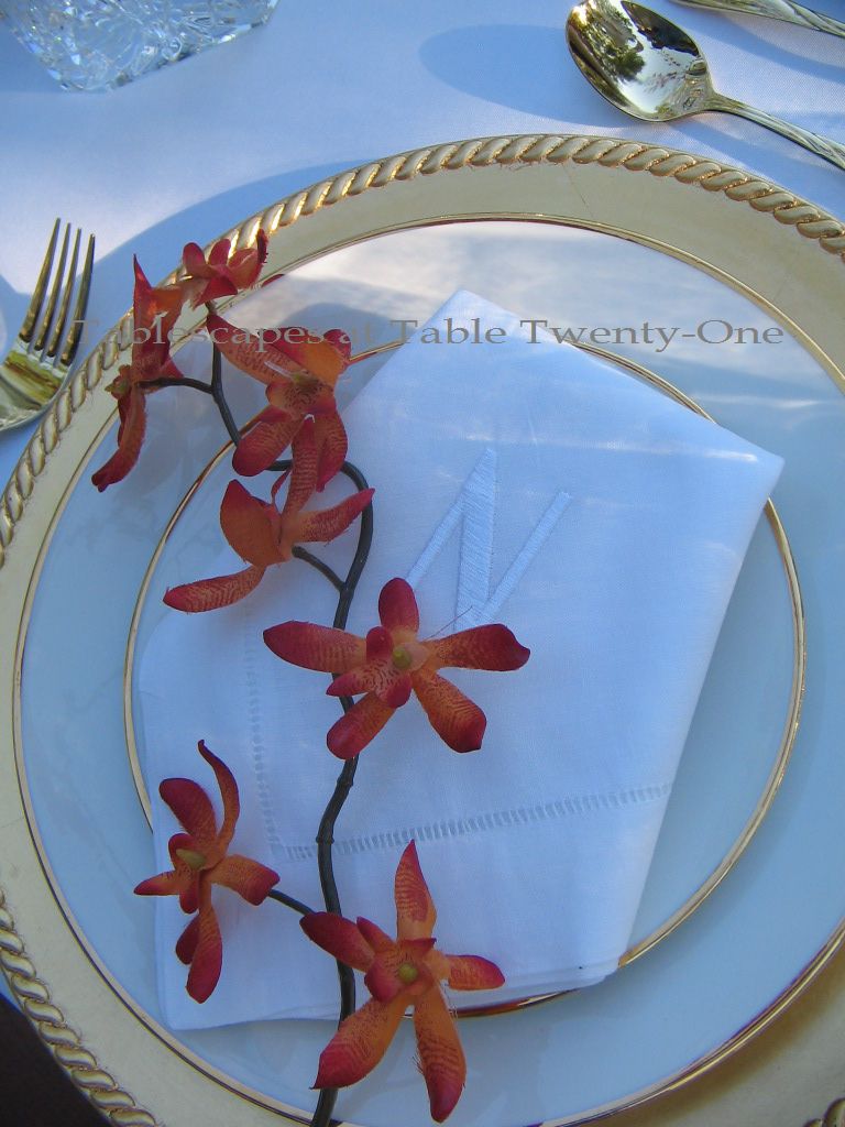
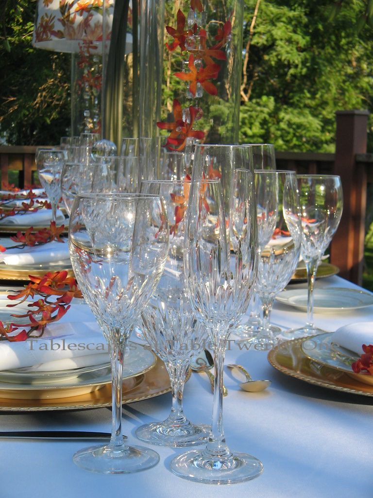
Crystal decanters filled with the spirit-du-jour always look pretty. These were a great buy from Tuesday Morning.

The center floral on this 12-ft. long table is a glass cylinder filled with 6-ft.H orchid stems. I arranged the stems to appear to be “raining” over the center of the table. (Click here and scroll down to “Autumn Orchids” to see another way to use these super tall orchid stems in glass cylinders!)

"Raining Orchids" - Tablescapes at Table Twenty-One, www.tabletwentyone.wordpress.com

"Raining Orchids" -I am a big fan of bringing the indoors out for a little air. Almost everything you love inside your house will look twice as great outside! These lampshades are from our dining room where the palette is predominantly orange.

The lamp base here is constructed of a simple clear glass 31″H cylinder. (Glass cylinders can be your very best friend!! Click here and scroll down to “Love and Orchids” for another great glass cylinder & orchid combo!))

"Raining Orchids" - Tablescapes at Table Twenty-One, www.tabletwentyone.wordpress.com
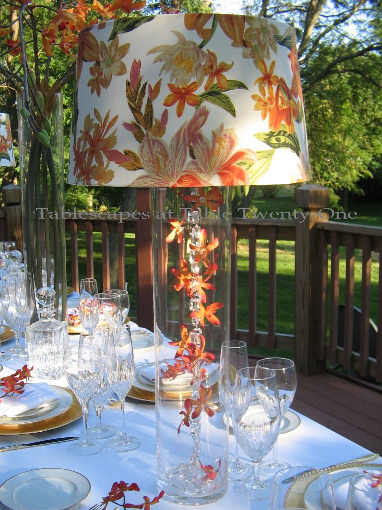
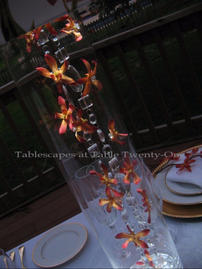
Suspended from the lampshade frame and “raining” into the glass cylinder are garlands of bling along with silk orchids sewn onto fishing wire. I hot glued a rhinestone to the center of each bloom to give it a little more “oomph!” and amp up the sparkle within the glass base.

"Raining Orchids" -This offers a glimpse as to how the lamp looks in pitch darkness. I used an uplight turned upside down to project light downward into the glass cylinder. Click here or on the Table Tips tab above, and scroll to Tip #29 to see how this lamp is constructed for this total effect. (For more candle lamps on this site, see “All A’Bloom for Spring“, “Should Have Put a Ring On It“, “It’s All About Me!“, and “Just Us Girls“.)

Join me at Susan’s place, Between Naps on the Porch” for Tablescape Thursday!

Just Us Girls

This week’s post is of a quiet, simple dinner for “Just Us Girls” when we want to relax, unwind, jibber-jabber, and have a good time in an elegant setting with minimal fuss. I hope you enjoy its simplicity.

Getting together with “the girls” is always fun. I have such a good time with them just relaxing, rehashing old stories from days gone by, and dreaming about the future. No better way to do that than over a hot meal in a quiet, relaxed atmosphere. Music for tonight: Soundtracks from “First Wives Club” and “Something’s Gotta Give”, a little Billie Holliday, and Patsy Cline.


Soft pink and velvety rich chocolate brown on a white background is the color scheme. It is a little on the contemporary side. A large round mirror anchors each place setting. Next comes a silver beaded edge charger. Then my favorite…fabulous glossy chocolate brown and white “Delfina” dishes with a silver rim from Z Gallerie! How I longed for these dishes!!! I was finally able to buy them a few months ago. They are classically clean-looking without fussy adornment. I love them! The rim of the Mikasa “Jamestown Platinum” stemware is a perfect match. The menus – generated on my home computer – are a brown underlay and a soft pink vellum overlay with pink velvet ribbon.


A peek at the plate. A bit difficult to pick up on the actual color, but believe me…to die for!!!


Keeping with the contemporary look, I chose these unusually shaped silver napkin rings. They remind me of a gentleman’s cuff link. Very snazzy!

The curvy J.A. Henckels “Bellaserra” stainless mimics the lines of the napkin ring. I love the way the knife sits on its edge.

The centerpiece is kept simple and streamlined. Pairs of clear oyster votive cups punctuate the “lamps” made of clear glass pilsner vases topped with a squared off bell shade in chocolate brown (from Walmart!). Click here and scroll down to Tip #21 see how the lamps were put together. While it is not completely evident from these photos, I must share with you a little secret: When using a clear lamp base such as this, try turning the LED votive used for illumination upside down. In doing so, you illuminate the shade and cast the light down into the glass which looks so cool!!! While I used white for this tablescape, it’s even cooler if you use a colored LED votive!  Try it and see what it does for the lamp and your adjacent florals! (For more candle lamps on this site, seeRaining Orchids“, “All A’Bloom In Pink for Spring“, “Should Have Put a Ring On It“, and “It’s All About Me!“.)

The contemporary look and feel is completed by a mass grouping of petal pink calla lilies in a simple clear glass vase. Nestled between the taller lamps, it brings a soft dash of color to the table.


Other pink & brown tablescapes on this site include:
Chocolate Traditional
Au Revoir!
Breast Cancer Awareness Luncheon


Be sure to check out the newest Table Twenty-One Table Tip, too! Coincidentally, it’s #21 on the tip page! Click here to find it or on the “Table Tips” tab above. Once on the page, just scroll down to Tip #21!

  Remember to check out my other tablescaping pals at Between Naps on the Porch for more tabletop ideas!

I am joining Susan and the bunch at Between Naps on the Porch for Tablescape Thursday.

Fete Noir et Gris


I was so taken with the black and white components of last week’s table! So when I volunteered to host an intimate dinner for friends who are running off to New Orleans to get married, I thought I’d use those colors again, this time infused with silvery gray. (Seriously, though…do you really “run off to get married” in your 50s? I’m in my 50s, and it would be more like “leisurely strolling off”…or “limping off.” I actually added the silvery gray to complement our hair color!) 😉  This time the colors are paired with more upscale china, stemware, flatware and other decorative accoutrement. I hope you like it!


There’s just something about decorating with black and white that renders such a profound sense of elegance! Adding touches of gray or pewter or slate seem to make it that much more so.


My sister’s classic Noritake “Whitebrook” china is always a lovely start to conveying formality and tradition. The china is set atop a double layer of chargers – one beaded silver and the other a rhinestone-studded white. Against the black of the table linen, the dishes really stand out. My favorite International Silver “Royal Danish” sterling flatware always looks great on a formal dining table.


When setting a formal dining table, I tend to forego fancy napkin folds and just go with something fairly staid. Adding a sheer silver organza beneath the black adds a bit of flair. The clustered dragon tear napkin rings add a bit more shine without going too far overboard.


These “Bella” wine stems from Z Gallerie are fast becoming a new favorite! The top color reminds me of the color of mercury in the old maximum thermometers. Very sultry!


Each person’s place is marked with a faux mother-of-pearl and rhinestone frame.


Million star gypsophila (a.k.a. “baby’s breath”) makes an airy, elegant statement in this ornately carved silver floral vessel. Baby’s breath floral arrangements are really quite striking and very easy to assemble using floral foam to keep them well-hydrated. (See this silver piece used again at “Rhapsody In Blue.)


I found this fabulous “Josephine” table runner in velvety soft pewter at Z Gallerie. I love the gentle scrolling.


The table’s look is finished off with a couple of “lamps” which are actually tall silver candlesticks with ornately beaded shades from….drumroll!…Old Time Pottery!!!  The shade design elements complement the place card frames. The lamps are illuminated using LED votive candles on a follower. (Tip #20)

Other tablescapes on this site using baby’s breath:
Shake, Rattle & Roll ‘Em!
Princess Pink Birthday Dinner
Ideas For Throwing A Winter Dessert Party

This would also make a great New Year’s Eve tablescape!!!

I’m teaming up again with Susan and the other tablescapers at Between Naps on the Porch for Tablescape Thursdays. After perusing my photos, you’re invited to join us there!

Home of the Lions!

This past week was such an emotionally difficult one with the passing of my dear friend, Delia Young. To the rescue were our dear friends who moved from Kansas City to the Detroit, Michigan area a couple of years ago! Ramon and I stepped on a plane bound for Michigan on Friday morning…no small feat as I am terrified of flying. There was no way, however, I would have missed out on visiting with our very special and incredibly gracious hosts…even if it meant I had to fly to get there!


The special treatment started at the front entry of their lovely lakeside home (above). It just got more and more special as we were treated to an inspired tablescape created by our hostess, Rene, to herald our arrival and declare the team spirit that runs deep.


Rene put her creativity to work to put together this incredible tablescape to get Ramon and me into the Lions spirit for the Sunday game!

The team colors of Honolulu blue, silver, black and white were all incorporated into the imaginative place settings with the placemats, team napkins and helmets, and chargers.

The cute miniature cars pay homage to both the Ford Motor Company which is headquartered in Dearborn, a suburb of Detroit, Michigan, AND to my sweet hubby who is a plant doctor at the Ford Assembly Plant in Missouri.

Rene thought of absolutely everything when putting this tablescape together, including this hilarious depiction of the Lions crushing the New York Jets!!! She and her imaginative friend, Karen, conspired to create the ultimate centerpiece with this bronze-come-silver lion. They actually came up with the brilliant idea to dust the bronze lion with silver cake dust to sync with the Lions’ official colors!!! Is that not the greatest??!?!?!!

The menu included a feast fit for a King of the Jungle! (I actually turned down dessert at one of the city’s toniest restaurants to get back home to Rene’s pear upside-down cake!)

Rene thought of everything! The Beef Wellington even had a puff pastry “L” for Lions on it! (This was her first attempt at Beef Wellington, but had I not seen her prepare it with my own eyes, I would have sworn it was catered! Magnificent!!!) For the record, I officially gained 4 pounds from Rene’s wonderful cooking over the three days we were there!

Our lovely and very thoughtful hostess surveys her handiwork.

Ramon and I are still staunch Kansas City Chiefs fans (forever!!!), but thanks to our gracious hosts we have a special place in our hearts for the Motor City and home of the Lions!

Other sports-themed posts on this blog include:
Hometown Pride – Kansas City Chiefs
The 19th Hole – Golf & Forever Love
Boys of Summer
Football Tablescape – Kansas City Chiefs In the Red Zone

I am so happy to share my thoughtful friend’s creation with everyone who visits my blog and that of the Style Sisters’ Centerpiece Wednesday and Susan’s Tablescape Thursdays! Enjoy!!!

Centerpiece Wednesdays ButtonBetween Naps On The Porch

Au Revoir!

I can only live vicariously through others since I have such a profound fear of flying. Thank goodness I have lots of friends and family who are ready and willing to hop on a big metal bird at the drop of a hat! Their adventures become my adventures, and this time is no different. As our pals head across the ocean to Paris, France, they can reminisce about the bon voyage dinner held in their honor. And as they wine & dine in the great restaurants, they can giggle about my lame attempt at recreating the fine cuisine.

I am a pink freak, so it’s always exciting to do a table for someone else who shares that passion.

I always knew this “Eiffel Tower” would come in handy for something! As my globetrotting friends set out on yet another wonderful cross-Atlantic adventure, we said goodbye with a dinner featuring tidbits of decor and cuisine they will likely encounter in “gay Paree!”


We have said au revoir to summer here in the Midwest, but the outdoor temperatures belie that fact with daytime highs in the 70s and 80s. So to bring in a bit of autumn and tone down the pink a bit, I used chocolate as the base color for this tablescape.

Atop the creamy chocolate table linen are gleaming silver chargers & flatware to keep the brown from washing out and looking so flat. A plain, creamy earthenware with a decorative rim was used to show off the food.

Menu and napkin

I created the fun little menus on my computer using cardstock and fleur de lis brads from Hobby Lobby. The pink toile scenes reminded me of the French countryside in a time when men and women actually strived to be described as “genteel.” The fun font I used reminded me of the font used on the posters promoting the 1958 movie “Gigi”, set in turn-of-the-20th century Paris.

I recently bought another book on napkin folding. (Shh! Don’t tell my husband!) This cute little fold looks like a “petit pain.” (Translation: bun.) It was a lot easier to create than I thought it would be and looked really sweet at the top of each plate. (Check out the “Books That Make You Go “Ooh!” tab at the top of the page for more information “Napkins With a Twist” by David Stark.) For a complete tutorial on how to create this napkin fold, click HERE and scroll to Tip #33. To see other posts on this site using the rosebud napkin fold, see “Cupcake Colors”, “Springtime in Paris Mother’s Day Buffet” and “Mother’s Day Luncheon in Pink”.

This night was a little warm, and that just brought the sweet smell of these pretty posies to the fore. Wonderful! I chose roses and carnations because they are so pretty together, and the variation in the depth of pink in the roses was interesting. Both were clipped within an inch of their little lives to create the mounding effect at the bottom of the tower and to float in the clear oyster votive cups. Stray rose petals helped to fill out the look.

To add just a bit of height and visual interest on the outside of the tower, I arranged the roses and carnations in clear vessels with a just a teensy bit of greenery.

What’s an evening celebration without a barrage of candles, especially when the honorees’ destination is the city most commonly referred to as La Ville-Lumiere (City of Light). The background music included a little Celine Dion, Eartha Kitt, and the soundtrack from “Something’s Gotta Give” (one of my all-time favorite movies!)

For other Parisian-themed posts:
Springtime in Paris
Patisserie de Paris
French Poodle

Other pretty pink tablescapes on this site include:
Peaceful Peonies
Days of Wine & Roses
Peonies & Pearls
Chocolate Traditional
Platinum & Pink Valentine
Blushing Bridal Shower
Easter Floral
Easter Bloom
Pink Plaid & Posies
All A’Bloom In Pink For Spring
Pretty In Pink
Showered In Pink
Easter In Pink & Grey
Peony Power
Fairy Princess Party
Fairy Tale Wedding Shower
Blurred Lines With Shades of Pink
Tea Roses
Breast Cancer Awareness Month
Pretty In Pink, Wicked In Spurs – Breast Cancer Awareness
Bald Is Beautiful – Breast Cancer Awareness
Pink & Purple Chocolate Christmas

Please pardon my French, but I am plein de joie to once again be a part of the Style Sisters’ Centerpiece Wednesdays and Susan’s Tablescape Thursdays.

Centerpiece Wednesdays Button

Tablescape Inspiration, Click to View

Simply Bittersweet

I can’t believe I’m saying this, but I am glad fall has arrived! I so enjoy entertaining in summer, but there’s just something about fall that can’t be beat. Probably something to do with the rich colors and fragrant, warm food!

With the chill of the season in the air, I’m entertaining outside less and less now. I’ve invited a few friends over for a casual dinner and a sappy movie. Nothing fancy, just pure fun tonight! I fashioned the main part of the extended centerpiece to mimic something I recently saw in a Pottery Barn circular. Quick, simple, speaks to the season. The addition of the smaller hurricanes lends more presence to the overall centerpiece. Votives add another level of light.


These multi-hued placemats from Pier 1 are among my fall favorites. The chocolate brown acrylic chargers are from Target and the bone colored 10 Strawberry Street stoneware plates were a bargain at Tuesday Morning. I went all European and did the French treatment on the flatware placement (tines and bowls down) even without a fancy monogram to show off!


Look  closely and you’ll see that the cotton napkins from Pier 1 are two-toned! I separated one color from the other with a fun wooden pumpkin napkin ring, also from Pier 1. I kept the fan fold of the napkin a bit more relaxed to match the feel of the evening.


Pier 1 sold this fabulous stemware a couple of years back, and I just can’t get enough of it! Each piece is so sturdy, and the wave of contrasting colors is very pleasing to the eye. The orange, cream and brown fit perfectly into my dining room color scheme. Gotta run! My popovers are done! Have a wonderful weekend everyone!!!

A few other autumn tablescapes you might like to visit on this site:
Casual Fall Harvest Dinner
September Harvest Breakfast
Pumpkins & Peacocks
Wondrous Wheat
Pheasants & Peacocks
Best Laid Plans
Serape High Style
Sunflower Simple
Raining Orchids
September Wine
Autumn Blues


I am delighted once again to share in this Tablescape Thursday with Susan and all my friends at Between Naps on the Porch. If you want to enjoy lots of fabulous tablescapes, hop on over there (after looking here, of course!) to see the work of people from all around the world! Just click on the link to your right.