Autumn In Cactus Country

My good friend (since 6th grade!), Monica, was recently swept away from the Kansas City area to Arizona. Arizona??!?!??!? We’re Midwestern girls! We don’t know anything about ARIZONA!!! We’re used to perceptible changes of seasons, with autumn (next to Christmas, of course) being at the top of our decorating list! We know that spring means pastels, summer means ice cream colors, winter means Chiefs red, and fall means russet, burgundy, deep greens and orange. Lots and lots of orange! What in heaven’s name is a Missouri transplant to do for fall in Arizona??!???!

Asked and answered on a recent “Better Kansas City” segment! This 2-1/2 minute clip includes four different autumn tablescaping palettes I think you’ll enjoy!

One way to bring the season to your table in climes where warm colors can overpower and autumn leaves simply don’t exist is to use white and pastel pumpkins along with lots of succulents.


While the palette is predominantly white, it’s the accompanying elements that lend to the fall feeling. Notice the use of translucent stemware and votive holders that keep the table light. The Home Essentials Antique White dishes, faux mother of pearl flatware, napkins…all in the white family but not the exact tone to add subtle variety.


Tucked among the varied sizes of white pumpkins are chicks & hens, jelly bean plants, echeveria, agave and seeded eucalyptus. The greens and burgundy in the succulents are a deliberate nod to the season and keep the tablescape from becoming too austere.


While standard votives would look perfectly fine with this vignette, I chose these cylindrical ones from Pier 1 to add just a teensy bit of height. It’s already hot in Arizona, so just a few for ambience!


The dining table is loaded with decor, so I elected to keep the buffet behind it sparse. The clay pots I chose for these flowing succulents remind me of a weathered adobe home with its pinkish tones.

The elements used in this tablescape could be applied all around the house for light, airy, fresh fall decorating in southwestern U.S. states like Arizona, New Mexico, Nevada and Oklahoma, and in parts of California, Utah, Texas, and Colorado as well as in Mexico.

Without question this was one of the most fun challenges ever! Monica, I hope this helps! Michael, I still don’t forgive you for taking Monica away! 😉

Other tablescapes on this site from this
“Better Kansas City” show clip:

Autumn Chinoiserie
(others soon to come!)

Other tablescapes on this site
using white pumpkins for fall:

Thanksgiving 2010
Autumn White Wedding
Finally Fall
Over the River and Through the Woods

Another tablescape suitable for fall
using succulents (and sunflowers!):

Cinco de Mayo Simply Done

I’m linking up this week for the first time to “Dishing It & Digging It” and the “Share Your Style” blog party where you can see all kinds of talent in the blog world!

Butterfly Bleu – The Grand Resurgence of Melamine

In a recent segment of “Better Kansas City” (my first appearance back on the show after a 7-month absence for my stupid spine surgery) I talked about the joys of the new melamine dishware that has flooded the market in recent years. One thing for certain: this ain’t your mama’s melamine!

Our back deck sets the scene for this sweet little table for four decked in a 108-inch round ivory tablecloth and surrounded by banquet chairs with ivory Spandex covers from LinenTablecloth.com.


Each place setting starts with a double layer of chargers that picks up key colors in the salad plate including a sapphire blue metal from Pier 1 (first used in the post “Simply Peacock Garden” in 2014) topped with a chocolate brown Baroque-style (also used in “Pheasants & Pumpkins” back in 2014) from Hobby Lobby. I’ve discussed in prior posts how using more than one charger can add interest to the place setting via design, texture, shape and color. The dinner plate is Home Essentials Antique White, a popular staple around the tablescaping blog world.


I found the blue compotes at Old Time Pottery way back in 2010 and have only used them a couple of times. Shame on me! The salad plate – my inspiration for this tablescape – is a sweet melamine by TarHong with impressive blue butterflies and an additional carte postale design. A far cry from the drab melamine of the 1960s! The faux mother of pearl flatware is from Target.


I recently picked up this beautiful Aurora Blue stemware by Qualia at Home Goods. It perfectly complements the clear glass stemware I purchased at a moving sale some years ago (also seen in “Something Blue Bridal Luncheon“). Ivory cloth napkins are cinched with a blue acrylic napkin ring, tucked into the stemware, and embellished with a blue butterfly to further complement the salad plates.


The hefty centerpiece, heightened by a rosewood Chinese pot stand, is made up of a tangle of greenery mixed with blue hydrangea, ivory roses, alstroemeria and hypericum berries finished off with eryngium blue thistle.

I’m not around as much these days as I’m taking LOTS of time out of each day getting healthy: walking 5-7 miles a day, spinning on my recumbent bike, working out with small weights, preparing fresh meals from scratch…all the things that will help my spine get (and hopefully stay!) strong and lose the “surgery weight.” I’m peeking in on you, and I’m so glad you peeked in on me today. Have a great week ahead!

Other posts on this site with butterflies include:
Float Like A Butterfly
Grazin’ In the Grass
Spring Into Easter
Patisserie de Paris
Butterfly Kaleidoscope
Spring Has Sprung
Mother’s Day Brunch
Purple For Spring
Showered In Pink
Going Green For Spring

If you’d like to see other posts on this site using double chargers, check these out:
Proud As A Peacock!
Fete Noir et Gris
Princess Pink Birthday Dinner
Year of the Rabbit
Copper Zen
Cranberry Christmas
Christmas Progressive Dinner
Get Me To the Church on Time
Let It Snow!
Winter Cardinal
Pumpkins & Peacocks
Mardi Gras Lite
French Poodle
Hooray For Vodka!
Clematis & Hyacinth
Rhapsody In Blue

Rhapsody In Blue

RHAPSODY IN BLUE
(a re-post from September 2010)

I treated a couple to a post-nuptial luncheon in our home to celebrate their union. A smattering of “diamonds” brings glitz & sparkle to the wedding tablescape.

 Bursts of bright green play nicely off the bride’s chosen colors of French blue & white. Granny Smith apples and juicy green grapes are surrounded by green button mums, spider mums, pink waxflower, Queen Anne’s lace, viburnum, and fragrant Stargazer lilies all spilling from a silver pedestal bowl. The main piece is flanked with green grapes atop simple silver pedestals.
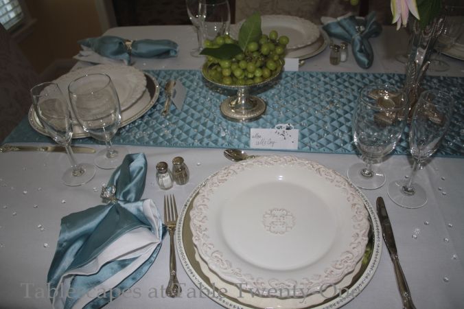
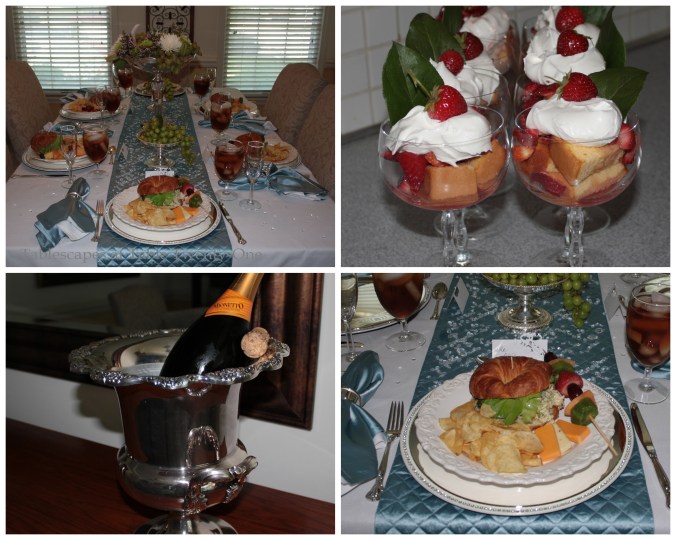
 Each lady’s place setting is marked with an oversized “diamond” napkin ring. The gentlemen have simple “wedding bands” of silver. Two chargers – one rhinestone-rimmed and the other a plain silver – mimic the differences in the men’s and ladies’ place settings. The scrolled-edge cream-colored plates are from TJ Maxx, and the quilted table runner and napkins are from Z Gallerie.

  Although a simple fare is served (pecan-chicken salad on croissant, honey-dipped fruit on a skewer, assorted cheese slices and kettle chips with strawberry shortcake for dessert), the tablescape still has a decidedly regal feel about it.

Autumn White Wedding

I recently received a request for ideas on an autumn wedding. Not that I have anything against fall colors, but sometimes it’s fun to march to the beat of your own drum. Try instead an autumn rehearsal dinner, bridal shower or wedding reception using the more unlikely colors of white, cream and chartreuse with touches of earthy brown for good measure. (For more wedding table ideas click here!)

If the weather is still warm enough in fall to do an outdoor wedding event, go for it! When you set up outdoors, the sky is the limit where your decorating options are concerned!!!

A full-length ivory table linen is topped with a satiny brown runner to add color and dimension to the tabletop. The place settings are fairly traditional with glossy silver chargers and ivory dishware from TJ Maxx. (One huge no-no is to use items that will upstage the reception decor on “The Big Day.”)

The napkin (Bed Bath & Beyond) is very simply folded across the dinner plate and tucked beneath. A white mini pumpkin is centered on each napkin. While a faux pumpkin is used for this sample setting, I suggest using the real thing. Mini pumpkins can be purchased at the grocer this time of year for around 50 cents apiece, and they make a great little take-home gift. (Or you can take the leftover pumpkins to bling them up and use them in a fall arrangement like here.) If you know a calligrapher or someone with exceptional handwriting skills, ask them to pen the names of each guest onto the pumpkins! Cooler yet….have them inscribe the monogram of each guest. That’s really different and kinda fancy to boot! 🙂

Keep the flatware along the same line of formality as the rest of the setting. The design on this flatware is similar to the pattern on the rim of the dinner plate. I went with Cristal d’Arques “Longchamps” crystal that offers a lot of bang for your buck.

Long tables offer an opportunity to do so many cool things with the centerpiece!
A mix of high and low arrangements fill out this 12-ft. table. For even longer tables (so cool to see 18-, 24-, or even 36-ft. tables!!!), add more high ones to balance it out. For this table, I used a little wrought iron number I bought earlier this year. It’s reversible…or at least I made it that way by accident! Lesson learned? Play with your toys…don’t just use them the way they were displayed at the store!!!

This is the way it’s used here, but it’s actually upside down and missing some parts!

This is how it’s supposed to look. I finally figured out what all those “extra” mystery pieces were for!

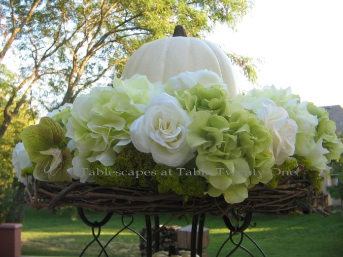
I outfitted the top of the centerpiece with a grapevine wreath bought at Hobby Lobby. I secured it with  floral wire. Next came lots and lots of flowers including chartreuse and creamy white hydrangea, white roses, and a few orchid blooms. (Sprigs of green hypericum berries, unripened coffee beans or unripened raspberries would really look slick and add more texture, too!) Hydrangea quickly wilts, so the trick is to put the water vial on the end of the floral stem immediately AFTER it is inserted into the wreath so it doesn’t wiggle loose. (Took me half the doggone wreath to figure that one out! :-() Use floral tape to secure the vials to the twigs so they don’t poke out or fall off during dinner…which would be highly embarrassing! Tuck in bits of fabulously bright chartreuse reindeer moss to help hide the mechanics of your arrangement, and finish it off with a plump white pumpkin. (Hint: When you go wreath and pumpkin shopping, take the centerpiece you’ll be working with along to make sure the wreath is the right size and that the pumpkin won’t overwhelm or topple it.)

The ugly little spindly legs on the bottom part of the centerpiece are camouflaged with mounds of florals accented with reindeer moss and a white mini pumpkin.

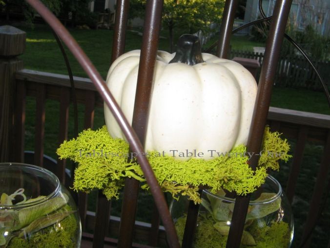
A mini pumpkin rests comfortably on a cushy bed of reindeer moss. I like the moss to look a little bit messy as nature would have it.

The side globes hold a single orchid bloom atop more reindeer moss.

The smaller components of the extended centerpiece correspond with the main piece. Iron candlesticks with fat pillar candles are flanked by small rose-filled globes stuffed with reindeer moss to keep a consistent look.

This same concept could easily apply to a winter wedding by swapping out the pumpkins with oversized ornaments. The look also works well indoors so long as the height of the centerpiece doesn’t interfere with overhead lighting, fans, etc.

I’m hooking up with my pals at Susan’s Between Naps on the Porch for Tablescape Thursday again this week. If you’ve never visited, you really must! Lots of talent out there!!!

A special shout out and great big thank you to Angie over at Echoes of Laughter who helped me figure out how to get rid of the bothersome “no reply” feature when I leave comments on other blogs. Teamwork paid off!!!

Welcome Back, Joel!

Our young friend from the country of Benin in Africa, Joel Ayatode (pronounced AH-ya-TOW-day), came back to the States this past week. Just as we bid Joel adieu with a farewell dinner last September when he returned to his home country (Summer Breeze), we wanted to do something casual but fun to welcome him back again. His wife, Loretta, offered to do the cooking. ‘Nuff said; game on! 🙂

Teetering on that edge between winter and spring, I dressed the table with elements that reflect this “seasonally challenged” time of year. Looking in the yard, we have both bare trees and the heads of early spring flowers emerging. We’re starting to hear the birds chirping at daybreak, too.

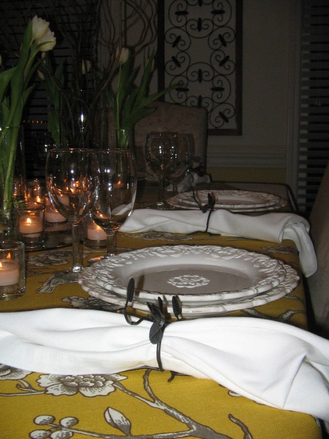
We have all seen these versatile ivory plates from TJ Maxx. I use them frequently because they can so easily switch from one mood to another…kind of like the weather in the Kansas City area! The design also seemed to complement the flowers in linen’s the tree branches.

I bought these oil rubbed bronze napkin rings at Pier One a couple of years ago. I’ve never had a chance to use them until now. I didn’t want to go all Hitchcock and overdo the bird theme with this table, so it is the only other aviary reference besides the table linen.

To keep the look of the table’s center consistent, I used plain clear glass stemware.

Simple banded edge stainless flatware is used so as not to conflict with the busy pattern of the linen.

This is another table linen that I made!!! When I saw the fabric, I just had to have it! I found the deep mustard color very attractive, and the birds in the nearly naked branches reminded me of the fickle change of seasons.


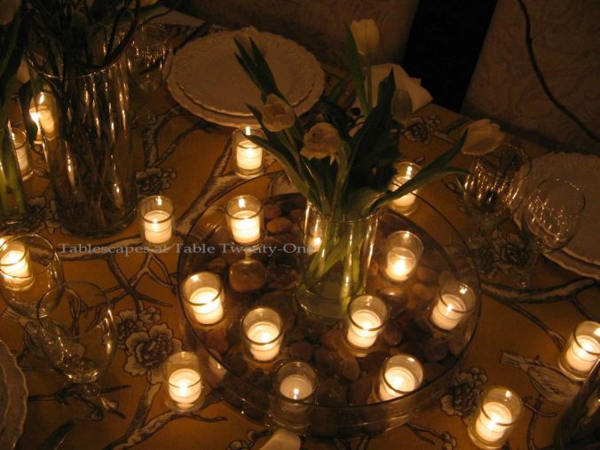
This 15.5″ low glass container was used to offset the dead center of the tablescape. Smooth river rock in the water reminded me of a brook. Votive candles nicely reflected off the water, reminding me of how the stars shine on the nearby lake. A simple arrangement of tulips – a sure sign of spring – in the center added height, color, and visual depth.


Keeping with the clear glass used in the center, I filled these narrow cylinders with tulips. Placing two small vases on each end rather than one seemed more interesting than a single larger vase.


To mimic the linen pattern and to add lots of height to the center arrangement, I used curly willow branches in tall glass cylinders. This added to the natural, outdoorsy feel.

The simple addition of 15 clear glass cylindrical votives subtly lights the buffet adjacent to the dining table.

After a wonderful and VERY filling meal prepared by Loretta’s loving hands, it was time for dessert. While this had absolutely nothing to do with the theme of the dinner party, I just thought it would be fun to honor our special guests with their monogram on the cake and cupcakes I made! These old arthritic hands could barely squeeze the icing out! 🙂


L to R: Incredibly patient husband Ramon, very helpful stepdaughter Robyn, our guests of honor Joel & Loretta Ayatode, and Robyn’s sweet & comical longtime friend Kamille Jefferson. (Joel’s eyes look a little tired in this photo. Poor thing was suffering serious jet lag from the 15+ hour trip!)

Pudgy little ol’ me just before the guests arrive. Notice how I placed the watermark on the photo to try to cover up my problem area! I’ll need much bigger lettering than this!!! 🙂

More tablescapes using curly willow on this site:
Blushing Bridal
Copper Zen
Autumn Blues

I hope it’s much closer to spring where you are today! Thanks for stopping by, and don’t forget to check out the work of all the other incredibly talented tablescapers at Susan’s Tablescape Thursday!

Au Revoir!

I can only live vicariously through others since I have such a profound fear of flying. Thank goodness I have lots of friends and family who are ready and willing to hop on a big metal bird at the drop of a hat! Their adventures become my adventures, and this time is no different. As our pals head across the ocean to Paris, France, they can reminisce about the bon voyage dinner held in their honor. And as they wine & dine in the great restaurants, they can giggle about my lame attempt at recreating the fine cuisine.

I am a pink freak, so it’s always exciting to do a table for someone else who shares that passion.

I always knew this “Eiffel Tower” would come in handy for something! As my globetrotting friends set out on yet another wonderful cross-Atlantic adventure, we said goodbye with a dinner featuring tidbits of decor and cuisine they will likely encounter in “gay Paree!”


We have said au revoir to summer here in the Midwest, but the outdoor temperatures belie that fact with daytime highs in the 70s and 80s. So to bring in a bit of autumn and tone down the pink a bit, I used chocolate as the base color for this tablescape.

Atop the creamy chocolate table linen are gleaming silver chargers & flatware to keep the brown from washing out and looking so flat. A plain, creamy earthenware with a decorative rim was used to show off the food.

Menu and napkin

I created the fun little menus on my computer using cardstock and fleur de lis brads from Hobby Lobby. The pink toile scenes reminded me of the French countryside in a time when men and women actually strived to be described as “genteel.” The fun font I used reminded me of the font used on the posters promoting the 1958 movie “Gigi”, set in turn-of-the-20th century Paris.

I recently bought another book on napkin folding. (Shh! Don’t tell my husband!) This cute little fold looks like a “petit pain.” (Translation: bun.) It was a lot easier to create than I thought it would be and looked really sweet at the top of each plate. (Check out the “Books That Make You Go “Ooh!” tab at the top of the page for more information “Napkins With a Twist” by David Stark.) For a complete tutorial on how to create this napkin fold, click HERE and scroll to Tip #33. To see other posts on this site using the rosebud napkin fold, see “Cupcake Colors”, “Springtime in Paris Mother’s Day Buffet” and “Mother’s Day Luncheon in Pink”.

This night was a little warm, and that just brought the sweet smell of these pretty posies to the fore. Wonderful! I chose roses and carnations because they are so pretty together, and the variation in the depth of pink in the roses was interesting. Both were clipped within an inch of their little lives to create the mounding effect at the bottom of the tower and to float in the clear oyster votive cups. Stray rose petals helped to fill out the look.

To add just a bit of height and visual interest on the outside of the tower, I arranged the roses and carnations in clear vessels with a just a teensy bit of greenery.

What’s an evening celebration without a barrage of candles, especially when the honorees’ destination is the city most commonly referred to as La Ville-Lumiere (City of Light). The background music included a little Celine Dion, Eartha Kitt, and the soundtrack from “Something’s Gotta Give” (one of my all-time favorite movies!)

For other Parisian-themed posts:
Springtime in Paris
Patisserie de Paris
French Poodle

Other pretty pink tablescapes on this site include:
Peaceful Peonies
Days of Wine & Roses
Peonies & Pearls
Chocolate Traditional
Platinum & Pink Valentine
Blushing Bridal Shower
Easter Floral
Easter Bloom
Pink Plaid & Posies
All A’Bloom In Pink For Spring
Pretty In Pink
Showered In Pink
Easter In Pink & Grey
Peony Power
Fairy Princess Party
Fairy Tale Wedding Shower
Blurred Lines With Shades of Pink
Tea Roses
Breast Cancer Awareness Month
Pretty In Pink, Wicked In Spurs – Breast Cancer Awareness
Bald Is Beautiful – Breast Cancer Awareness
Pink & Purple Chocolate Christmas

Please pardon my French, but I am plein de joie to once again be a part of the Style Sisters’ Centerpiece Wednesdays and Susan’s Tablescape Thursdays.

Centerpiece Wednesdays Button

Tablescape Inspiration, Click to View