I DO NOT like to jump the gun on seasons. I take each one as they come, savoring the best of it and slogging through the worst toward the light. But I do believe seasons are “sectional” with early, mid, and late portions. So before I start hauling out the pumpkins and corn stalks, here’s a little something-something for late summer/early fall.
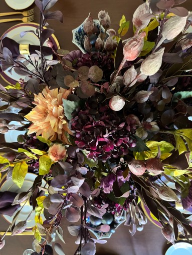
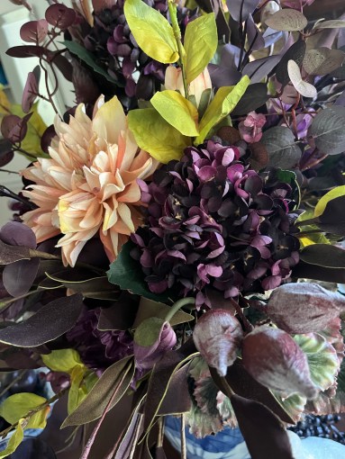
And for those of you who, like me, like to closely study details on still photos…
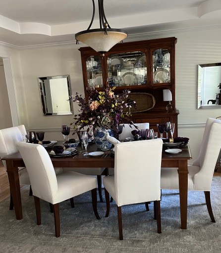
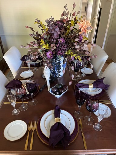
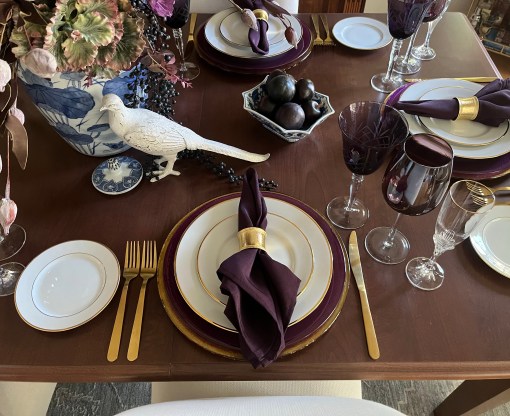
Shades of plum and blue-violet are tempered with white, luscious peach, and citrus green. I’m not quite sure why I went with the blue & white chinoiserie. It just felt right.
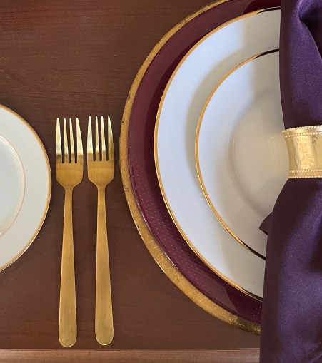
Each place setting starts with a gold leaf glass charger topped with a purple Bormioli Rocco glass charger. I used gold-rimmed white china to temper the depth of the purple tones. Gold flatware compliments the stack.
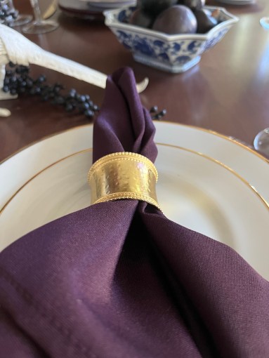
Starched napkins in deep, moody eggplant are wrapped up with a shiny golden ring.
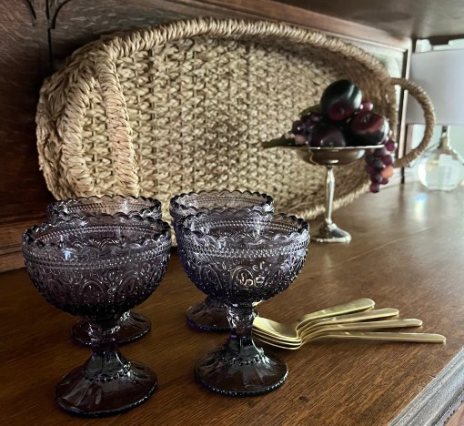
Of course, bowls of plums had to be included!
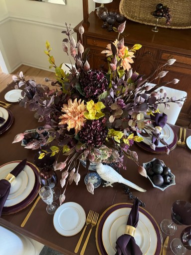
I SO loved this floral arrangement and hated to disassemble it!😖 The faux flowers came from many sources including Nell Hills and Charmed House Interiors in Kansas City, Petals & Potpourri in Blue Springs, McKeever’s grocery floral department and Cameron’s Home Furnishings in Lee’s Summit near where we live, and Hobby Lobby (those berries hanging off the side). Massive arrangements like this are moved to a side surface after guests have ooh’ed and ahh’ed over it before the meal is served.
This white-painted pheasant has been with me for a good while and looks great under the floral fronds.
This will be among the final pics of my beloved Louis XVI reproduction vitrine as I have sold it. It has been a faithful servant for more than 20 years. Here it plays host to a dessert setup with a Nell Hills basket backdrop.
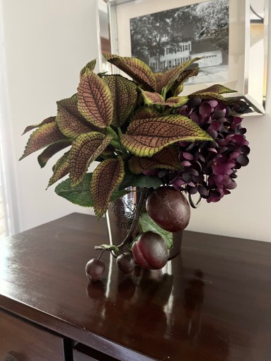
A side chest is treated to an arrangement of coleus, hydrangea, and plums in a mini silver ice bucket.
With temperatures headed back into the upper 90s and near 100 over the next few days, it’s tough to get into the fall mood. This “fall lite” works for me!
Like shades of purple? Here are a few other posts on this site you may enjoy!💜
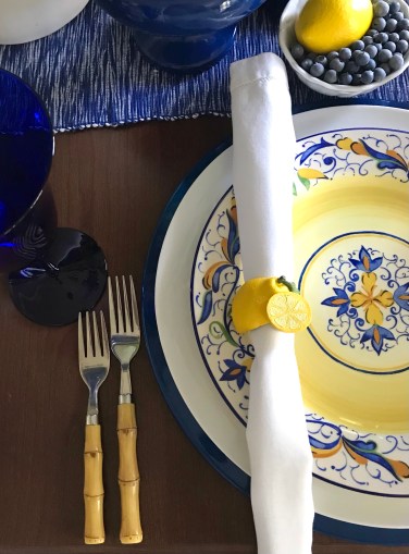
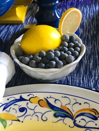
Summer is drawing to a close…at least on the calendar. Withering heat still plagues us here, but we know relief is a stone’s throw away. My last summer tablescape of the year includes two very prominent products of the season: blueberries🫐, which I buy in copious amounts to flash freeze for winter, and lemons🍋.
Our dining room palette is shades of blue and white on a daily basis, but the addition of sunshiny yellow really perks it up! The table runner is from At Home which has a few good decorative items from time to time. Cobalt blue metal chargers from Pier 1 ground the place settings which include “Mirandela” dinner plates, also from Pier 1. A white ceramic charger separates the two and adds depth. The monogrammed lumbar pillow is from Sew Gracious.
I love the very European design on the plates! These lemon napkin rings around plain white hemstitch napkins work well with the design rather than competing for attention. Faux bamboo flatware with a yellowish undertone easily slips right in for a polished look.
Blueberry Lemon sparkling water…naturally!🫐🍋😉
The centerpiece was so easy to create it’s almost embarrassing.🙈 I have had the Z Gallerie yellow finial urns forever. When I saw the cobalt blue ones on a recent shopping trip to Nell Hills, I knew I had to have them! The asymmetrical faux floral piece is comprised of a single Nell Hills lemon branch nestled among showy palm leaves and spiked with the most fabulous blueberry branches from a little shop (been there at least 40 years!) in Blue Springs, MO, called Petals & Potpourri. Ice cream bowls from Pier 1 hold blueberries and lemons to keep the theme going from base to tip.
Lemon blueberry cake, anyone?
Blueberries, all ready for the freezer!
Just FYI, I get absolutely nothing in return for mentioning products & services or for providing links to various sources. Just sharing the info!
I’m really not ready to say goodbye to summer, but I suppose it has to be. If you would like to check out a couple of other blue & yellow tablescapes on this blog, “Mother’s Day Brunch” and “Sun & Sky” (from 2017 which used some of these same elements in a very different way) might tickle your fancy.
Or if you’re just looking for a tablescape with scads of lemon yellow:
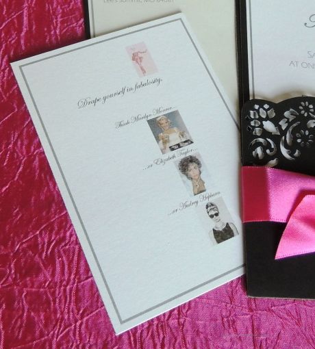
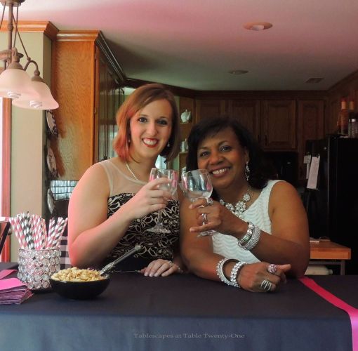
My 60th birthday has come and gone, and all that’s left are the fabulous memories of the ladies luncheon I threw for myself. Yes…I threw my own birthday party! Why? I’m a (retired) professional special event planner. Who else would I put through the torture it would take to make me happy?!! So…here are photos of the June 9 luncheon for 22 of my nearest and dearest in-town friends (all on the guest list were able to attend except one!) who I thank for helping me to celebrate in style!
Invitations were created using clearance stationery from Hobby Lobby. I invited the ladies to drape themselves in jewels to go with the theme! I printed the Marilyn Monroe drawing in the corner of each mailing envelope to complement the insert.
Me in my party dress, trying to emulate Marilyn Monroe’s look in the pic below!
The inspiration for my party dress!
When I go with a theme, I go ALL THE WAY! The backdrop for the opening and closing credits of “Gentlemen Prefer Blondes” gave me inspiration to create this elaborate “wall of diamonds” against a pink satin drape on the deck for photos. I simply used drapery clips to hang the fabric and crystal curtains from TableclothFactory.com on existing cup hooks. It was so unseasonably hot & humid, though, that few pics were actually taken out here. On the other side of the deck I hung 3 mirrored outdoor LED chandeliersfrom Old Time Pottery that looked so cool blowing in the breeze. I planted all pink flowers for the occasion, a departure from the reds and yellows I generally favor.
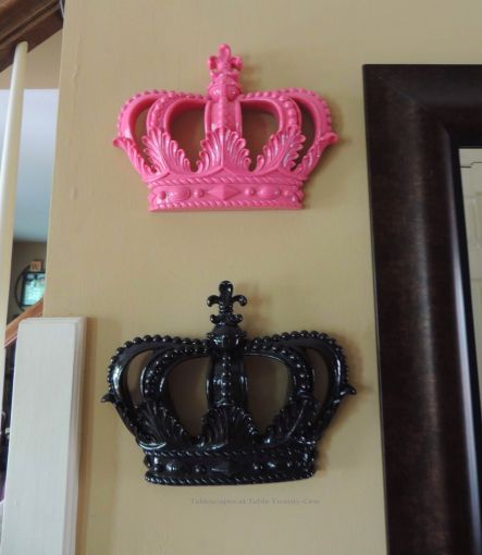
Upon entering, the ladies were greeted with 2 WAY oversized hot pink balloons that were originally intended for a display at the end of the driveway. It was so hot & humid, however, I opted to just put them inside so they wouldn’t wilt. The telephone table on the other side was decorated with a “diamond-dotted” rose ball atop a facted pillar. (I’ve done these before for “Should Have Put A Ring On It“.) The foyer table was draped in a “diamond” sash with a pink ribbon accent. I created a Harry Winston/Tiffany’s-inspired window display on the table for dramatic effect. On the walls were pink and black crowns I bought on clearance at Hobby Lobby years ago but have never used. (Another jewel-inspired post worth checking out is “Diamonds Are A Material Girl’s Best Friend“)
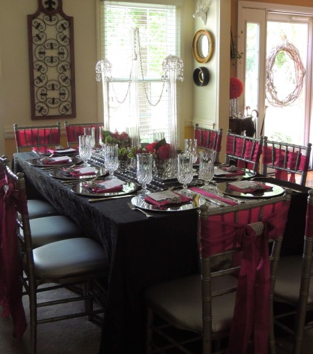
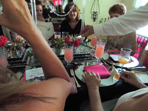
We didn’t have a lot of time to get pics, but this is the dining room seating area. (Because ALL but one of the invited guests accepted, I had to create 2 separate-but-complementary dining environments.) This table is draped in a black crinkle taffeta tablecloth with a silver sequin runner, “diamond” sash, pink ribbon, and mirrored trays beneath the centerpiece of tall gooseneck vases visually joined by a garland of crystal and lots of flowers in faceted vases. (I created 19 total fresh flower arrangements!!!) The buffet behind the table is similarly dressed with another jewelry display. My sweet friend, Cindy, was so gracious as to lend me chiavari chairs for this room which I tied in with the other room by threading through a pink crinkle taffeta sash with a “diamond” cuff. I found the cute poodle art on the sconces on clearance at…you guessed it!…Hobby Lobby. Some may remember the poodle from “French Poodle“, the jewelry display pieces from “Breakfast at Tiffany’s“, the mirror treatment from “Ain’t Misbehavin’ – Celebrating Mom’s 89th Birthday Gatsby Style“, the Princess In Pink signage from “Princess Pink Birthday“, and the faceted & mirrored centerpiece trays from “Happy Birthday, Barf!“.
The family room dining table was constructed using two 6-ft. folding tables to create more of a square shape. I draped them in hot pink/fuschia crinkle taffeta tablecloths and ran black sequin runners and “diamond” sashes crosswise. Towering glass vases (I taped a hanging facet on the underside at the top!) filled with “loose diamonds” and connected by crystal garland loom over faceted vases filled with roses, mini carnations, tulips, astilbe, white calcynia, variegated pittosporum and hypericum berries. I left some of the faceted vessels empty so as not to overcrowd the table. The bulbous structures in the last photo are simply one vase atop another. Ballroom chairs with black slipcovers are dressed in the same sashes and “diamond” cuffs as in the dining room. The place settings are slightly different with a double stack of chargers – white rhinestone-studded acrylic and hot pink Bormioli Rocco glass – and black napkins instead of pink. (TIP: If you have a behemoth television in the room, make lemonade from that lemon by showcasing photos or playing a movie – on mute, of course! – that relates to the party theme. For my luncheon, “Gentlemen Prefer Blondes” was perfect!)
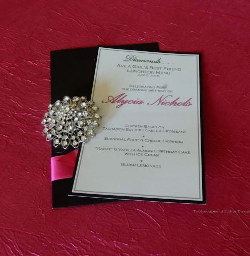
I created the menus using the same stationery as the invitations, strategically affixing tiny rhinestones for a bit more glitz. Each menu was outfitted with a sparkling “diamond” brooch.
The weather demanded that we move the bar in off the deck. My friend Rachael stepped in as bartender for the afternoon before joining the other guests at the table. Good ol’ Geoffrey beckoned guests to come grab a cocktail.
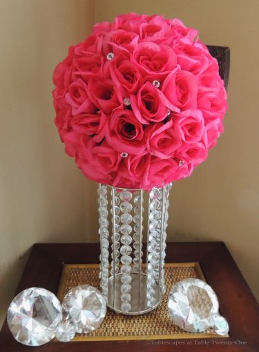
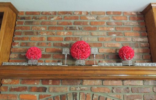
The mantel is simply dressed with more of the facted vessels, some topped with rhinestone studded hot pink rose balls.
My wonderfully talented friend Patrick created the glitzy almond-vanilla cake that I further decorated with a couple of the same brooches as used on the menus. (We also served my famous carrot/”karat” cake for the occasion!)
Dessert course was served with these cute black paper napkins fashioned to look like a black party dress. I saw the idea on Pinterest and couldn’t resist! That’s two hours out of my life I’ll never get back, but totally worth it for the fun factor! And speaking of fun factor…
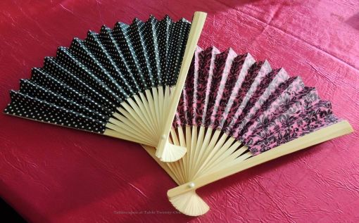
Pink and black paper fans for cooling down or just looking ultra fem!…
…rhinestone studded fortune cookies created by my sister…
…a fun game called “Who Knows Alycia Best?” where Rachael won for having the most and Dixie won for having the fewest correct answers, and this was Dixie’s hilarious reaction!…
…pink raspberry lemonade “diamond” ice cubes served directly to the table…
I know this post was super photo heavy, but I always include lots and lots of details in every event I create. If you’d like to see other fun photos from the party, keep on scrolling!
Thanks for stopping in to celebrate the big 6-0 with me and my fabulous pinkposse!!!
Such a class act!
Jeff and Meghan were wonderful servers for the day!!!
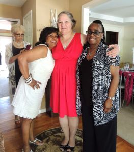
With my sister, Berishia, who looked so nice in her breezy outfit, and her daughter/my niece, Yvonne, who always rises to the occasion when bling is involved!
My oh-so-elegant neighbor, Leslie, and her equally chic Mom, Dixie (as Ramon photo bombs the pic trying to escape all the estrogen in the house!)
My friend and hair stylist/magician of 25 years, Dorothy
Good friends Ebony (another decorator/event planner!), Audrey, and Ty (organizers after my own heart!)
High school mates/lifelong friends Joan and Audrey
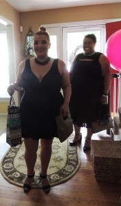
Friend/neighbor/drinkin’ buddy, Kerry who I simply adore!
Neighbors/Friends Lori and Vicky who are so skinny I just HATED taking a picture with them!!! 🙂
My dear, sweet, supremely elegant friend Marchita who means the world to me!
The stylish matriarchs – Senator Mom and Aunt “Bean Bean Dancing Machine”
I cannot tell you how much I love this woman! Ladies and gentlemen…the fabulous Carla!!!
Ever-fashionable Mom and daughter duo, Barbara and Rachael!
Melanie in her Holly Golightly “Breakfast at Tiffany’s” outfit!!!
Jane took it to the hilt looking positively radiant with her Marilyn Monroe look, while my gorgeous Mary Ellen played it sleek & understated. I LOVE all the different ways my friends interpreted the theme!!!
Best friend, Sheri, and me in PJs, enjoying a well-deserved and much needed glass of wine after the party. Cheers!
In a recent segment of “Better Kansas City” (my first appearance back on the show after a 7-month absence for my stupid spine surgery) I talked about the joys of the new melamine dishware that has flooded the market in recent years. One thing for certain: this ain’t your mama’s melamine!
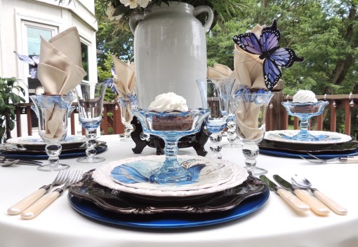
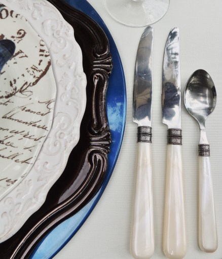
Each place setting starts with a double layer of chargers that picks up key colors in the salad plate including a sapphire blue metal from Pier 1 (first used in the post “Simply Peacock Garden” in 2014) topped with a chocolate brown Baroque-style (also used in “Pheasants & Pumpkins” back in 2014) from Hobby Lobby. I’ve discussed in prior posts how using more than one charger can add interest to the place setting via design, texture, shape and color. The dinner plate is Home Essentials Antique White, a popular staple around the tablescaping blog world.
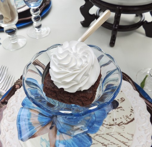
I found the blue compotes at Old Time Pottery way back in 2010 and have only used them a couple of times. Shame on me! The salad plate – my inspiration for this tablescape – is a sweet melamineby TarHong with impressive blue butterflies and an additional carte postale design. A far cry from the drab melamine of the 1960s! The faux mother of pearl flatware is from Target.
I recently picked up this beautiful Aurora Blue stemware by Qualia at Home Goods. It perfectly complements the clear glass stemware I purchased at a moving sale some years ago (also seen in “Something Blue Bridal Luncheon“). Ivory cloth napkins are cinched with a blue acrylic napkin ring, tucked into the stemware, and embellished with a blue butterfly to further complement the salad plates.
The hefty centerpiece, heightened by a rosewood Chinese pot stand, is made up of a tangle of greenery mixed with blue hydrangea, ivory roses, alstroemeria and hypericum berries finished off with eryngium blue thistle.
I’m not around as much these days as I’m taking LOTS of time out of each day getting healthy: walking 5-7 miles a day, spinning on my recumbent bike, working out with small weights, preparing fresh meals from scratch…all the things that will help my spine get (and hopefully stay!) strong and lose the “surgery weight.” I’m peeking in on you, and I’m so glad you peeked in on me today. Have a great week ahead!
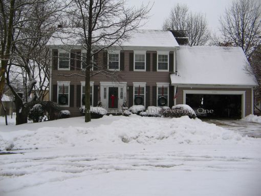
Christmas Eve 2009 brought a thick blanket of snow to the Kansas City area. What better way to celebrate it than to bring a few snowflakes inside to the dining room tablescape?
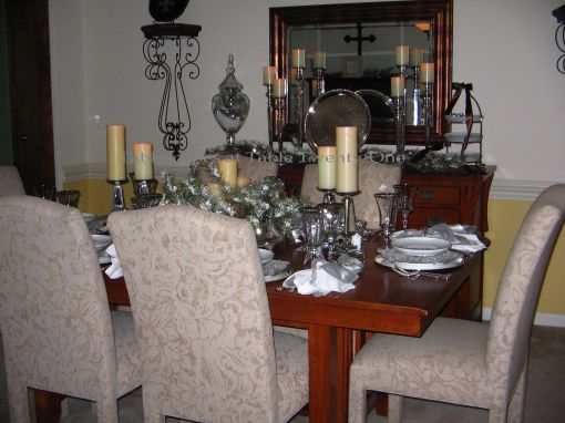
Because I wanted to keep a little bit of a “woodland” look, I kept the table bare of linens to expose its grainy wood.
A shiny silver charger anchors platinum rimmed white Noritake “Spectrum” dinner plates, followed by a shimmering acrylic snowflake, and finally a white snowflake-laden salad plate from Pier 1. Mikasa‘s Jamestown Platinum stemware and heirloom silver flatware complete the setting. The centerpiece is made up of a large silver cake plateau topped with “snow-dusted” faux evergreens and lots of pillar candles.
Sometimes one napkin is simply not enough! Layering napkins – here a sheer silver organza from Pier 1 over crisp white cotton – gives a richer look. The rhinestone flecked napkin rings continue the snowflake trend.
I love these mirrored candlesticks from Pier 1 (2009 collection) used to elongate the centerpiece! Silver jingle bells rest on a mound of faux snow in modern crystal mini vases, and a 3-D glittery star work to complete the centerpiece.
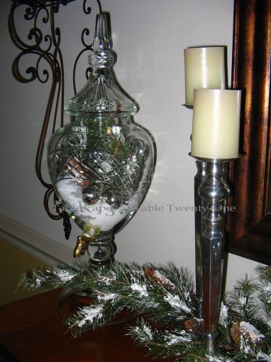
The buffet decor mimics that of the dining table with snowy faux greenery, pine cones, more jingle bells, and lots of sparkle. The glass Parisian decanter is filled with “snow” and greenery, and a length of brown satin ribbon literally “ties” the dining room in with decor in the foyer.
I treated a couple to a post-nuptial luncheon in our home to celebrate their union. A smattering of “diamonds” brings glitz & sparkle to the wedding tablescape.
Bursts of bright green play nicely off the bride’s chosen colors of French blue & white. Granny Smith apples and juicy green grapes are surrounded by green button mums, spider mums, pink waxflower, Queen Anne’s lace, viburnum, and fragrant Stargazer lilies all spilling from a silver pedestal bowl. The main piece is flanked with green grapes atop simple silver pedestals.
Each lady’s place setting is marked with an oversized “diamond” napkin ring. The gentlemen have simple “wedding bands” of silver. Two chargers – one rhinestone-rimmed and the other a plain silver – mimic the differences in the men’s and ladies’ place settings. The scrolled-edge cream-colored plates are from TJ Maxx, and the quilted table runner and napkins are from Z Gallerie.
Although a simple fare is served (pecan-chicken salad on croissant, honey-dipped fruit on a skewer, assorted cheese slices and kettle chips with strawberry shortcake for dessert), the tablescape still has a decidedly regal feel about it.
Royal Stafford “Clematis” dinnerware. Sigh!!! When this design first hit the scene some years ago, it was all the rage. I promptly plucked up ten dinner plates and cereal bowls to add to my ever-growing collection. Hmmm…that was 5+ years ago. I’ve just recently been inspired to actually USE them!
This relatively quick and easy-to-assemble tablescape begins with a pewter-toned crushed poly full-length tablecloth that I absolutely love for both its color AND its versatility.
The smoky grey/pewter of the tablecloth and napkin – loosely knotted and draped over the lower edge of the plate – works so well with the purple hues of the dinnerware. I used 2 chargers for depth and color variation (a lavender acrylic and a silver beaded edge metal), a tablescape design trick I also used for “Simply Peacock Garden“, “French Poodle“, “Pumpkins & Peacocks“, “Copper Zen“, and “Hooray For Vodka!“
Hampton Silversmiths “Patriot” flatware.
The water glasses are simple stock from Old Time Pottery. The plum-colored wine glasses are from Home Goods.
Now this is where it all gets a little sketchy. In my twisted little mind, clematis and flowering dogwood possess some similarities. No, they don’t look just alike by any stretch of the imagination, but the blooms on dogwood branches were close enough for me to create dramatic height for this table! Flowering dogwood branches spring up from this trio of slender grey glass vases that make up the simple centerpiece.
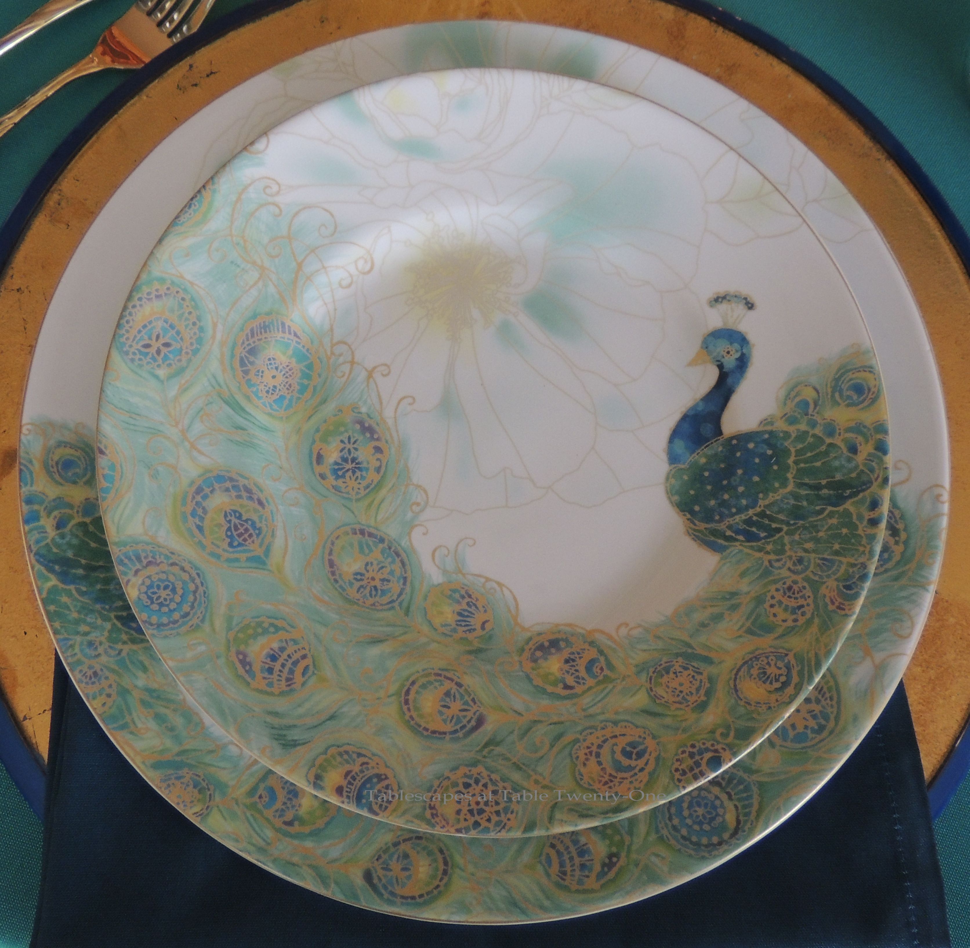
INSPIRATION: 222 Fifth “Peacock Garden” plates from Home Goods
True story: My Mom MADE me get these plates! Seriously! Stop laughing! She did!!! We were in Home Goods, and I was going to pass them up…but she insisted I get them and then ultimately bought them for me. STOP laughing! I’m telling the truth!!!
Have you composed yourself? Good. Then please enjoy my post using these beautiful 222 Fifth “Peacock Garden” dinner and salad plates. Then be sure to stop back tomorrowfor another peacock tablescape that would sub nicely for a Mardi Gras setting! (Click on any photo, then click again to enlarge/enhance it.)
I set up this 48″ table in our library as burly men with their butt cracks showing finished installing new windows in our dining room. This was my only diversion as they were here for way too long on a frigid day. Ice and snow as far as the eye could see. Yes…that meant the house was freezing cold, so I had to keep busy!
Clockwise progression: The deep blue metal charger used at the bottom of the place setting was found on clearance at Pier 1. I was so lucky to get 8 of them! My sister gave me the beautiful gold- and silver-leafed glass chargers a few years ago, and I use them often. The deep turquoise poly-cotton napkin is from Z Gallerie, and you already have the 411 on the plates. That’s my story, and I’m stickin’ to it, people! 🙂
The napkin is simply folded and placed between the top charger and the dinner plate. I placed it here to pick up the deep turquoise in the plates, while the top linen picks up the softer turquoise color in them. The bottom charger picks up the 3rd shade of blue, the gold charger picks up the gold, and the bottom white linen, of course, picks up the white in the plates. Like a peacock’s feather, this place setting is a dazzling array of hues that artfully work together.
Wacky? Yes. Unconventional? Yes. Fun? You betcha!!! It’s not a formal setting, so this is just another way to add interest to the tabletop and keep guests on their toes! 🙂 While the salad and dinner forks are in their traditional places, the dessert fork and coffee spoon decide to get jiggy with it!
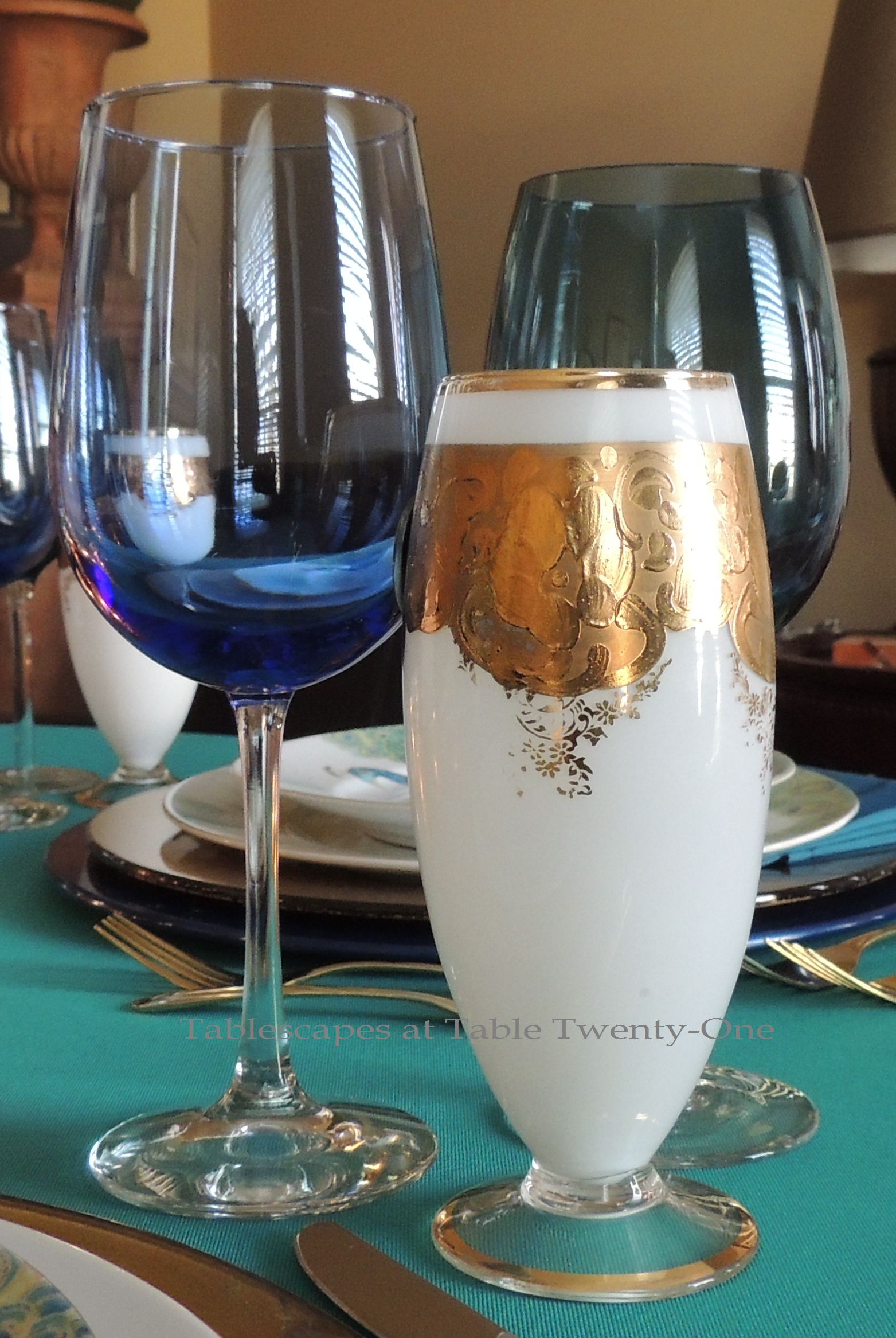
Wanting once again to pick up the array of colors in the peacock plates, I teamed up an inexpensive cobalt blue goblet from Dollar Tree with a mid-priced deep turquoise goblet from Stein Mart, then finished it off with a 24-kt. gold-rimmed white vintage piece from my Mom. I love to mix glassware like this! (For more ideas on successfully mixing stemware, visit HERE, HERE, HERE, and HERE.
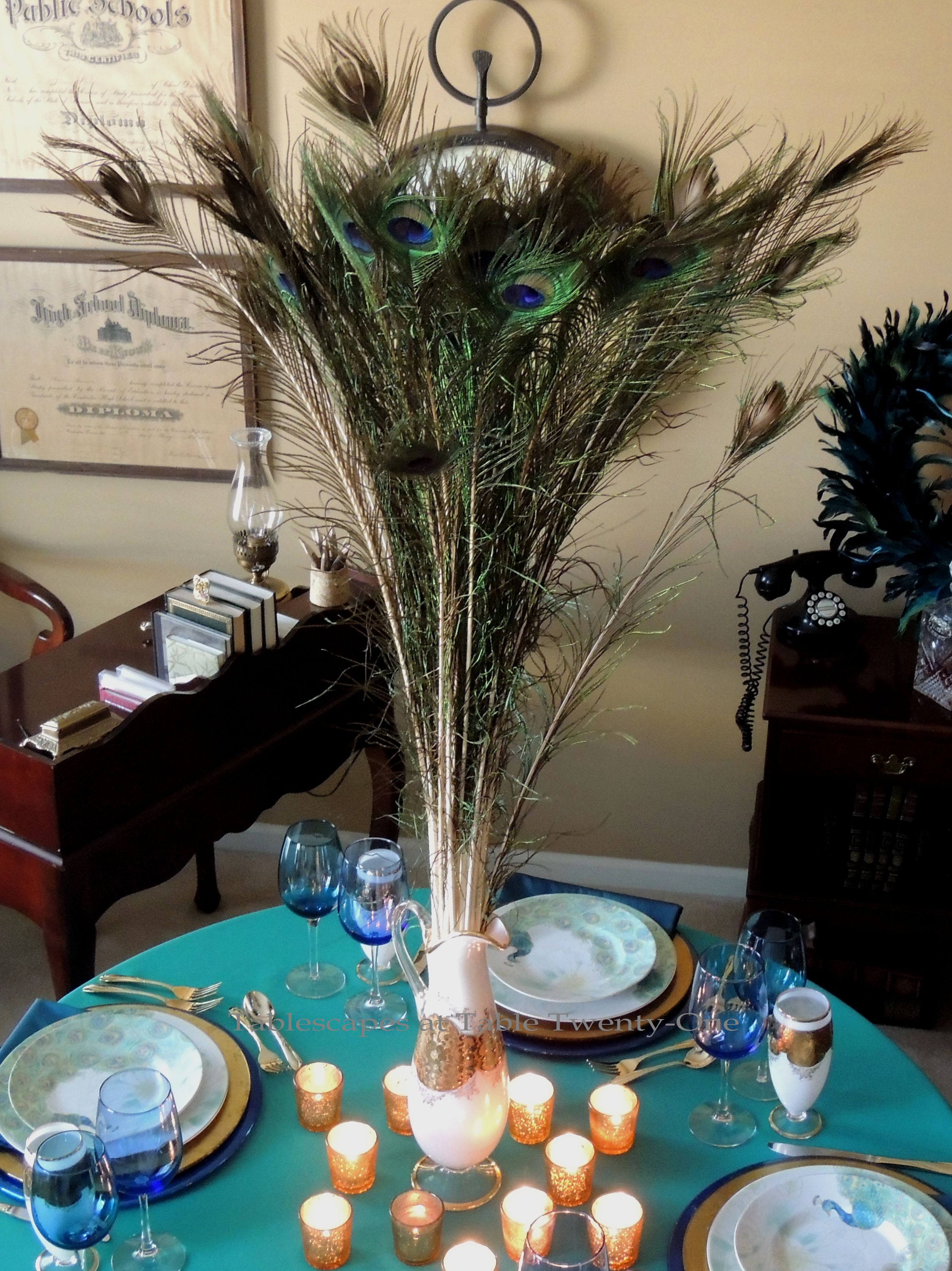
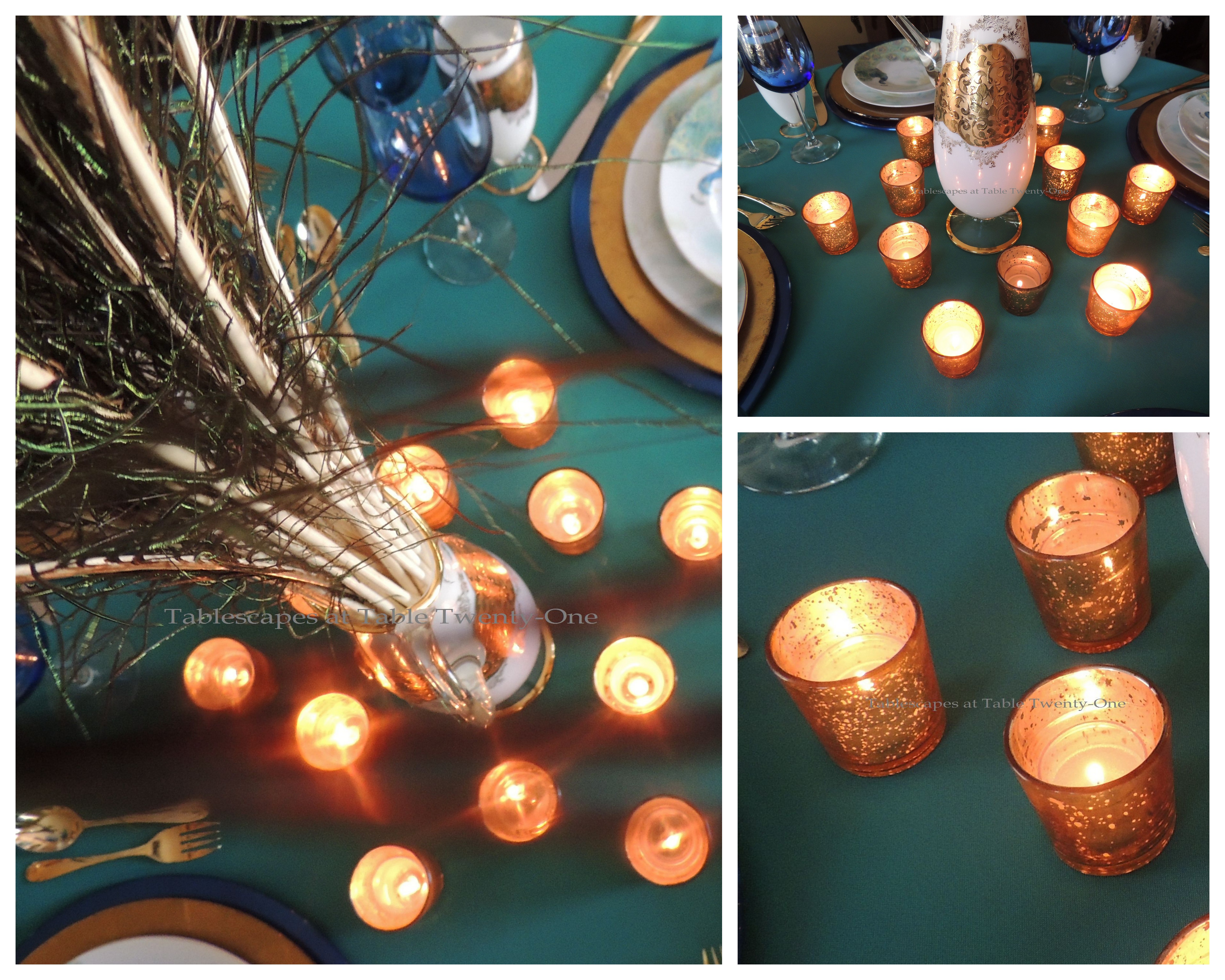
The centerpiece is easy to create but packs a whallop. A beautiful pitcher is filled with peacock feathers at varying heights and then simply surrounded by a splash of gold mercury glass votives. All the girth is way up high, so the centerpiece can remain throughout the meal.
OK, now I’m saying this so much that even I’m starting to think I’m lying: My Mom MADE me get these wreaths!!! We were checking out accessories in Home Decorator Collection when she suddenly summoned me to the back. She literally called me on my cell phone and told me to come back there. I’m an obedient daughter ( 😉 ), so I went. There, at 75% off in the after-Christmas section, were these beautiful and very full peacock wreaths. “They’re perfect for the plates,” she said. “You need to have those,” she said. “If you don’t buy them, I’ll just buy them for you,” she said. Honest!!!
I’m exhausted! All this explaining myself is really hard work! Please stop back by tomorrow for another peacock tablescape that is a nice respite from the “usual suspects” in Mardi Gras decorating. I’ll post it just before leaving the house to go shopping with my Mom! 🙂 🙂 🙂
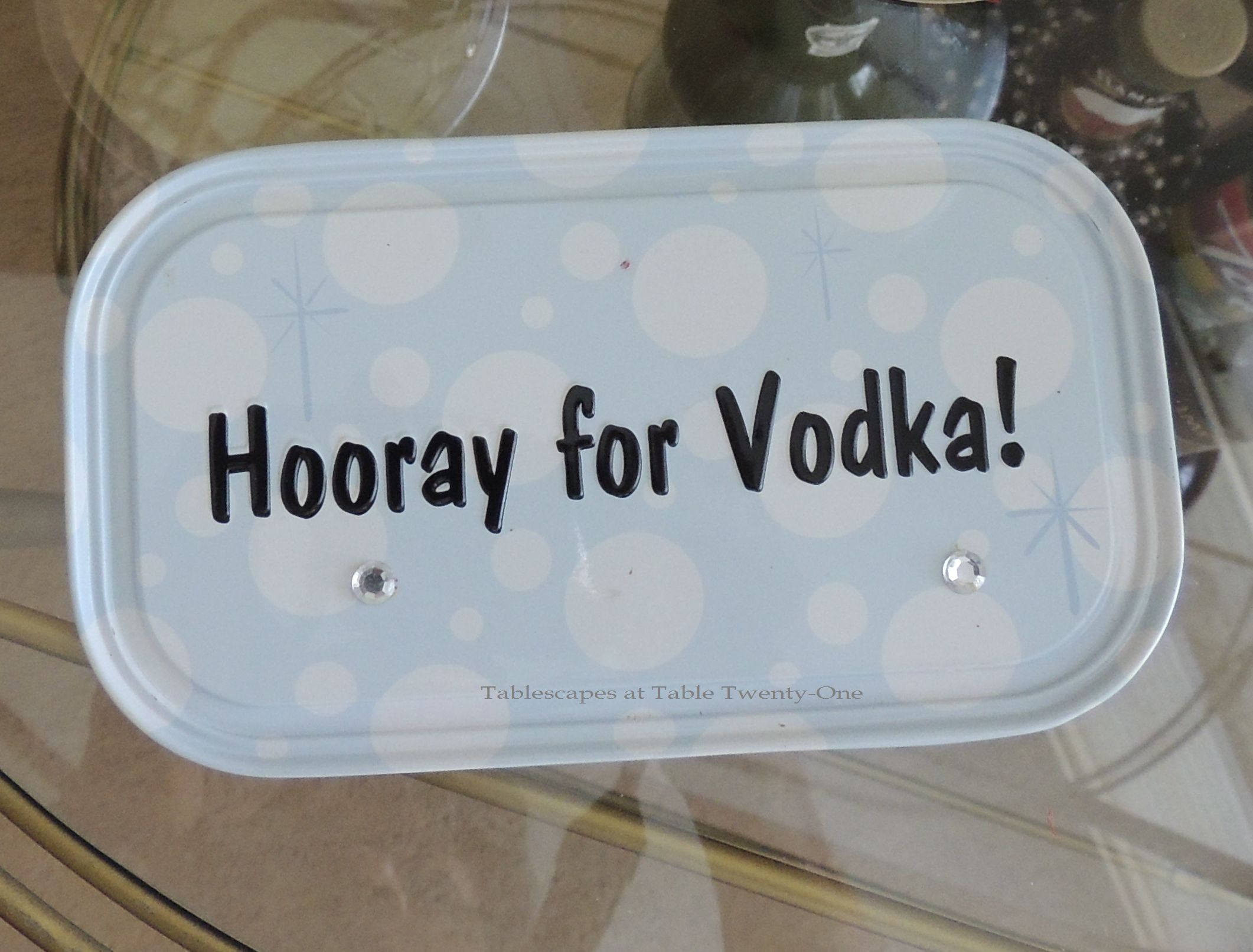
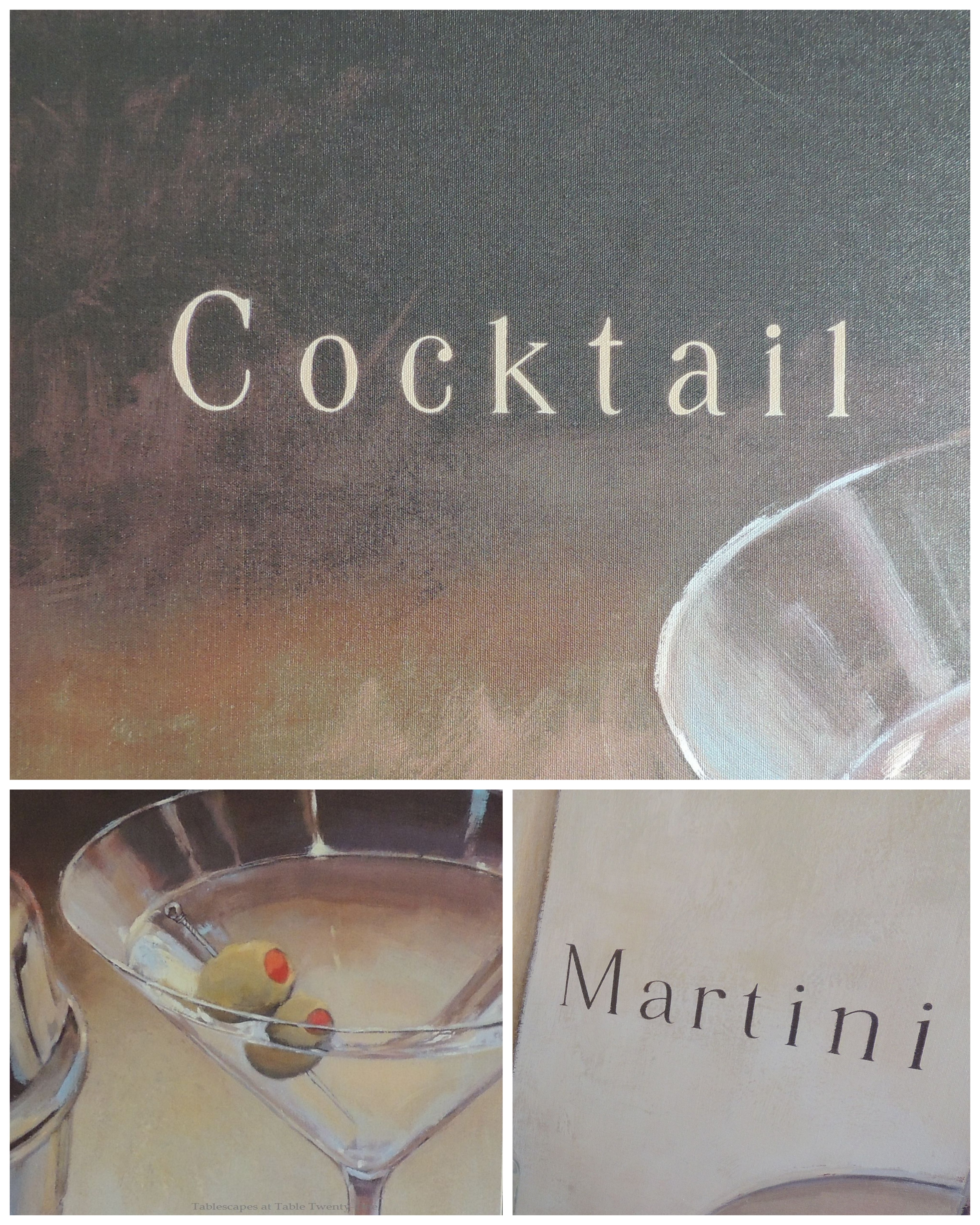
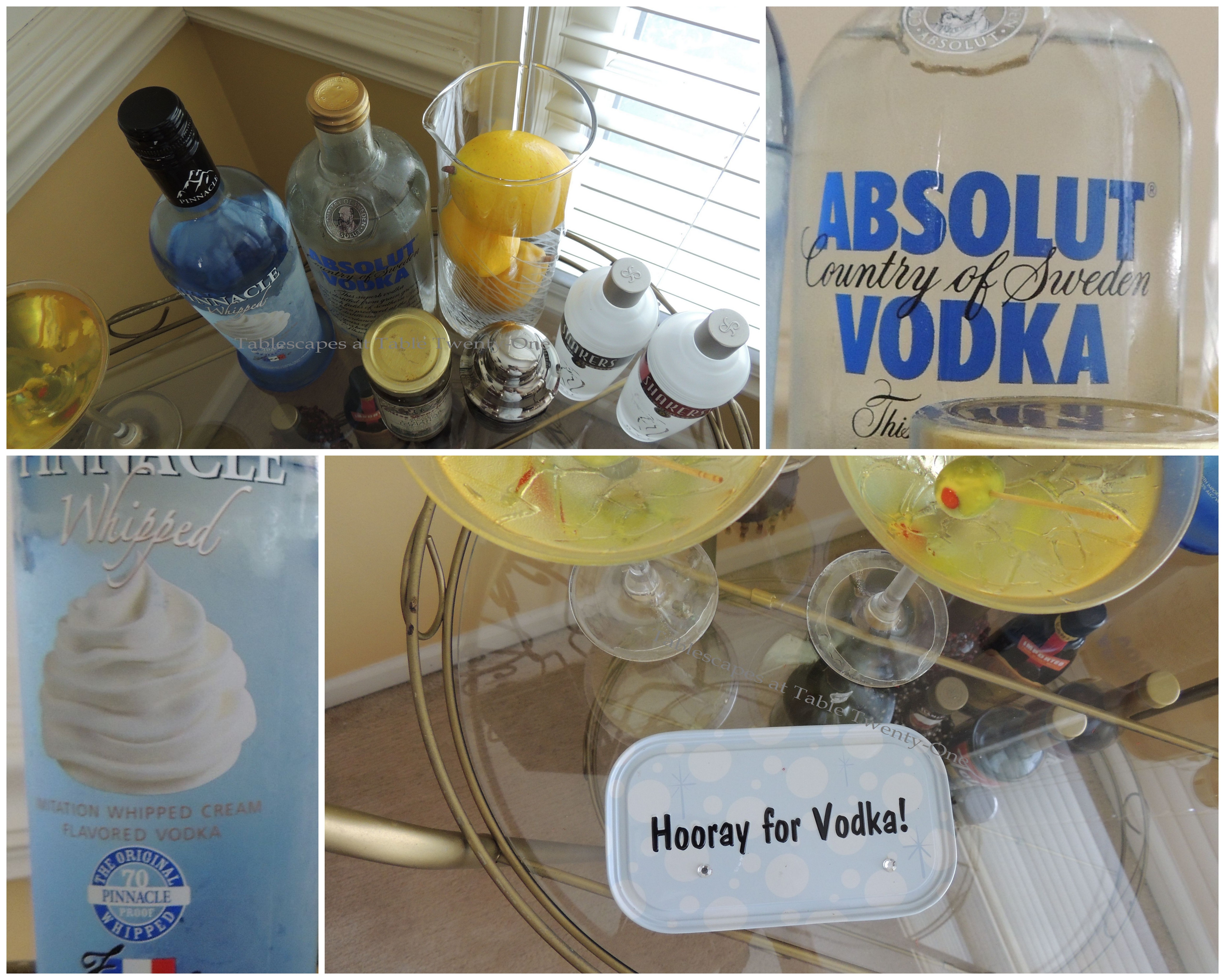
INSPIRATION: My niece, Yvonne, bought me this fun placard a few years ago to celebrate my favorite party libation.
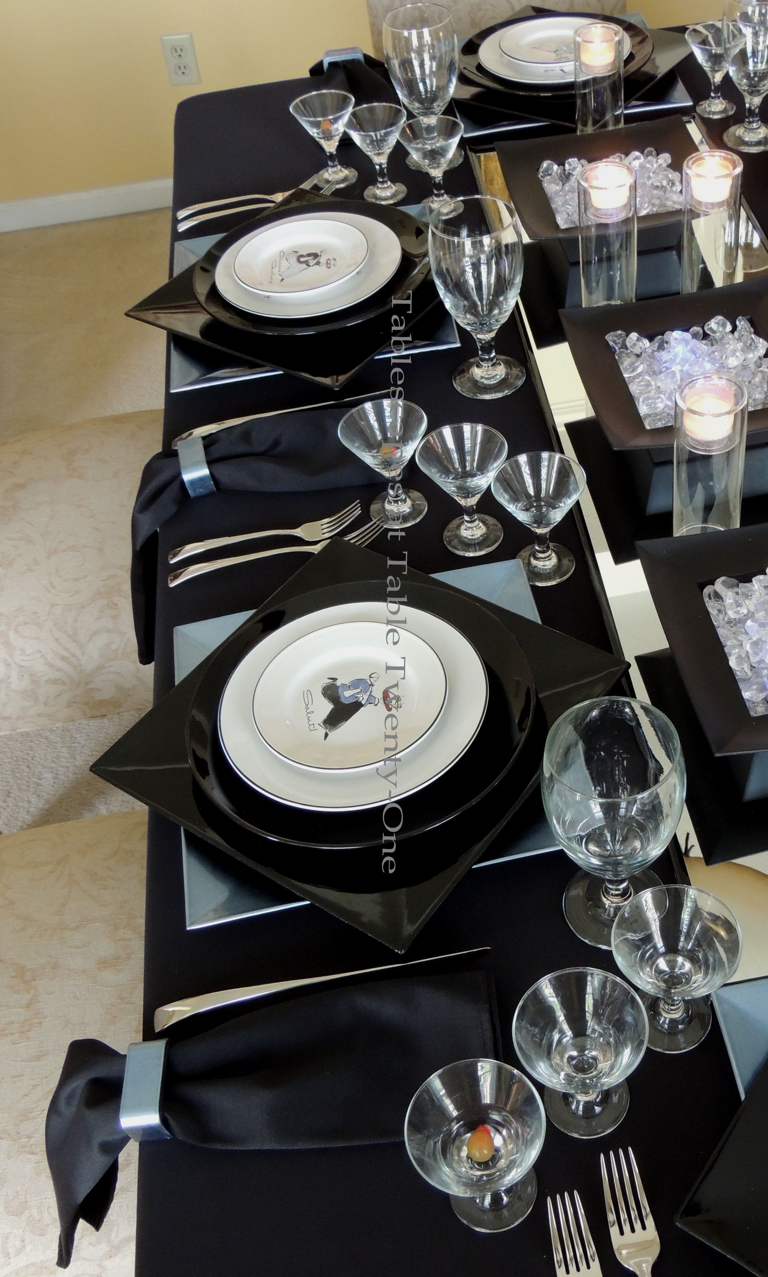
New Year’s Eve 2013 is just 2 days away, and I say, “Good riddance to you, 2013!” This year SUCKED for me in so many ways! My Dad got sick and passed away, I had surgery that has required many months of painful & tedious rehab…it just plain SUCKED!!! So I’m ready to party and kiss this year goodbye. Martini, anyone? (Click on any photo to enhance/enlarge it and see details up close.)
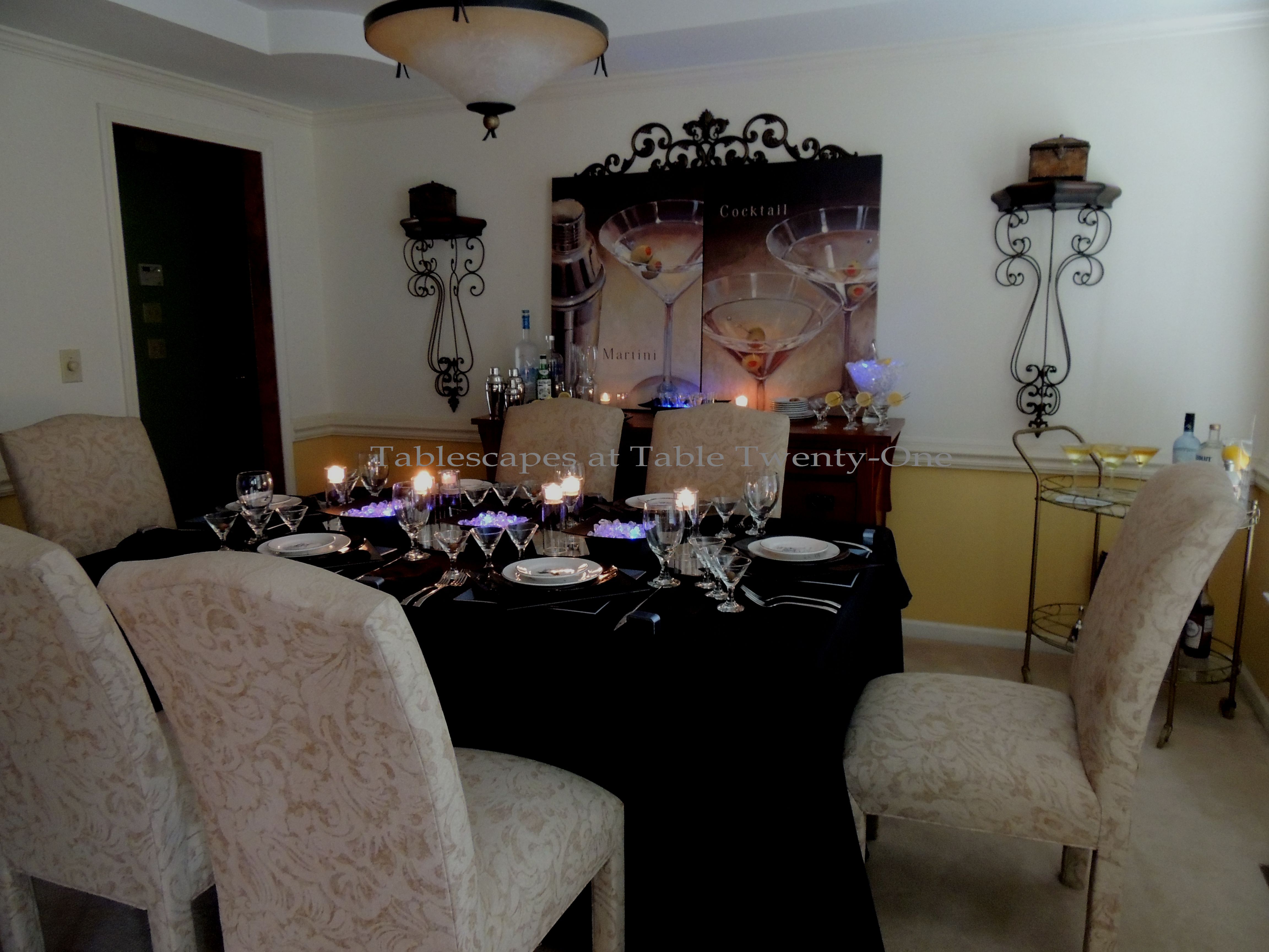
I wanted to include a photo of the room in natural daylight and one with the lights dimmed so that you get an idea of the lighting effects. A contemporary dinner/cocktail party like this is really easy to do, and the expense was kept to a minimum by using things I already had and shopping thrift stores.
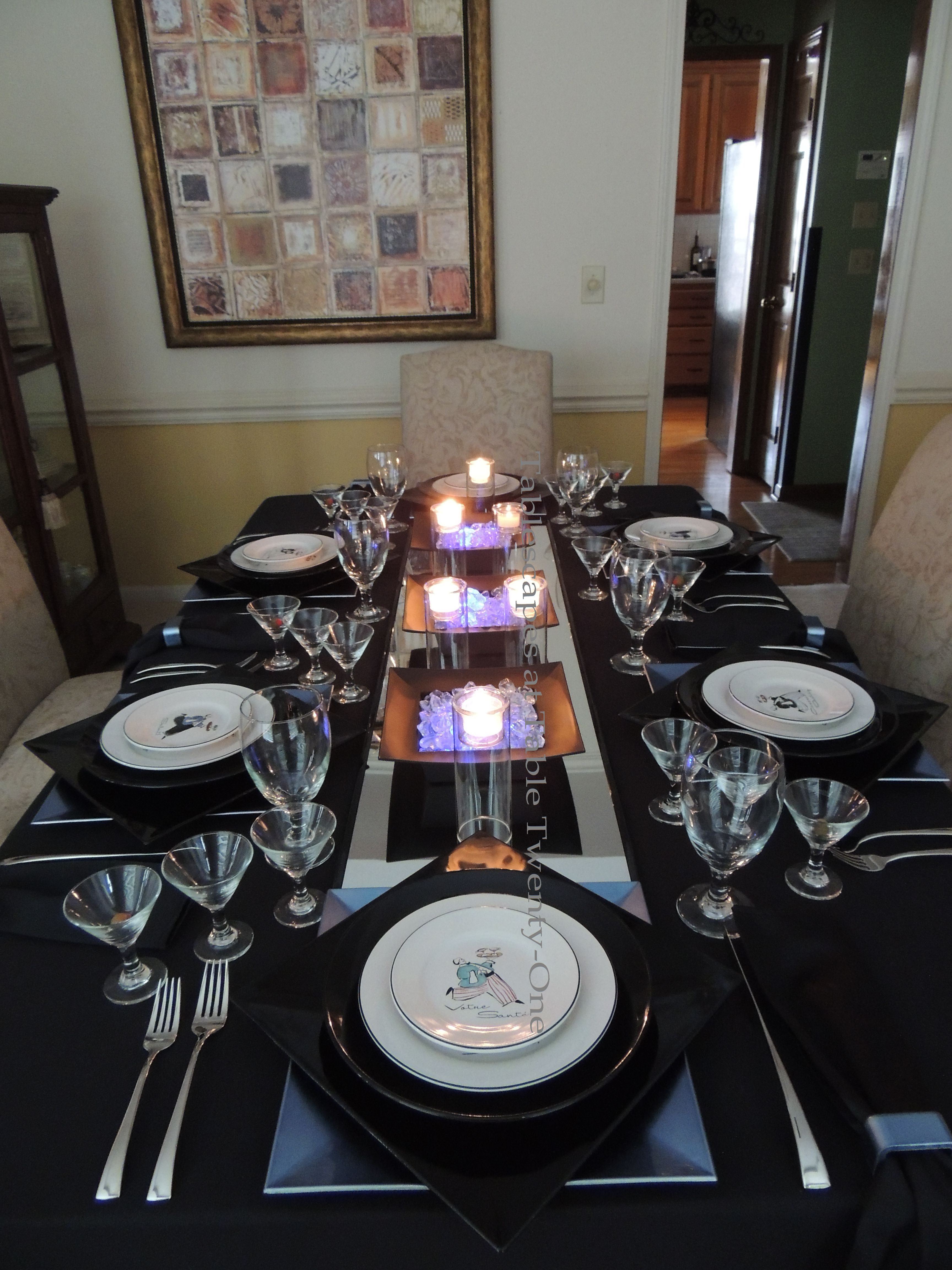
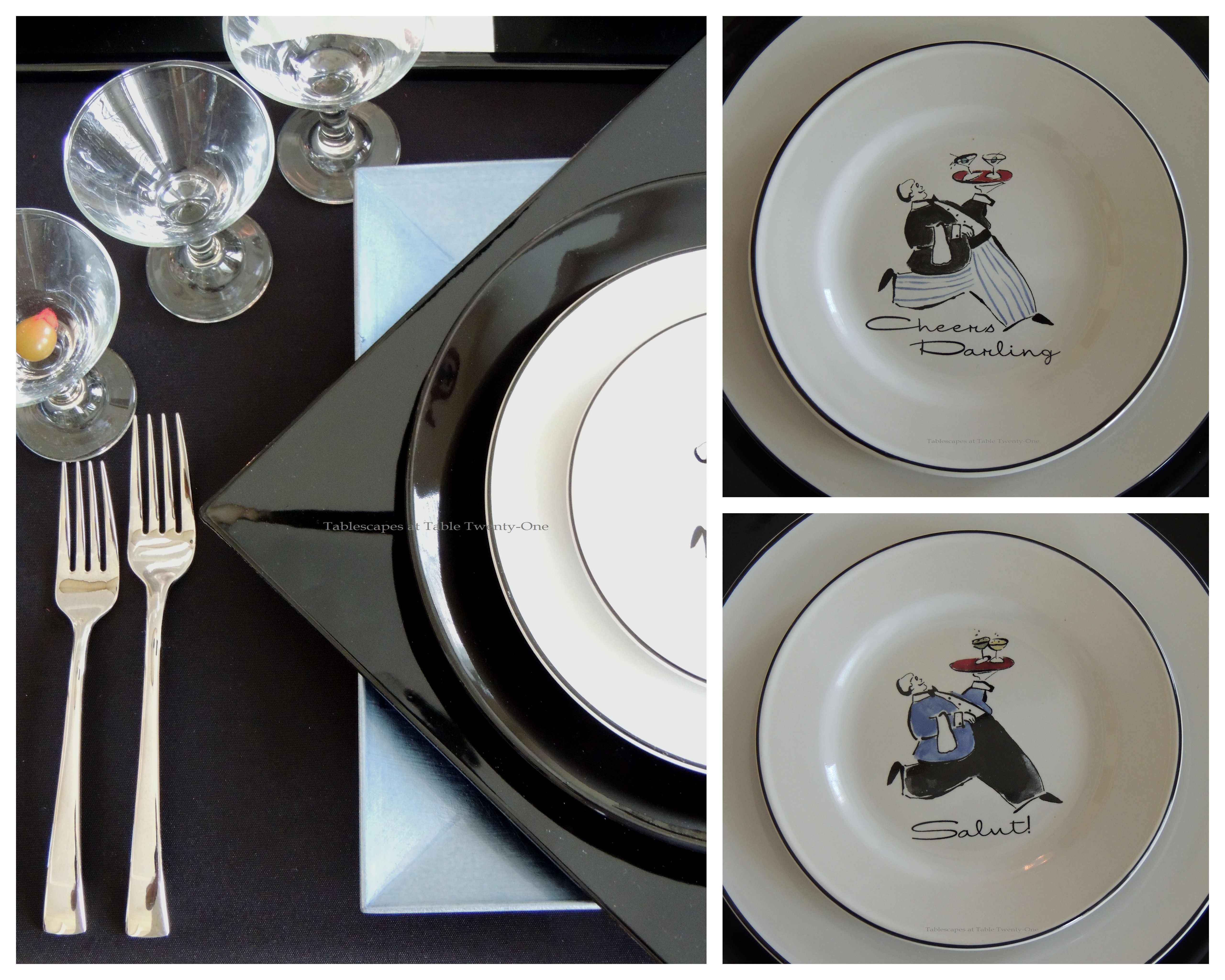
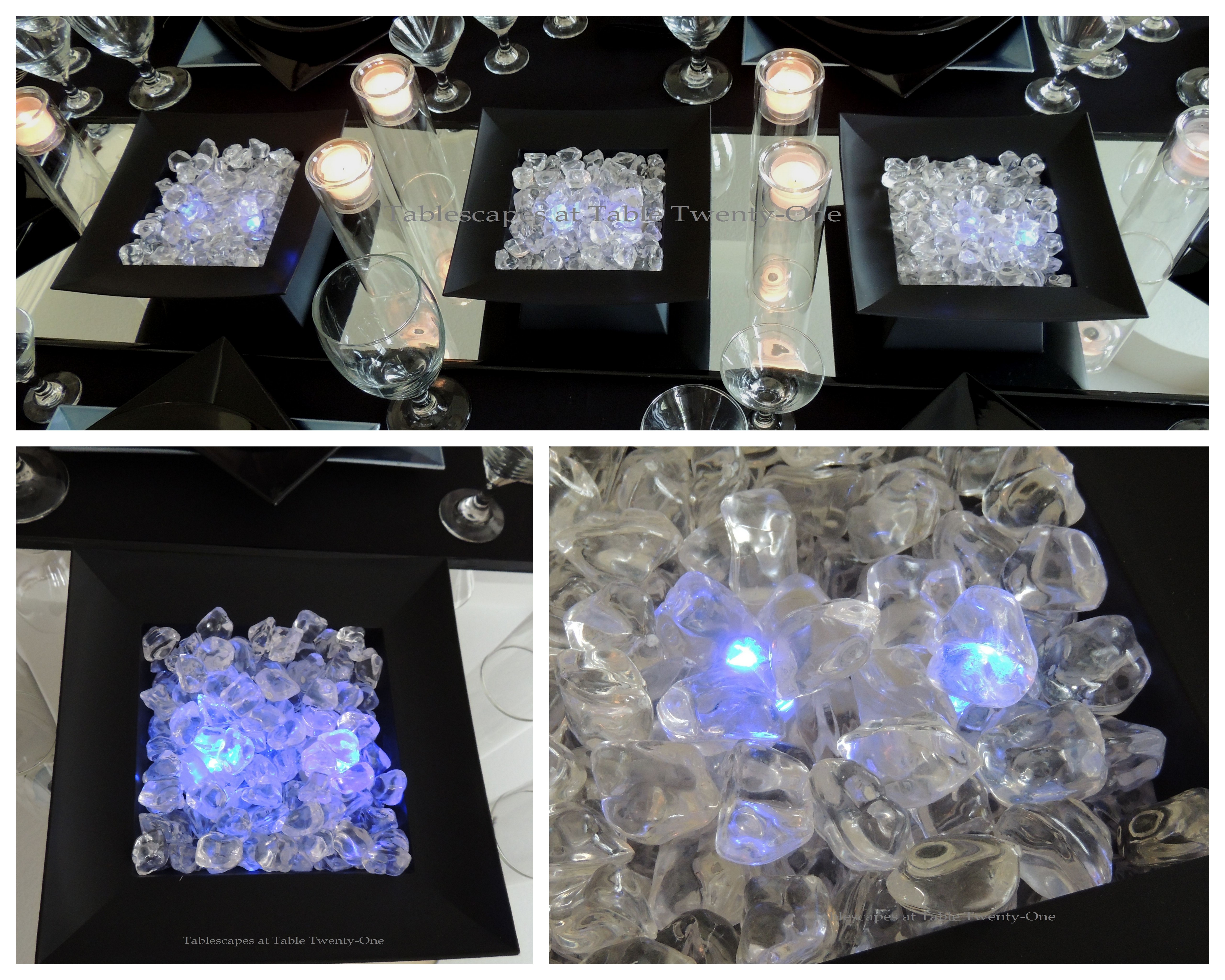
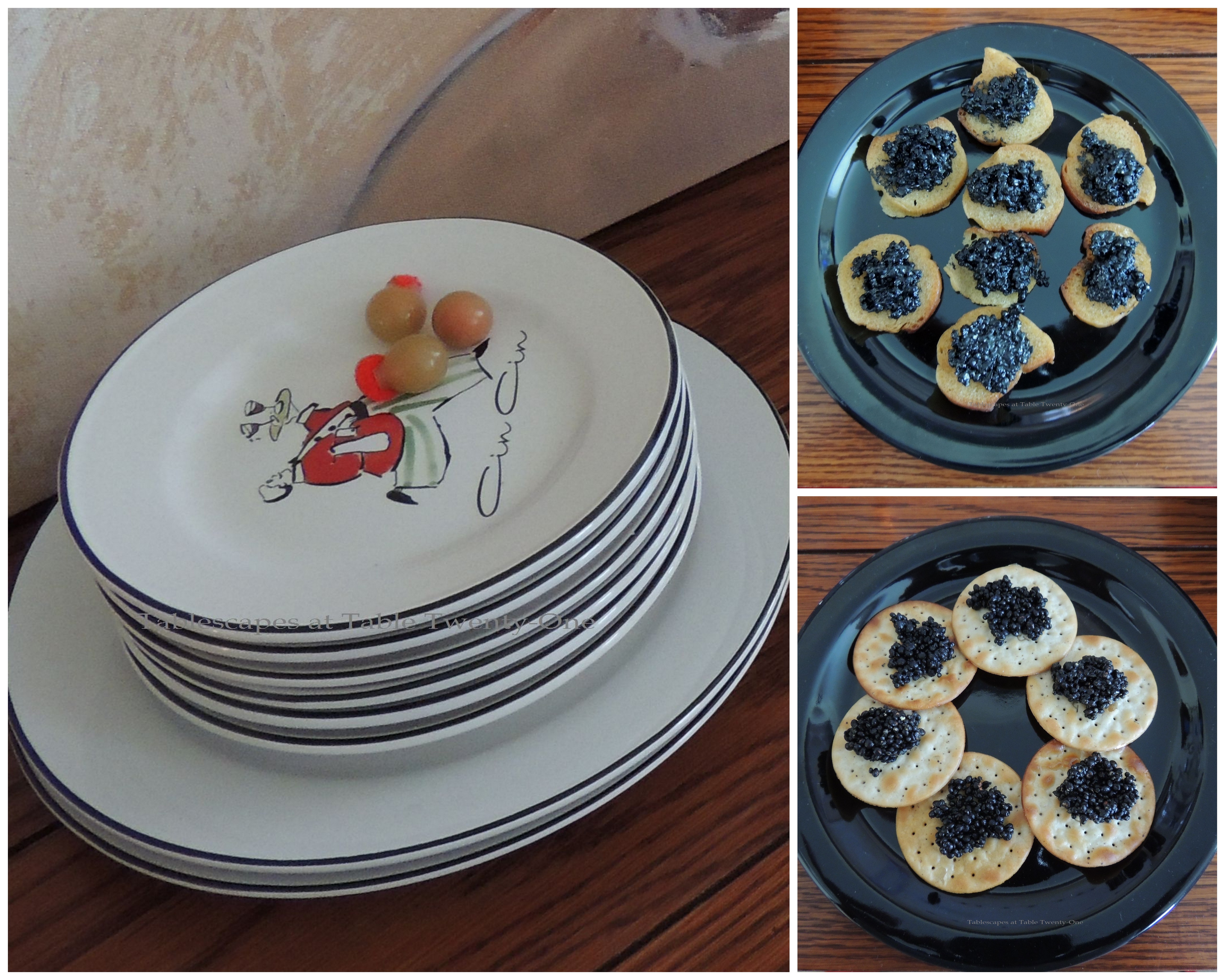
I played up the blue in the dishes by introducing a square French blue acrylic charger topped with a juxtaposed black one. The black dinner plates are topped with a salad plate and appetizer plate purchased at a crazy rock bottom price at a local thrift store. (I think this will put a big smile on Jamala’s (Vintage 4YourHome.com) face because she is a super thrifter!) Each plate depicts a portly waiter serving up a different vodka-based cocktail.
The contemporary styling of the J.A. Henckels “Bellaserra” flatware is perfect for this setting. The squared off handle complements the straight lines of the double chargers.
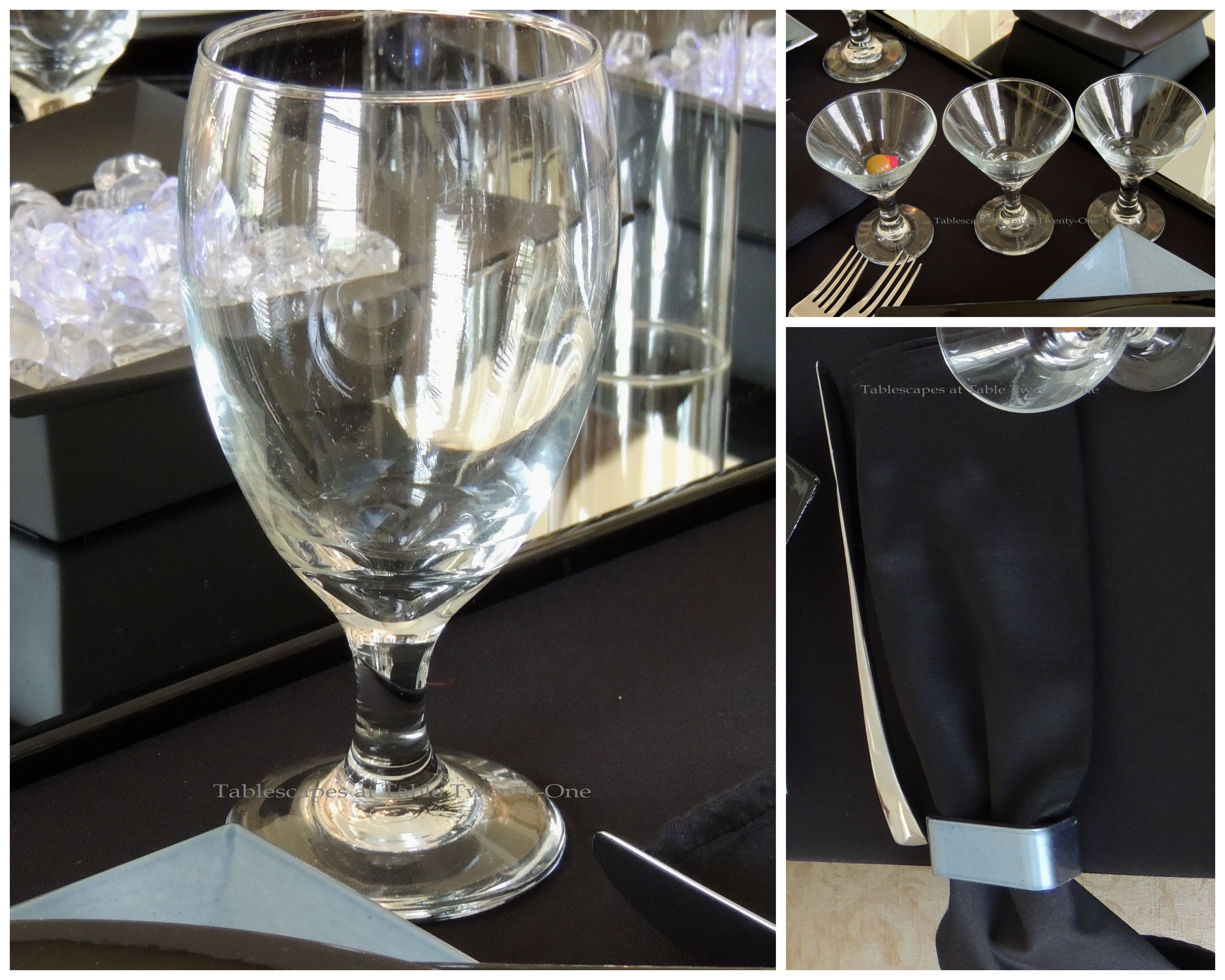
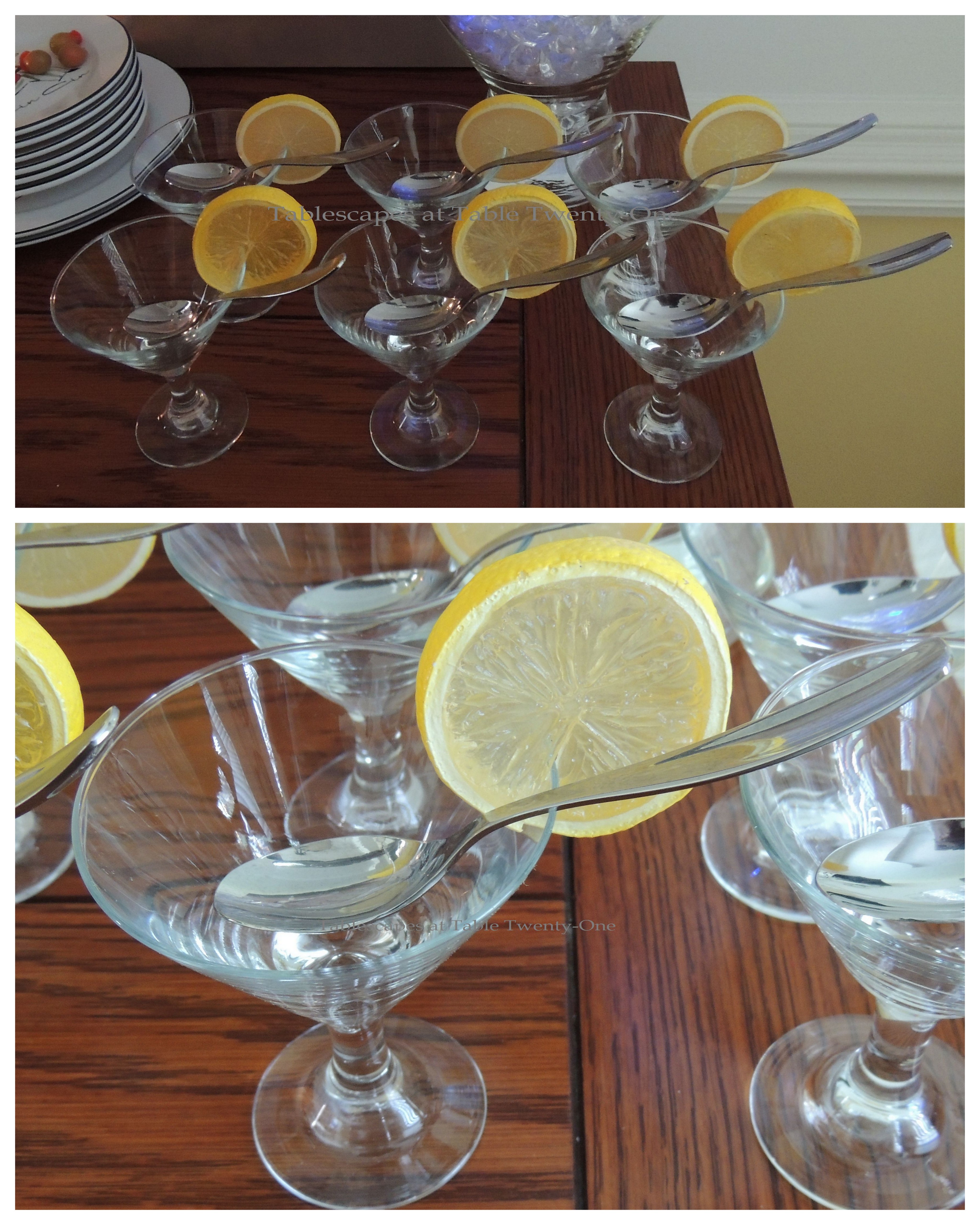
A flight of three miniature martini glasses from Crate & Barrel are at each place setting. I like to serve a different vodka-based drink at different intervals of the meal. A water glass is at each place setting because let’s face it…you can only drink so much vodka before your face is in the plate!!! 🙂 The black napkins are simply folded and laced through a French blue squared napkin ring that matches the charger. (Click HEREand scroll down to “And the Winner Is…!” to see another tablescape with a vodka flight.)
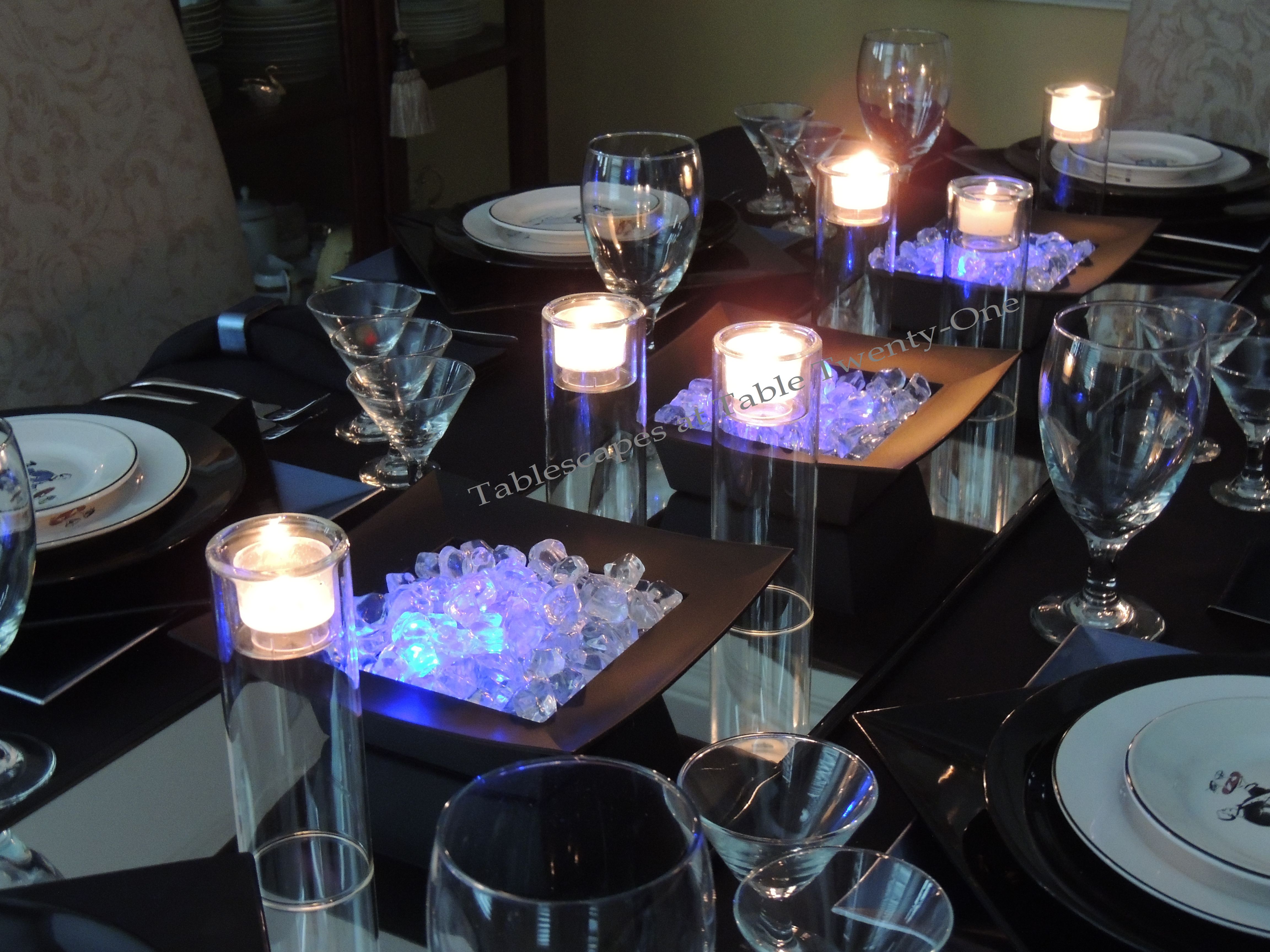
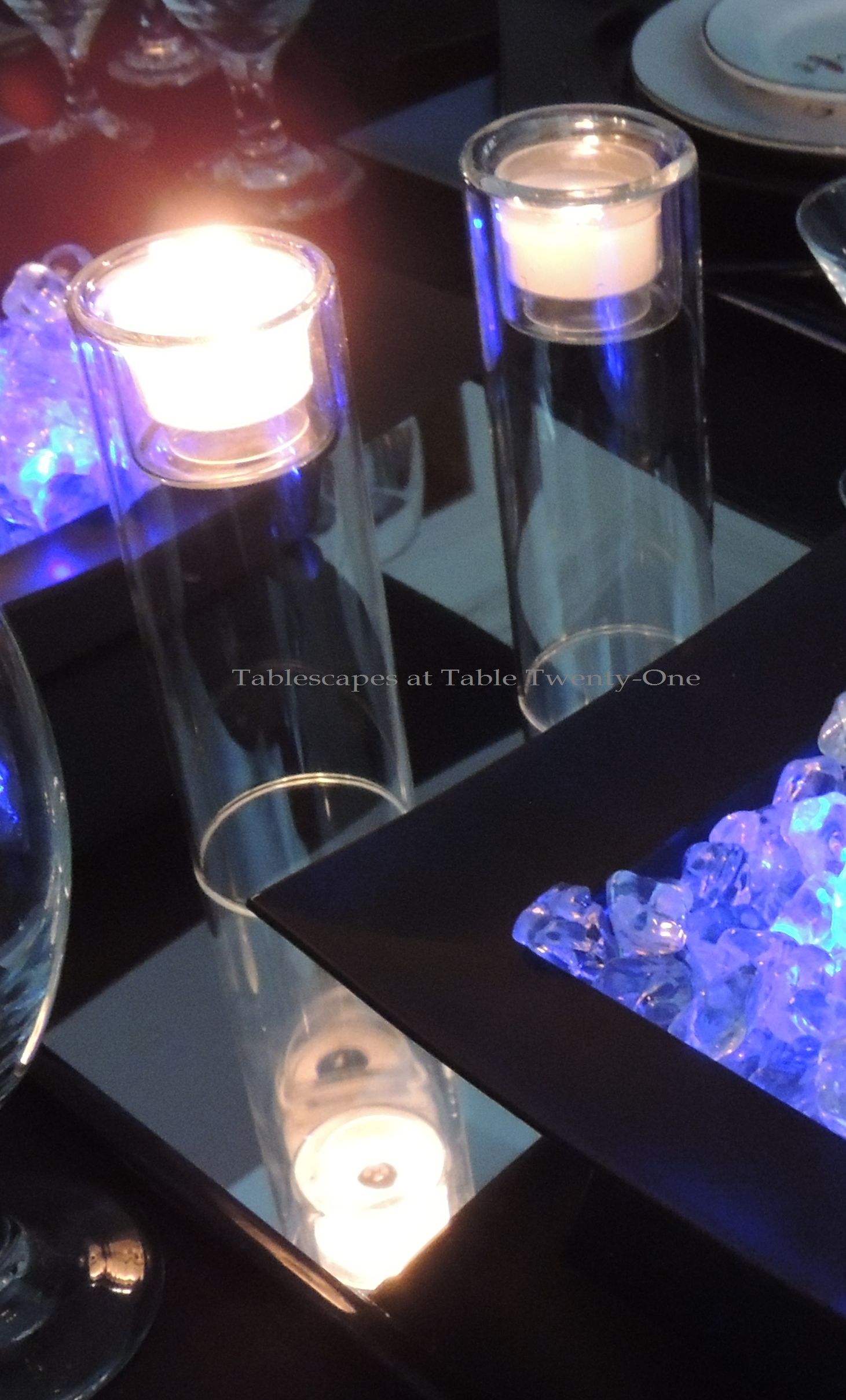
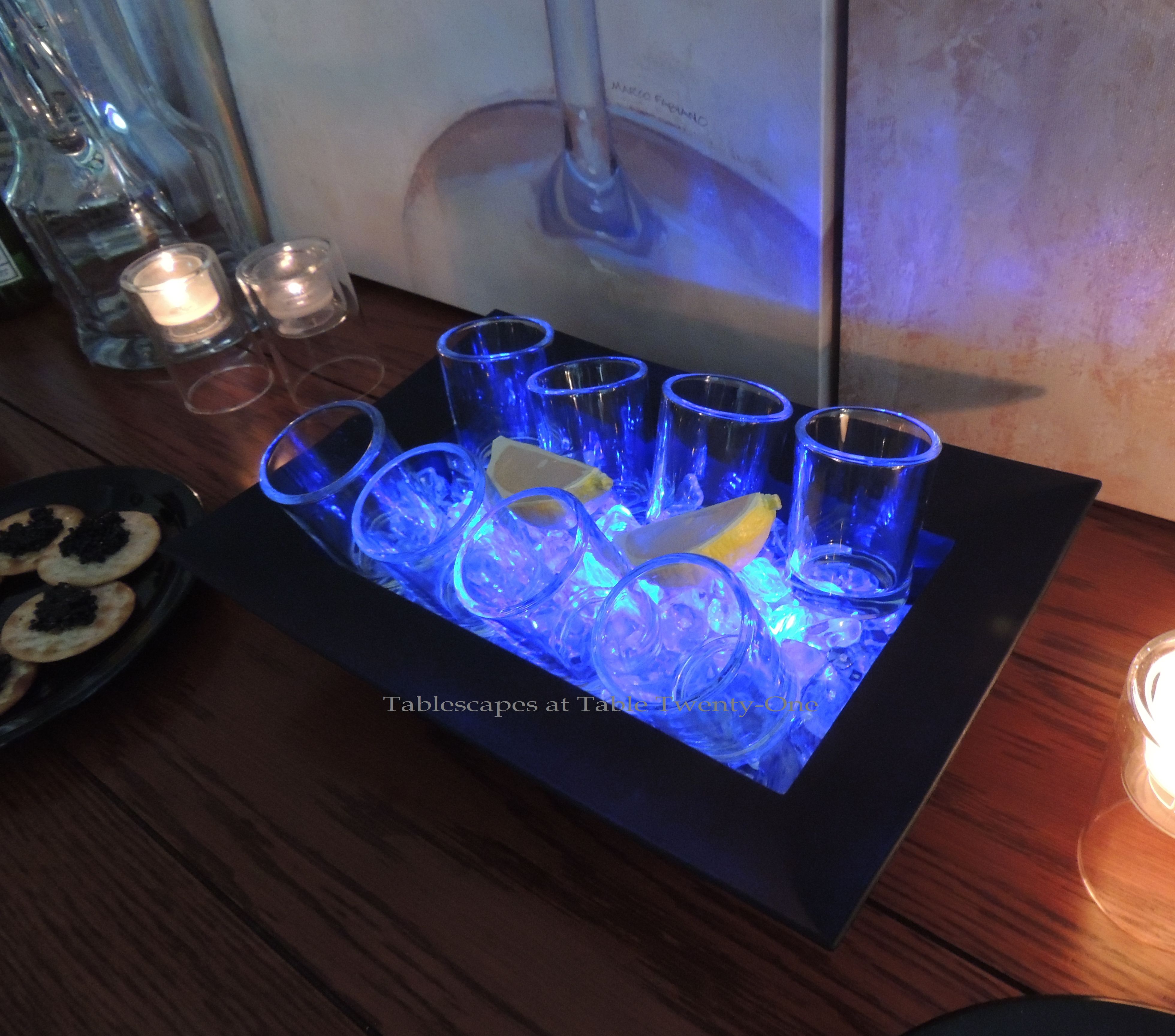
The centerpiece is what really brings the drama to this tablescape. For New Year’s Eve, it’s imperative that you include something that has lots of sparkle and light like the Times Square ball! I started the centerpiece with an inexpensive ($3 or $4) black framed door mirror from Old Time Pottery. Mirrors are a GREAT way to stir up drama on your table! (Click HERE, HERE, and HEREfor other dramatic centerpieces on this site using large mirrors.)
The square bowls used here, believe it or not, are just black acrylic planters that you can pick up at any floral shop for a couple of bucks. I’ve even seen them in the garden department at Walmart! I chose them for the shape and color. Each bowl is filled with acrylic ice chips lit from beneath with tiny blue LED lights. (If you opt to use real ice, be sure your LEDs are waterproof!)
These are the LED lights used in the centerpiece. You can buy them just about anyplace like Hobby Lobby, Michael’s, or any floral or home accessories shop.
These cool double-decker glass votive holders were purchased on clearance at Pier 1 a few years ago. I like the way they reflect in the mirror beneath!
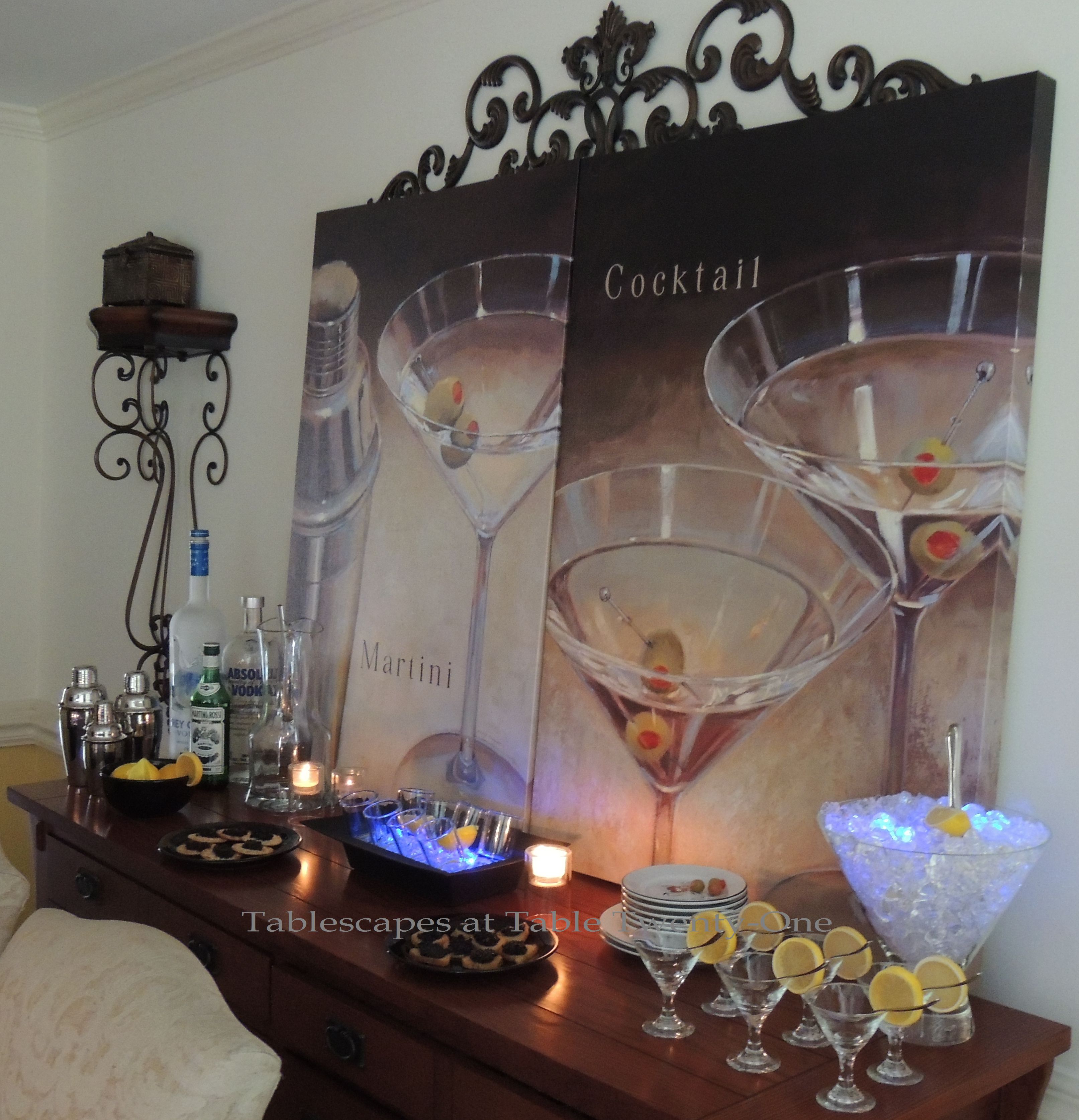
It ain’t a party unless you’ve got a swanky DIY bar goin’ on!!!
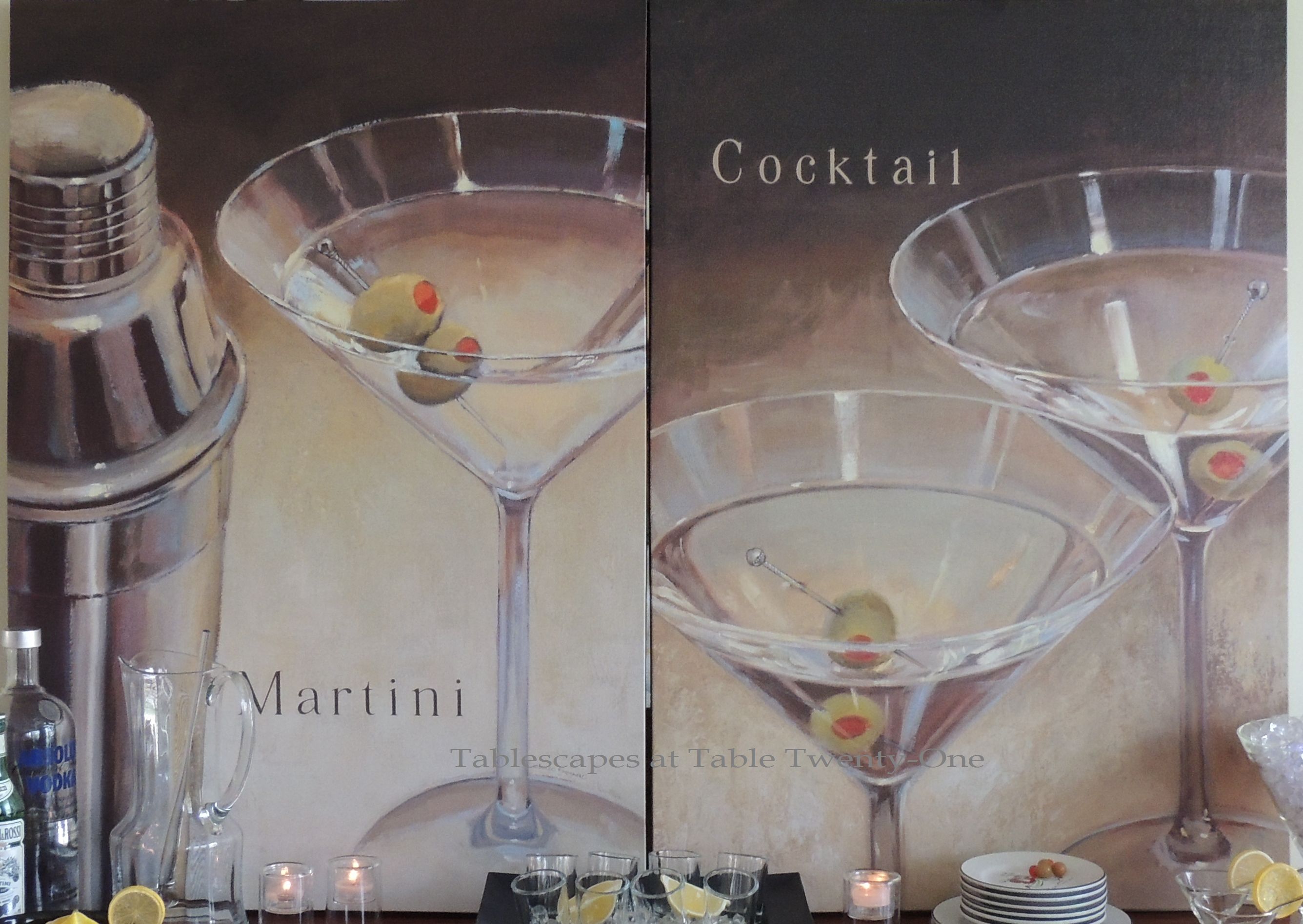
I borrowed these canvases from our lower level bar area & just propped them up on the buffet to hide the mirror on the wall. Adding fun art as a backdrop on your buffet is a little more of that drama I alluded to earlier. (Tip: Shop your house for accessories that can kick your tablescape up a notch.)
How’s THIS for drama? Same concept as what’s going on with the table centerpiece, but this time REAL ice is used to keep shot glasses teeth chattering cold for vodka shots!
Since I bought a whole case of the mini martini glasses, I thought it prudent to use them for serving hors d’oeuvres, too. The mini spoons are from Bed, Bath & Beyond. They also make great dessert vessels!
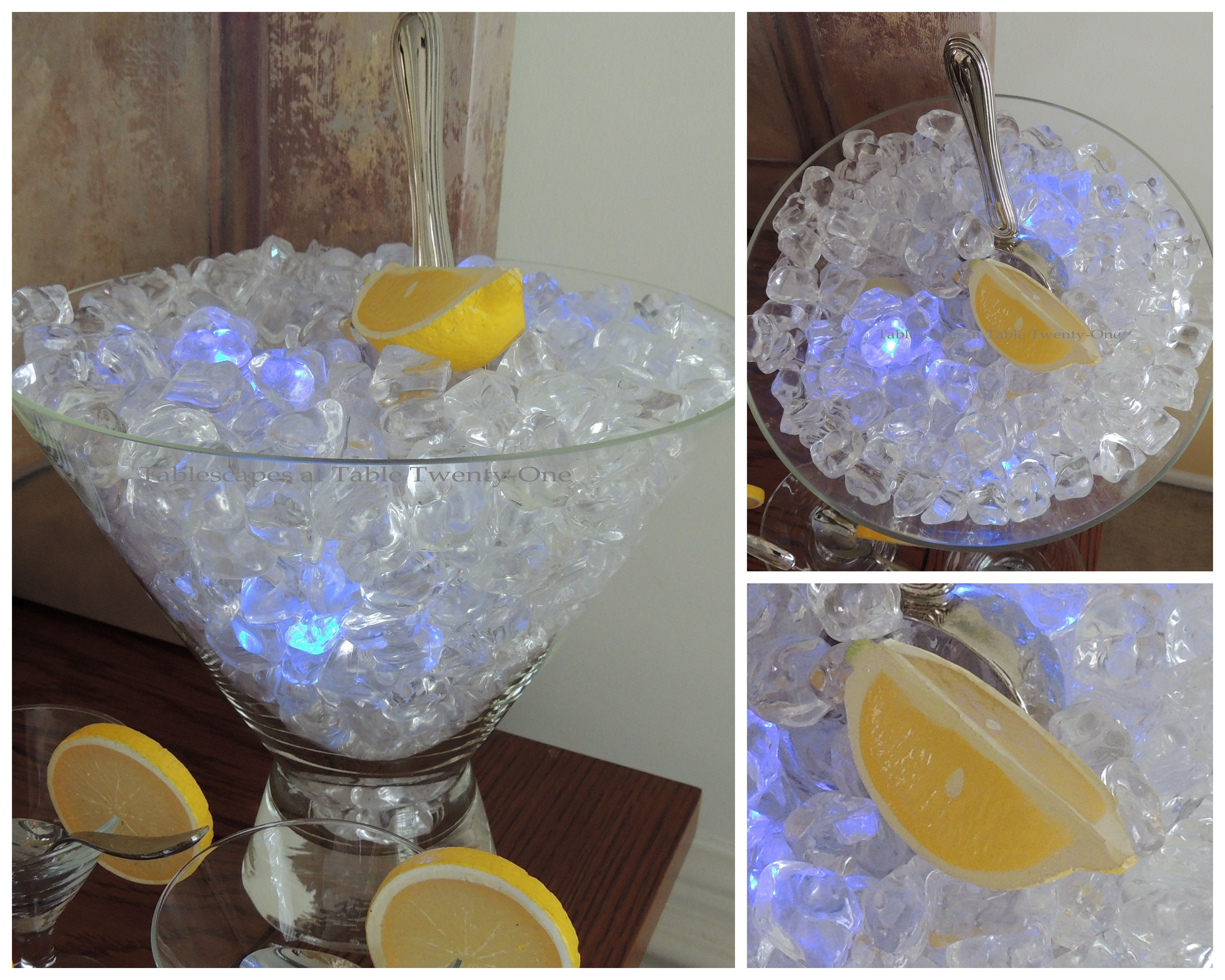
I have had this oversized martini glass for as long as I can remember. Since I would never dream of drinking a martini this large 😉 , it works nicely as an ice bucket. The silver scoop is a nice addition to fancy it up. Waterproof LEDs add a little zing.
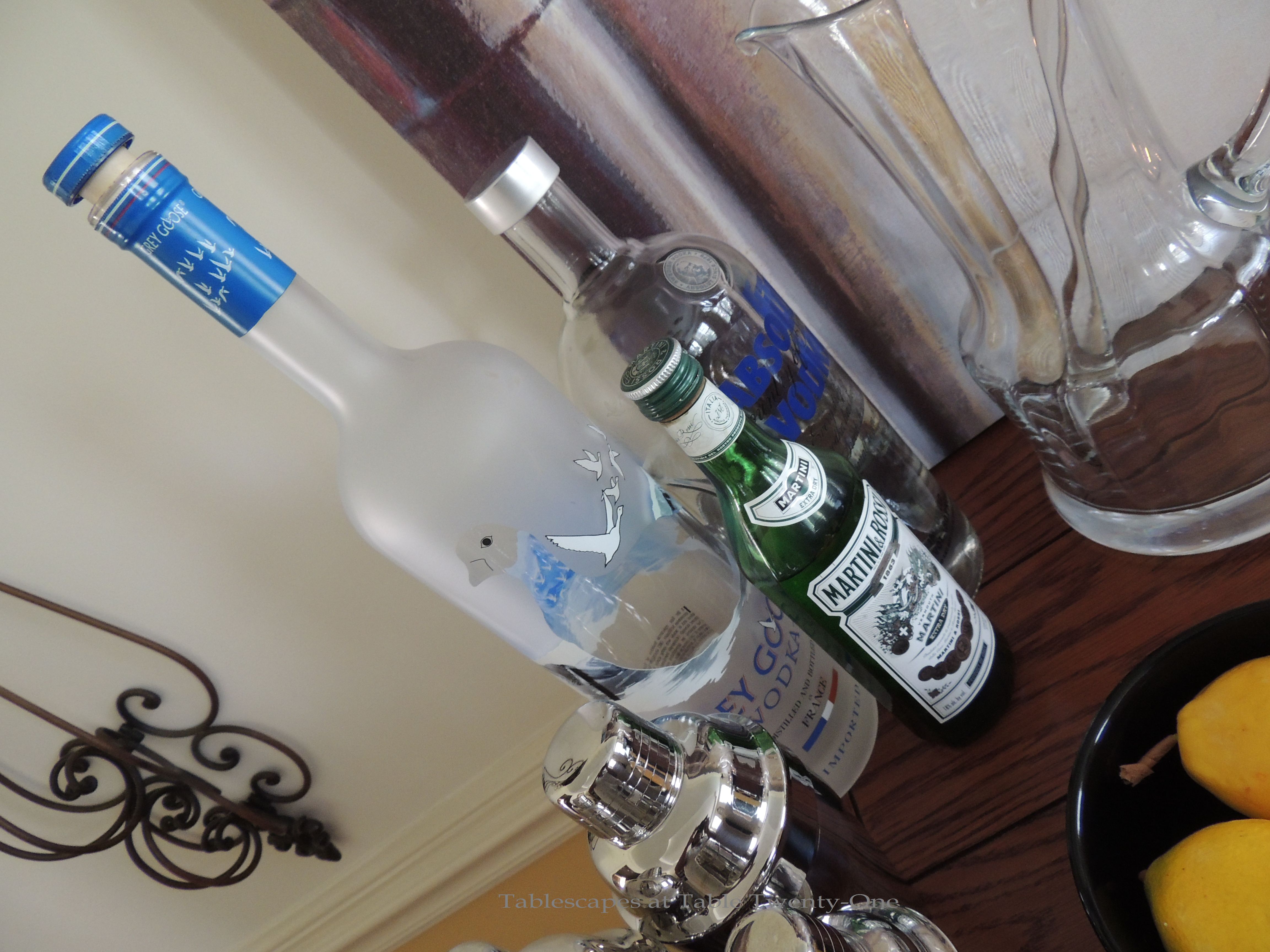
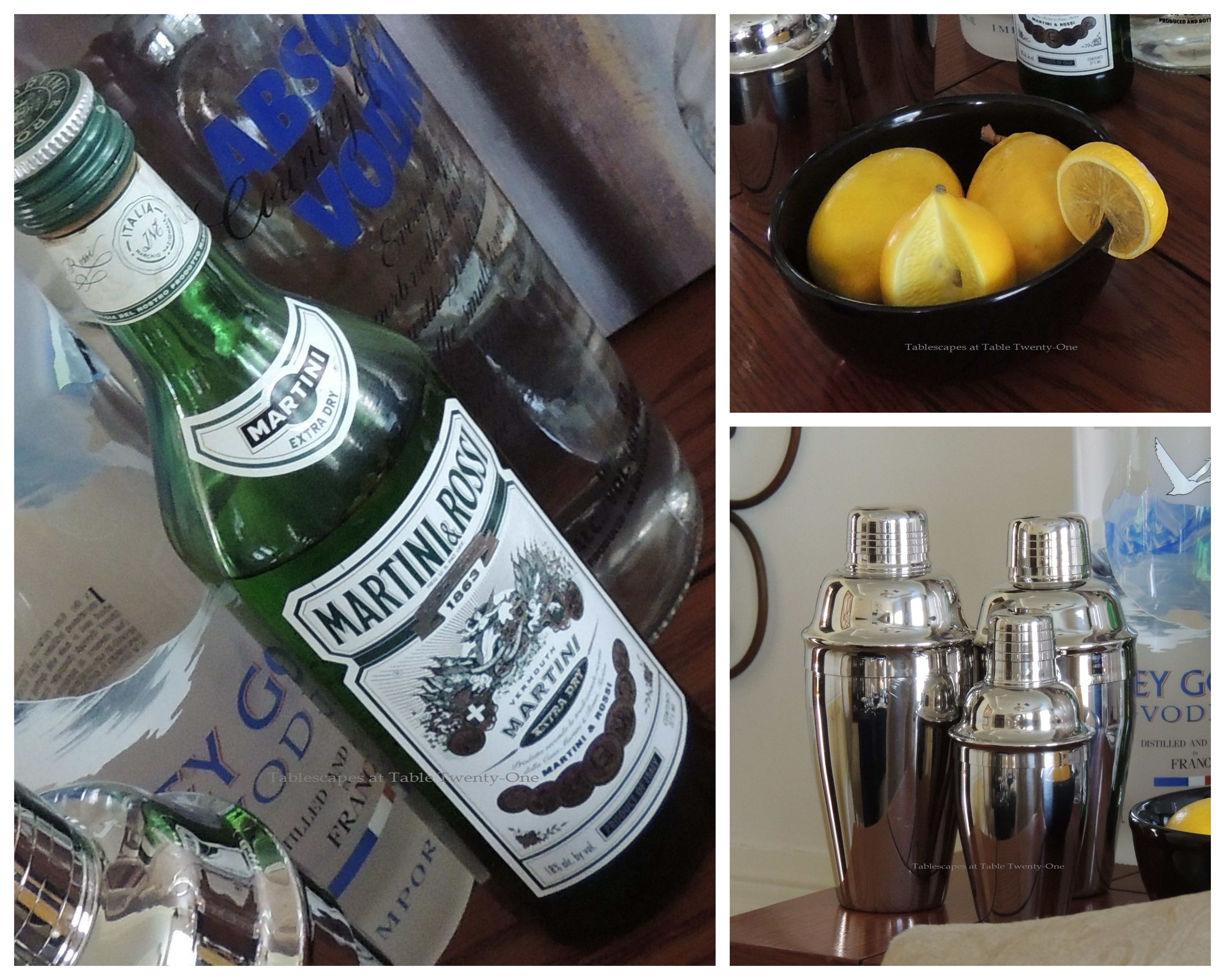
I like to have at least 2 or 3 different brands of vodka on hand to suit guests’ tastes. Caviar is a perfect pairing with ice cold vodka. Hop on Google or Bing to see what other foods to serve with vodka-based drinks for both your cocktail hour and dinner.
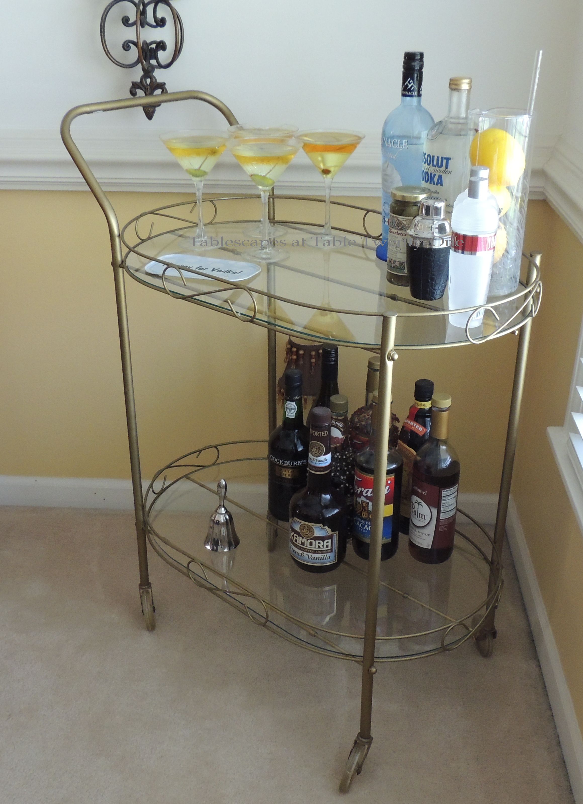
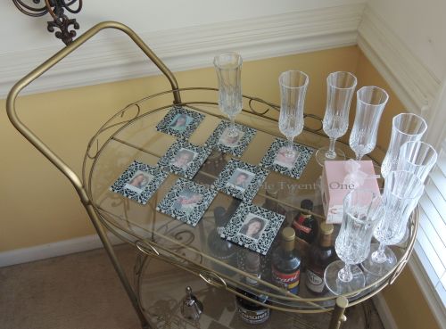
Our vintage tea cart is used here as a secondary bar. Have you tried that Pinnacle Whipped Cream vodka?!??!?! T-A-S-T-Y!!! My son’s girlfriend makes something called an Orange Creamsicle. Basically just mix it with good orange soda (Orange Crush seems to be the best because it’s super fizzy) and top with whipped cream. I’ve also seen recipes that call for mixing the vodka with orange juice and lemon-lime soda. DEE-licious! But careful…that bad boy will sneak up on you and bring you to your knees if you’re not careful! 🙂
I wish you all a SAFEand very Happy New Year!!! Thank you for hangin’ out and – perhaps more important – hangin’ in there with me this past year! 2013 sucked a whole lot less because of you!
🙂 🙂 🙂
INSPIRATION: This prim, proper, and oh-so-Parisian French poodle I bought at Home Goods with a gift certificate I won from Cuisine Kathleen!
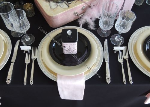
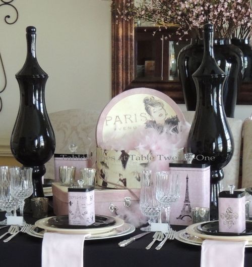
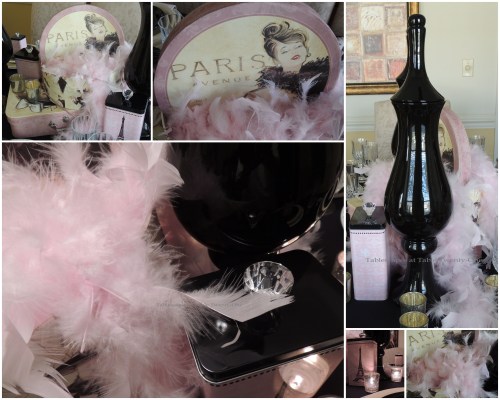
With Mothers Day on the horizon and this time of year buzzing with bridesmaid luncheons, bridal showers and birthdays, this Paris-themed tablescape using pink, black, cream and white is a fun idea to add a little ooh-la-la to the celebration! (Click on any photo, then click again to enhance/enlarge it.)
This very girly tablescape begins with a full-length black cloth from LinenTablecloth.com. Black linens are a staple just like the proverbial “little black dress” we all have in our closets because they can be dressed up or dressed down.
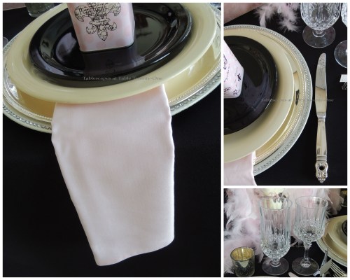
Each place setting is outfitted with a rhinestone-studded white charger that has been topped with another silver beaded-edge charger. The dinner plates are a simple cream color, and the salad plates in black to finish the look. TIP: Remember…it’s not always necessary to use “matching” dinnerware, but rather pieces that are complementary to one another and the surrounding decor.
A soft pink napkin from Bed, Bath & Beyond peeks out from beneath the dinner plate and is highlighted by the black background of the linen. The flatware, passed on to me from my Mother, is International Silver’s “Royal Danish” and the crystal diamond-cut stemware is from the Longchamps collection.
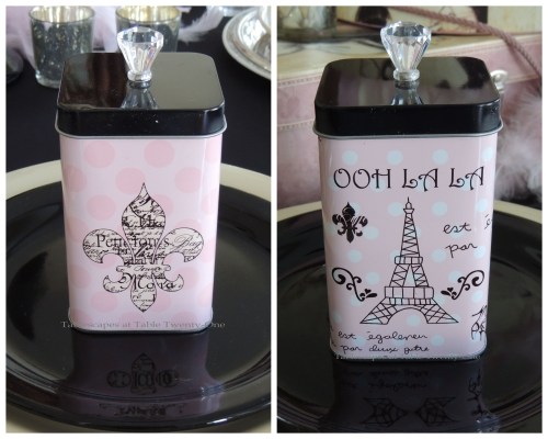
Whatever the special occasion, you want to have something fun for your guests to remember the event. These fun little tin boxes (Michaels Ashland Home Decor collection), embellished with either a fleur-de-lis or Eiffel Tower, are topped with a pretty “diamond” knob. They make a great favor in and of themselves (I’m using mine for storing cotton balls, Q-tips and makeup sponges in my dressing room!), but if you want to take it a step further, add a little gift or edible treat to be enjoyed later. TIP: These tins are on sale this week (thru 4-20-13) at Michaels at 50% off!
I L-O-V-E these darling silver Eiffel Tower place card holders from Beau-coup.com. Thanks to the folks there at Beau-coup who were so kind as to send these for me to use in a tablescape. Even the place cards are embellished with tiny fleur-de-lis symbols!
I always go on about shopping your home for centerpiece items, and these fun hat boxes from Gordman’s and poufy pink feather boas from Hobby Lobby came straight from my dressing room. I lengthened the centerpiece by adding curvy black lidded ceramic vases from Tuesday Morning and a couple of the larger pink & black tins from Michaels. Silver mercury glass votives dot the area for shimmer and ambient light.
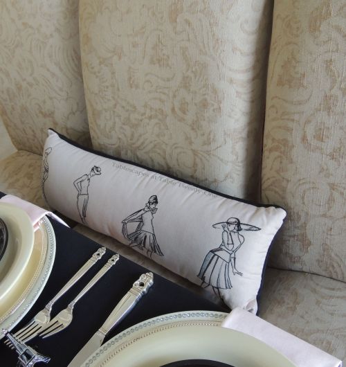
This pink & black fashion pillow from Stein Mart is another item found in my dressing room that adds another fun touch to the overall ambience in the room.
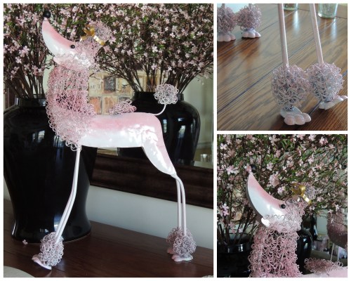
I like to extend the look on the table to the buffet. This time I used a black ginger jar from Home Goods to display a generous profusion of faux floral branches from Hobby Lobby to add to the feeling of springtime in Paris. Shading herself beneath the floral arrangement with her perfect little nose in the air is Fifi the pink French poodle. Thank you again, Kathleen! I’ll get a lot of use out of Miss Fifi in the years to come!
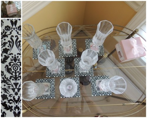
Beau-coup.com came through again with a real winner. These glass coasters are great for entertaining! Just slide a photo of each guest into the back pocket, and voila! (I used the photos of some very special blog buddies.) These coasters could work well as a place holder at the table or to simply identify whose drink is whose at a cocktail party! (Imagine your bridesmaids’ delight if you had this at their place setting and then a whole pack of them as a little thank you gift after the shower or luncheon!) The classic damask design around the edges lends to the upscale feel of the room’s design elements. One of the best features: the coasters have little rubber “feet” on the four corner to help stabilize them on any surface!


 Bursts of bright green play nicely off the bride’s chosen colors of French blue & white. Granny Smith apples and juicy green grapes are surrounded by green button mums, spider mums, pink waxflower, Queen Anne’s lace, viburnum, and fragrant Stargazer lilies all spilling from a silver pedestal bowl. The main piece is flanked with green grapes atop simple silver pedestals.