If you’ve not seen the latest Julian Fellowes installment, “Downton Abbey: A New Era”, don’t worry…no spoilers here. I waited until it came out on Peacock this week to watch myself and would have been grievously disappointed if the surprises had been tarnished.
This is just my way of once again paying homage to the sublime series and subsequent movies that have been so entertaining as I binge-watched in the comfort of air conditioning throughout this blistering hot summer.
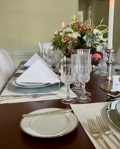
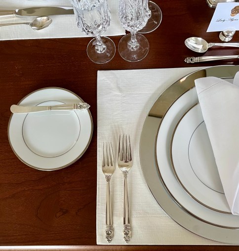
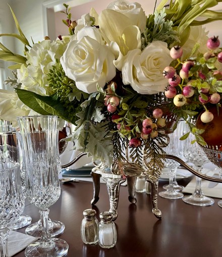
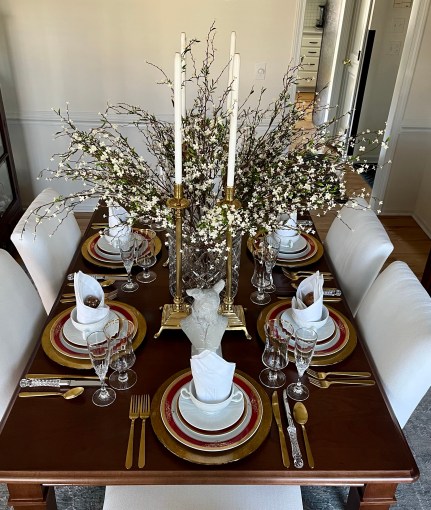
The Crawley family may have (often reluctantly) transitioned from the blithely unrestrained indulgences of the Edwardian era to the slightly less buttoned-up/pre-Stock Market Crash Roaring Twenties, but they still dine in a refined manner. I tried to capture the essence of that poised manner with gleaming silver chargers and flatware, fine white china, cut crystal stemware, and crisply starched hemstitch napkins.
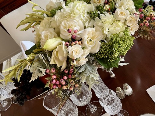
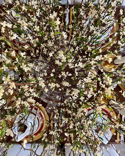
This silver epergne is perfect for a lush centerpiece of fruit and flowers.
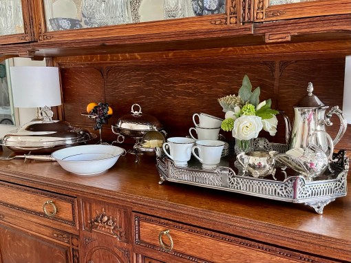
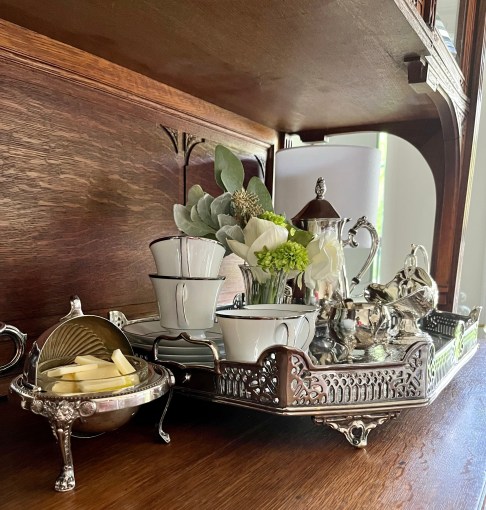
The vitrine holds all the service pieces including an inherited butter server. With an army of footmen no longer en vogue, who on earth will bring it all to the table?🤷🏽♀️
Obsessed? Maybe.🤔 Entertained? Absolutely!😀
If you’re into formal table settings, you might like these:
Celebrating the Return of “Downton Abbey” 2022 with Quotes from the Dowager Countess
OK…so you got me! Busted! I finally gave into the whole “Downton Abbey” craze after resisting for more than 10 bloody years. (Oops! I sound like a commoner!)
“Vulgarity is no substitute for wit.”
I started watching and simply could not stop!!!!!! I have now watched the entire series 3 times over, the 2019 movie twice, and am gearing up to see “Downton Abbey: A New Era” at our local theater. Satisfied?
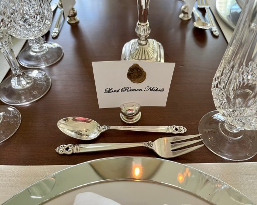
So to celebrate the new movie, the glory of all things “Downton Abbey”, the beauty of formal table settings, and most particularly the wry humor and steadfast wisdom of the Dowager Countess, Lady Violet Crawley (quotes in her signature violet color), I’ve created a couple of tablescapes that I think capture a bit of the splendor. This is the first of two…or many…not by any means historically accurate!😉
I read somewhere that a white tablecloth was used in the series only to protect the decades-old table at Highclere Castle where “Downton Abbey” was filmed. (If I read it on the internet, then it must be true!😉) Hmmmmm…🤔 So naked formal table it is for this entry!
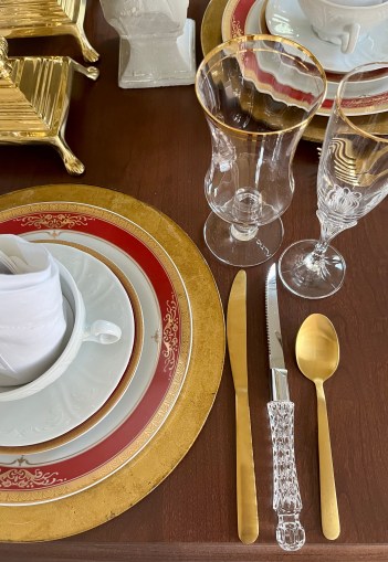
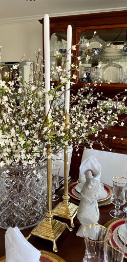
I don’t know, nor did I note in the series or the first movie, that gold was used very much decoratively in the 1920s. (Silver – or silver plate, nickel, or zinc for the less monied – had prominently established its place.) I’ve blatantly strayed from that with this gold leaf charger, the flatware, and gold-rimmed Royal Scotland china.
“Nothing succeeds like excess.”
Meals were always served in courses at Downton, and a cream soup bowl and saucer like these from Nell Hills in Kansas City, MO may have been a part of that.
I took notice of the elaborately folded dinner napkins and did my best to replicate a Bishop’s Hat fold. I failed miserably and settled on this one instead. As noted in an article in Victoriana Magazine, the famous Delmonico’s restaurant in New York always employed a napkin fold to hold the dinner roll. Whether or not the Dowager Countess would approve of such a change is up for debate…or not.😒
“First electricity, now telephones. Sometimes I feel as if I were living in an H.G. Wells novel.”
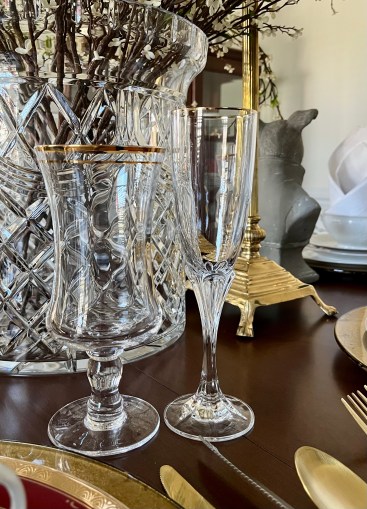
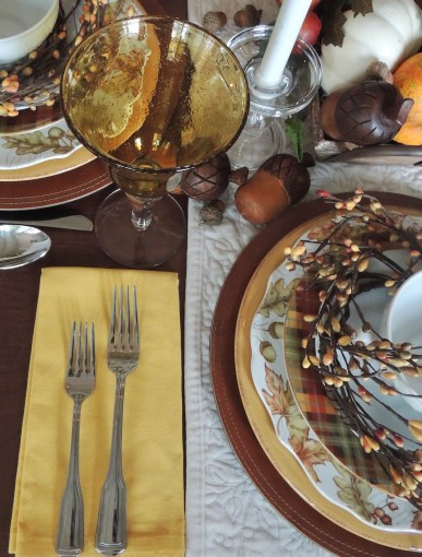
My beloved Nell Hills (Kansas City, MO) beverage stem with Cristal d’Arques “Asheville Gold” champagne flute.
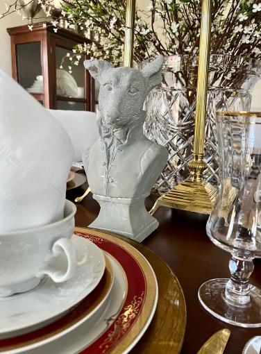
While you’ll never, ever, ever see the likes of these little dudes (they rather look like footmen, don’t they?) on a formal dining table at Downton, I felt them right at home 100 years later. I like them, so they stay…unless the Dowager Countess says otherwise, of course! (Source: The Painted Sofa, Kansas City, MO)
“Don’tbedefeatist, dear. Itisverymiddleclass.”
The Dowager Countess referred to Lady Grantham’s floral arrangements as being better suited for “a first Communion in Southern Italy.” Geez…that was harsh! 😒 I don’t even wanna know what she’d say about this monstrosity in heavy lead crystal! (It would, of course, be removed for real dining.)
“Why does every day involve a fight with an American?”
While multi-arm candelabra were more the fashion of the time, I don’t think anyone (except perhaps the Dowager, of course!) would sniff at these leggy gold candlesticks.
“Edith, you are a lady, not Toad of Toad Hall.”
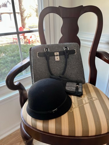
Although one would never catch the Dowager in such “hep” fashion as this, it certainly might be found in the closet of the very fashionable Lady Mary or Lady Edith. It’s certainly found in mine!
If you like this formal tablescape and would like to see others on this site:
Last week’s post was the exuberant, quite colorful, more casual styling for celebrating the Kentucky Derby. Today, with only days to spare before the big race, I offer a more formal version that despite the gilding and crystal is still somewhat relaxed in its overall style.
An overhead shot of the centerpiece focuses on the sumptuous assembly of red roses and the gold-tone candle holders from Very Violet Boutique in downtown Lee’s Summit, MO. (Just a side note to those of you in shopping distance: Very Violet has now closed and sent all inventory next door to sister store Ivy & Sparrow.)
It is the run for the roses, so adding a few here and there (or a lot everywhere!) is quite appropriate . For demonstration purposes these are from my faux collection, but I urge you to incorporate fresh if at all possible.🌹 🌹 🌹
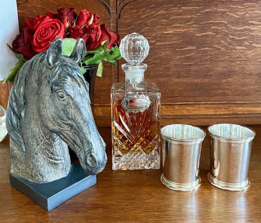
I found this fabulous horse head at The Painted Sofa in downtown Kansas City, MO.🐴 If you plan a visit to the KC area, The Painted Sofa is an exciting, expansive, must-see shopping destination! Three full floors of fabulous furniture and furnishings!
From the bottom up: “raggedy edge” gold glass charger and Ciroa black & white buffalo check from Home Goods intermingled with regal red & gold Royal Scotland pieces.
My sister (her given name is Berishia, but I’ve always lovingly called her Barf!) gifted me with several yards of Derby-themed fabric a few years back, but life got in the way and I never had anything done with it. This year my exceedingly talented and thoughtful neighbor, Barbara, fashioned these gorgeous napkins from some of it. See how she even thought to use red thread on the hem? Gorgeous detail!!! Thank you, Barbara!!!!!!!!
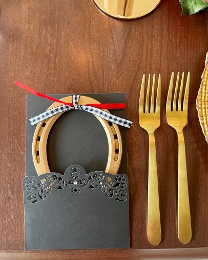
Need a little take-home gift for guests? Gold-painted horseshoes make a wonderful paperweight! I dressed these up with a simple mix of simply tied ribbons tucked into very fancy black card sleeves. (The sleeves are leftovers from my 60th birthday party invitations.)
Gold-rimmed iced beverage glasses from Nell Hill’s in Kansas City, MO paired with Cristal D’Arques -Durand “Ashville Gold” champagne flutes.
After dinner you simply must have a sliver of Derby Pie and/or Bourbon Butter cake! A generous host or hostess will wrap up an extra slice of each for you to enjoy with coffee next morning.😉
There is no Derby celebration complete without the requisite mint juleps served in traditional silver cups. Create an extra special ambience by transferring good bourbon into a fancy crystal decanter.
On the side I created a fun arrangement in a white Nell Hill’s chinoiserie pot with an ivy topiary, luscious red roses, and another gold horseshoe. The 2 miniature horse heads from Hobby Lobby complete the side table decor.
So that’s it for this year’s Kentucky Derby! These ideas can be easily used for any equestrian event with just a few tweaks.
Here are a few other Derby tablescapes on this site you might enjoy:
I’m trying to stay upbeat, but it’s hard to do when so many are needlessly and through no fault of their own suffering so much. I’ve felt this way regarding many people targeted by bullies, and today (as in the weeks since the vicious and unwarranted attack began) I’m thinking more than ever about the people of Ukraine.🇺🇦 I began pulling together a tablescape meant to be a joyous representation of Spring and ended up in tears. I’m going to post this without a lot of further commentary because I’m otherwise going to start cussing…and crying again.🤬😢
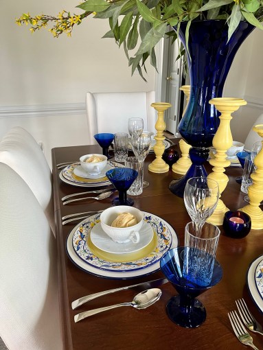
The blue-rimmed chargers are from Hobby Lobby, the “Mirandela” pattern dinner plates (last featured here in August of 2021) and cobalt blue stemware from Pier 1, the J.A. Henckels “Bellaserra” flatware and Cristal d’Arques “Capella” wine stems from Macy’s, and the cream soup sets from Nell Hills in Kansas City, MO. The “Opera” Royal Crystal Rock glasses were an estate sale find.
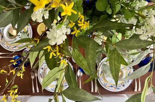
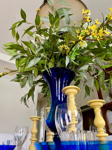
While these are faux greenery (Kirkland’s) and flowers (Kirkland’s and a wholesale outlet), fresh ones on your table would be glorious. I found the curvy cobalt vase at Z Gallerie some years ago.
I often take liberties with candlesticks and employ them as finials.
Lighting candles of hope.
This is by no means the definition of “art imitating life”, but the people of Ukraine are on my mind and in my heart, and their plight is burning a hole into my very soul. May God bless them all. 🇺🇦
There are a couple of other blue and yellow tablescapes on this blog you might like to see that incorporated these same Pier 1 dishes:
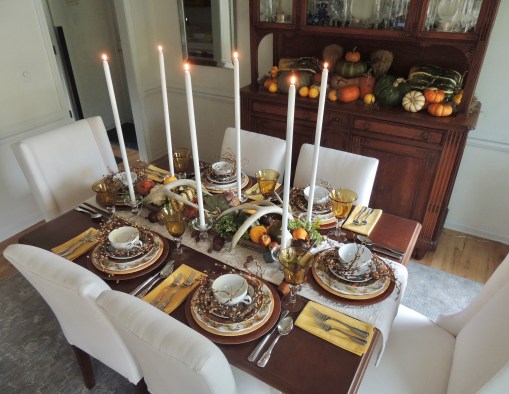
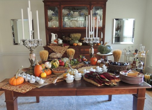
Thanksgiving will once again this year be a sparsely attended event at our home. While I’m a firm believer in “the more, the merrier”, I know that’s not possible and can appreciate and embrace a smaller group. So “bountiful simplicity” will be the name of the game for 2021.
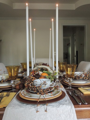
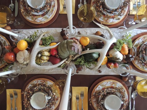
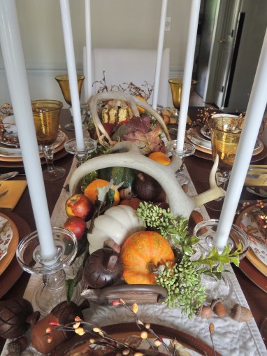
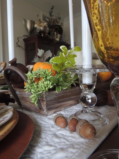
This tablescape concept began with the purchase of the white pumpkin-embossed runner from Home Goods I bought a few weeks ago. The pickings are slim this year, so I felt fortunate to find something I liked. The centerpiece is created with a long, narrow wooden “trough” from Nell Hill’s filled with a variety of pumpkins, gourds, fruits, faux acorns, greenery, and leaves topped off with a pair of antlers. A six-pack of 24″ metal case candles in clear glass holders runs along both sides. With such a low centerpiece, I felt it necessary to add height but still be mindful of being able to see across the table.
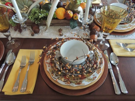
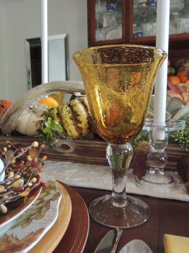
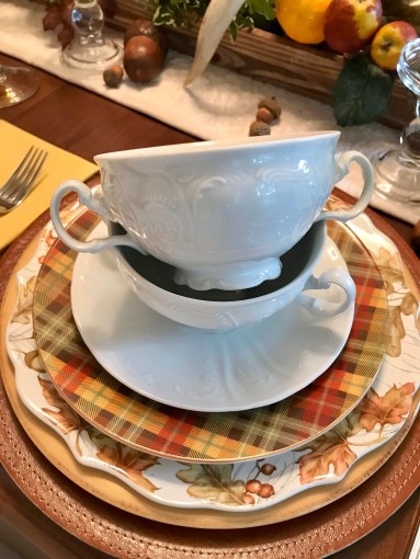
I was SO excited to find these great leather look chargers at Hobby Lobby this season!!! I used them once already this season for “Hey, Pumpkin!“, and they will come in handy for lots of future fall and winter tablescapes. The mustard yellow dinner plates, oak leaf/acorn plates, and plaid salad plates are all from Pier 1, purchased over the last 10+ years. The delicate cream soup bowl with saucer (having homemade mushroom soup for a starter!) is from Nell Hill’s in Kansas City, MO. Hampton Silversmith “Patriot” flatware, napkins from LinenTablecloth.com, and amber bubble glass stemware from TJ Maxx round out the place settings. Lithe seed pearl wreaths add texture, color, form, and a little fun.
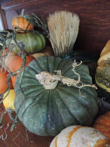
I was determined this year to reuse, recycle and reduce waste when it came to decorating. While I bought LOTS of pumpkins and gourds at the start of the fall season, I’ve made sure to use them in various ways inside and out. A quick dip in a weak Clorox bath when I first brought them home has kept them going strong. See how I first used these pumpkins as the backdrop for my 2021 Halloween entry, “The Spider & the Fly“. Deep six the spiders and flies, do a little artful rearranging, add some wheat sheaves, and it’s all ready for Thanksgiving! (PSA: If you know someone nearby who has a farm, ask them if they’d like to have your pumpkins after the season to feed their livestock. If not, consider chopping them up and scattering them in an uninhabited wooded area for wildlife such as foxes, deer, squirrels, and other animals who often find it difficult to source food in the winter. Full circle use!)
The small china cabinet is all decked out with its usual aluminum wine and champagne coolers that are further embellished with berry branches, pumpkins, and a big moss ball.
If you would care to check out other Thanksgiving-inspired tablescapes on this blog:
I’m pleased as apple cider punch to be joining a talented group of ladies from across the globe in Blog Land for a Thanksgiving Tablescape Blog Hop! I hope you will click on their links to check out their Thanksgiving tables! (NOTE: Set to go live Tuesday, November 9 at 7 a.m. EST, although some posts may be up now.)
Have you ever considered a Thanksgiving Progressive Dinner? A moveable feast is a fresh way to enjoy the holiday. Perhaps pre-dinner cocktails and hors d’oeuvres at the first home while watching the Macy’s Parade and Bowl games, the main course at House #2 with a little more football, and finally dessert at House #3 followed by a neighborhood tour of Christmas lights to kick off the new holiday? You’ve arrived at House #3!
(1:18. No music, just in case you’re opening this at work! I’ve got your back!😉) And oops! Yes, that IS an open laundry room door caught in the mirror!🙄
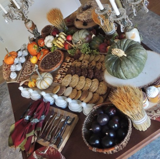
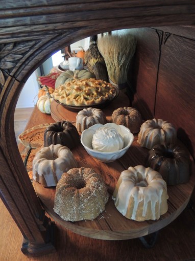
A table laden with a variety of desserts is a sure way to delight your guests! I describe this one as Thoreau meets Liberace…a hybrid of natural and glitzy elements.
This dessert bar could be easily transformed into a Christmas/winter theme by exchanging the pumpkins and wheat for holiday elements like small trees, poinsettias or paperwhites, and interesting ornaments.
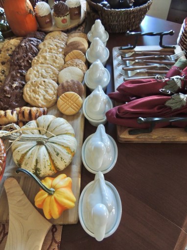
The huge dessert board that displays the cookies and pecan pie is from a lovely shop in downtown Lee’s Summit, MO, called Very Violet Boutique. I have BIG plans for this substantially-proportioned board in the coming years!
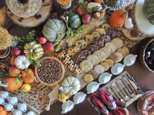
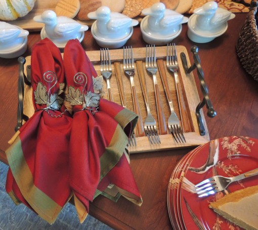
I LOVE this tray from Home Goods that holds the Cambridge “Esben” flatware and Pier 1 napkins! Those wrought iron handles…yaaaaaassssss!!!
These little duck casseroles were purchased at World Market YEARS ago. They’re perfect for individual rice or bread pudding with whiskey sauce! Emphasis on the whiskey sauce, y’all!🥃
The table runner with colorful meandering vines was purchased along with 6 matching placemats at Pier 1 many years ago. It’s nice to be able to shop your home for “just the perfect thing” and actually find it!
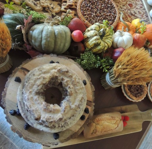
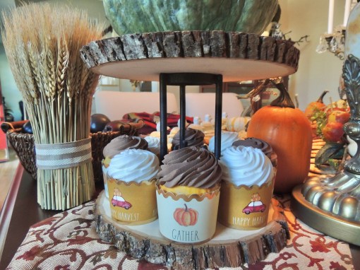
The wheat sheaves and smaller charcuterie/cheese/breadboards are all from Home Goods. I particularly like the wood slice cake riser. It will serve me well for years to come.
I created this cupcake stand using a couple of wood slices and a 3-legged wrought iron piece I happened to have. The oven-safe Rae Dunn cupcake holders are from Home Goods. They REALLY dress up cupcakes and muffins!!!
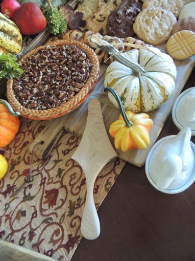
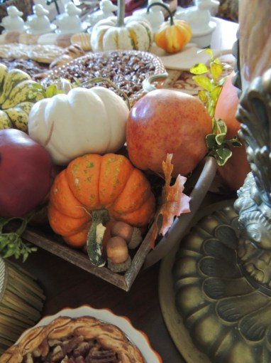
The expanse of desserts is broken up with this pumpkin/gourd/acorn/apple-filled wooden “trough” from Nell Hill’s in Kansas City, MO. I’ve used this vessel for a couple of tablescapes this season, including “Home for the Thanksgiving Holiday“.
More miniature covered casseroles from World Market for perhaps a taste of crème brûlée?
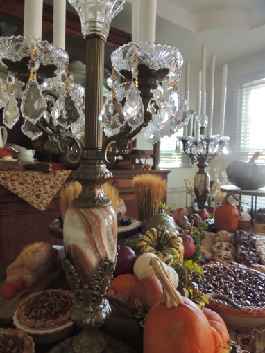
I have had these striking candelabra for a number of years and pull them out just about every fall for decorating somewhere around the house. As I often do, I used metal case candles which are a bit safer if accidentally knocked over. These are 15″H and perfect for lending a bit more height to the tablescape. (I have them in 6″ and 25″, too!)
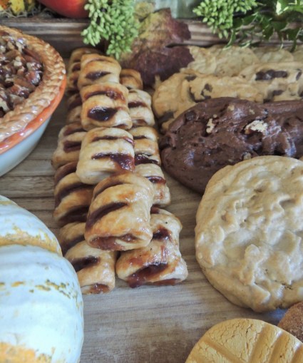
More desserts, you ask?!! Why, indeed! It’s a dessert extravaganza!!! Don’t forget the coffee!
So there you have it! Perfect for Thanksgiving or anytime during the holiday season when family and friends gather together!
This is my final autumn-themed post for 2021. I hope to see you back here soon for the winter holidays!
If you’re looking for more ideas for your Thanksgiving or autumn tables, take a peek at these on this blog!
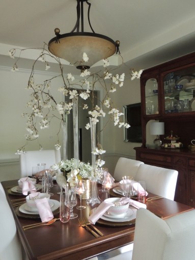
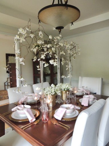
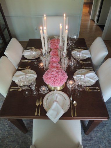
It’s no secret I love the color pink. It has the power to simultaneously soothe and energize me. “Coquettish” is how it has been described, but I am invincible when cloaked in it or when my surroundings bathe in it. I’ll take it! Serve it up any way you want…from the softest blush to the boldest bright…like Shelby in SteelMagnolias”, “Pink is my signature color!”
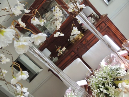
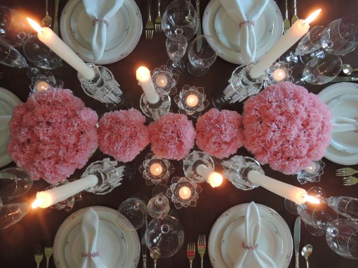
At times I opt to keep the drama of a table confined to a single element. For this one, the WOW is in the waterfall of graceful florets (Nell Hills) spilling from a trio of tower vases.
The softness of this tablescape lends itself to the most feminine events: birthdays, wedding or baby showers, Mothers Day, Breast Cancer Awareness, or just a much needed girls’ night in.
I used these same floral branches in a totally different way in the recent post “Solemn Stars & Stripes“. White flowers instead of pink are used to keep the table from looking overly “sweet” and saturated.
A mix of old china and new Grace Teaware gold-dotted porcelain with a gorgeous pink band sits atop gold-leaf glass chargers. The faux pearl napkin rings are actually 2 rings fitted together for more girth, a trick I first used in the post “Peonies & Pearls” back in 2012.
I am so excited about and in love with these shapely gold-rimmed beverage glasses from Nell Hills!!! They are quite substantial in hand and easily pair with many items already in my repertoire. The blush pink stemless champagne glasses (Michaels) mimic the bowls with their generous sprinkle of gold dots.
This white pheasant has made an appearance in autumn posts like “Pheasants & Pumpkins” and “Candy Colored Autumn“, but never in a spring/summer setting. He just looks right at home here, though, so…voila!
These glass lamp votive holders are a favorite of mine, but I have rare occasion to use them. I bought them on clearance at Pier 1 some 20+ years ago in 3 colors, and they add just the right amount of ambient light at a slightly raised level. (I used the purple shades for “Celebrate Mardi Gras!” in 2014 but still haven’t found the right time and place for the red ones.)
The vitrine holds coffee service and dessert that includes assorted confections on a tiered tray and cupcakes under a fluffy cloud of pink frosting.
If you like pink as much as I do, check out these posts!
Thanks so much for stopping by to visit my little blog! I appreciate it more than you’ll ever know. I’m also on Instagram if you’d like to follow me there! Enjoy your day!
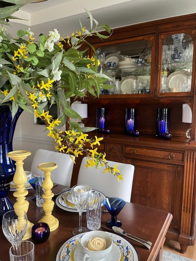
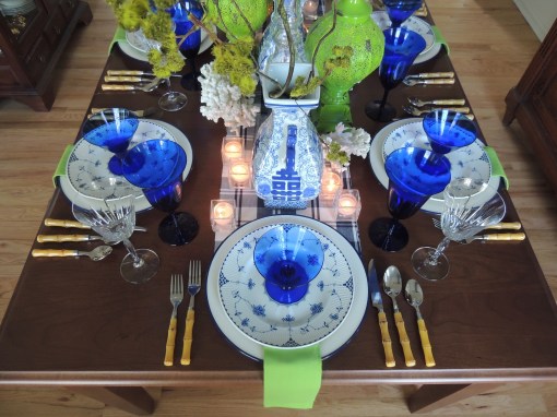
I had to Google the term “grandmillennial style” when it started making the rounds on Instagram. House Beautiful’s definition of “granny chic” threw me for a loop! Chinoiserie has been a favorite of mine long before I actually became a granny, and it will remain so. But define it as you will, here we are…granny chic in blue and white with a scandalous kiss of lime green.
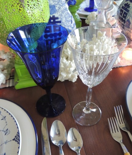
I don’t think I have EVER used these Johnson Brothers “Blue Denmark” dinner plates in the 10+ years I’ve had them! They work perfectly with the beautiful yet sturdy cobalt blue-rimmed ceramic chargers I found on clearance a couple of years ago at Hobby Lobby. Centered on each plate is a cobalt short martini glass from Pier 1 in their heyday. A lime green cotton napkin adds a shock of unexpected color.
Faux bamboo flatware plays into the chinoiserie styling.
I didn’t keep much of the crystal from my Mom’s estate. Simply nowhere to store it all. So the few pieces I brought home with me, like her Mikasa “Innovation” crystal wine glasses, are extra special. I chose them for this tablescape as they complement the shape of the Pier 1 cobalt blue water glasses.
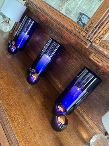
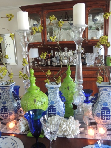
I found these 3 identical fabulous blue and white vases at Nell Hills in Kansas City, MO. It is one of my favorite places to shop these days, and the selection is always over the top…even in times of COVID! I like the way the willowy branches look in them! Towering glass candlesticks from Z Gallerie add a little height, while spiky white coral and a pair of shabby chic perforated lime green finials finish the look atop a blue and white plaid fabric runner.
So there you have it! “Granny chic” from a not-so-chic granny!🙃
If you would like to see more blue & white/chinoiserie/granmillinial/Granny chic posts on this site:
Marty Robbins. Anyone? Anyone? If you’re in my age group, or if you’re a fan of vintage country music, you recognize the name and the tune. And now you’re gonna be involuntarily humming it for the next 2 days! “A white sport coat, and a pink carnation.” You’re welcome!😁
The late, great design innovator Joe Nye and I both have a soft spot for the oft-maligned carnations. Gorgeous? Check! Fun texture? Check! Fabulous fragrance? Check! Affordable? Hell to the y-e-s, CHECK!!! CARNATIONS! I kept my affinity for them on the down low until I soaked up the pages of his book “Flair” years ago. He unapologetically flaunted carnations, pink ones in particular, in his fabulous chinoiserie table designs. So without further soapbox cheering on their behalf, I give you my 2021 Mothers Day tablescape featuring…(insert wild guess here)…pink carnations!
A mix of new and not-so-new purchases make up this proper pink, crystal-laden tablescape. Although the dishware has a vintage look, it is new from Home Goods. Joseph Sedgh “Floral Blush” china with its barely there pink and tinges of gold teams up with a trio of stemware. The red wine glass is a very subtle pink, while the gold-rimmed champagne flute and water glass are clear. A delicate faux pearl ring encircles the crisp white hemstitch napkin.
Fluffy pink carnations crowd gold textured floral vessels to create a dramatic yet very feminine centerpiece. Using multiples in 2 sizes adds visual interest. The crystal candlesticks are dripping with facets that catch the light reflected from the scattered crystal votive holders beneath.
On the vitrine is a simple dessert and coffee set up with some of the same elements from the dining table for continuity of color, texture, and theme.
Well, that’s it for me this Mothers Day week! I plan to spend Mothers Day at home just puttering around our yard. What are your plans? I’d love to hear them! Whatever you do, I wish you health, wealth, wisdom, and peace.
If you like pink as much as I do, here are a few other posts on this site just bursting with it!
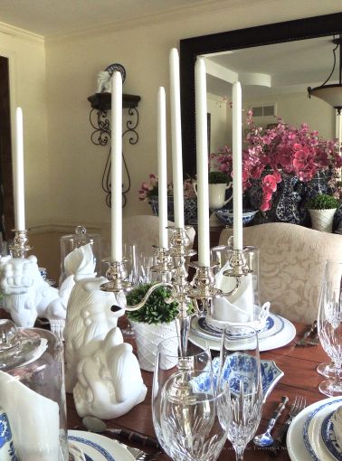
I’ve been floating the idea of bringing a blue & white chinoiserie motif into our dining room. The colors and pattern are classic, and I could work with them all year round. (See Autumn Chinoiserie – Classic Blue & White from 2017 and Mandarin Bling from 2011.) This is my Spring and Summer take on it! (NOTE: Our dining room is currently undergoing redecorating. These pics were snapped before that arduous process kicked in.)
I kept the table bare to better showcase the contrast in colors.
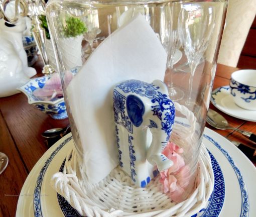
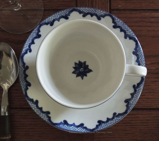
Although I have several blue & white dish patterns, this Ralph Lauren “Mandarin” is my favorite. This time around it is paired up with Godinger “Chelsea” crystal and black faux bamboo flatware. The extra special touch…gorgeous cloches from Nell Hills in Kansas City, Mo.!!! I wasn’t so thrilled with the white wicker tray, but Liz (Home & Gardening With Liz) convinced me to not spray paint them…yet! Under each cloche is a starched white linen napkin and a beautiful porcelain elephant from Pier 1 Imports. Small pink blossoms are added to break up the blue & white.
I like to add in lots of detail, color, texture, and varying heights for centerpieces. Silver candelabra with towering white metal case candles (for safety!) are surrounded by white Foo dogs, floating orchids, and greenery in white ceramic vases. The small floral branches alongside the bowls help to elongate the centerpiece.
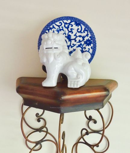
A small white foo dog with another Ralph Lauren “Mandarin” plate graces the sconces in the dining room.
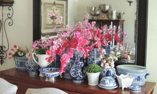
The buffet behind the dining table is laden with various blue & white pieces I’ve collected over the years. Some are filled with orchids, while others hold small cherry blossom branches and tulips. To further tie the florals on the buffet and dining table together, I added more vases of greenery.
Do you like classic patterns, or do you lean more toward contemporary styles?